How to Make a Minimalist Logo Stand Out
Learn how to give a simple logo a distinctive concept, typography, symbol, and color without adding clutter.
Many minimalist logos look alike because they use familiar geometric shapes, neutral sans-serif type, and similar layouts. To make yours distinctive, start with an idea tied to your brand, then refine the lettering, symbol, and color until each choice has a reason to be there.
Why Minimalist Logos Often Look Alike
1. Why Do Geometric Logos Often Look Generic?
Circles, squares, triangles, and abstract lines are popular because they're simple and versatile. Without a connection to the brand, the same shape could belong to almost any business. Before keeping it, ask what it expresses about your name, product, or personality.
2. How Does Typography Affect Logo Uniqueness?
Many minimalist logos rely on familiar sans-serif fonts. Look closely at the font, letter spacing, and proportions of your wordmark. An adjusted letterform can give people a feature to recognize.
3. Can a Logo Be Too Minimalist?
Yes. Simplifying a logo can remove the curve, letterform, or symbol that made it recognizable. The useful test is whether each remaining element helps people identify the brand.
Check the mark at small sizes as well as on a full screen.
4. Why Should Logo Design Reflect Brand Identity?
A creative studio, a technology startup, and a luxury brand can all use simple logos. Their type, symbols, and colors should express the personality of each business. Start with the traits you want people to notice, then judge whether a popular style actually conveys them.
How to Make a Minimalist Logo More Distinctive
1. Start with Your Brand Name and Identity
Write down your brand name, what you offer, and the impression you want to make. Those details give you a basis for judging concepts instead of choosing a random icon.
With LogoAI, you can generate logo concepts from your business name, an optional description, and selected styles. Compare several results to see which direction reflects the brief most clearly.
2. Explore Different Styles Before Choosing One
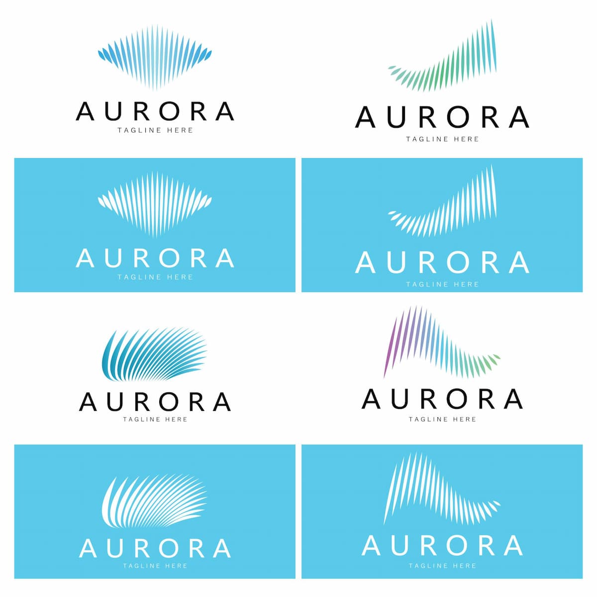
The same brand can look different with geometric, typographic, abstract, or organic treatments. Compare several options side by side. Look at how the lettering and symbol change the impression, then check which direction still works at the sizes where you will use it.
3. Refine Typography and Layout
If a logo feels generic, look at letter spacing, font proportions, and the balance between the icon and business name. A change to one of these may be more useful than replacing the entire concept.
You can refine a generated LogoAI concept by describing the change you want. Review the whole result afterward, since AI refinement may change other details too. If you already have a logo, you can redesign the existing mark to explore typography, layout, and other changes.
4. Make Your Symbol More Meaningful
Look for a visual idea drawn from your name, products, or business characteristics. A small use of negative space can add another meaning without complicating the symbol.
Compare each variation with your original brief. If a new detail makes the symbol harder to read at small sizes, simplify it again.
5. Use Color to Give Your Logo More Personality
Choose color for the impression it creates alongside your typography and symbol. Compare a few palettes, then check that the logo remains clear wherever you plan to use it.
Frequently Asked Questions
Why are minimalist logos so popular?
Their simple shapes and clean typography can adapt to websites, social media, packaging, and other brand materials. The design still needs a recognizable idea.
Does a minimalist logo have to be black and white?
No. Choose colors that suit the brand and keep the mark clear in the places it will appear.
How do you make a minimalist logo stand out?
Give it a brand-specific concept, distinctive lettering, or a meaningful symbol. Then test whether people can still recognize the design at small sizes.
Can AI generate unique minimalist logos?
AI can generate different styles, symbols, and layouts from a brand brief. Compare and edit the results, and check for similar marks before using one. Generation alone does not guarantee exclusivity.
Final Thoughts
Before choosing a final version, check whether its lettering or symbol gives people something to recognize and whether that detail survives at the smallest size you need. Remove anything that obscures it.
Ready to create your own logo?
Turn your brand name into professional logo concepts in seconds with LogoAI.
Generate my logo