Logo Design Trends 2027: 8 Directions Shaping Brand Identity
From adaptive logo systems to motion-first marks and warm minimalism, here are the logo design trends to watch in 2027, and how to use them without dating your brand.
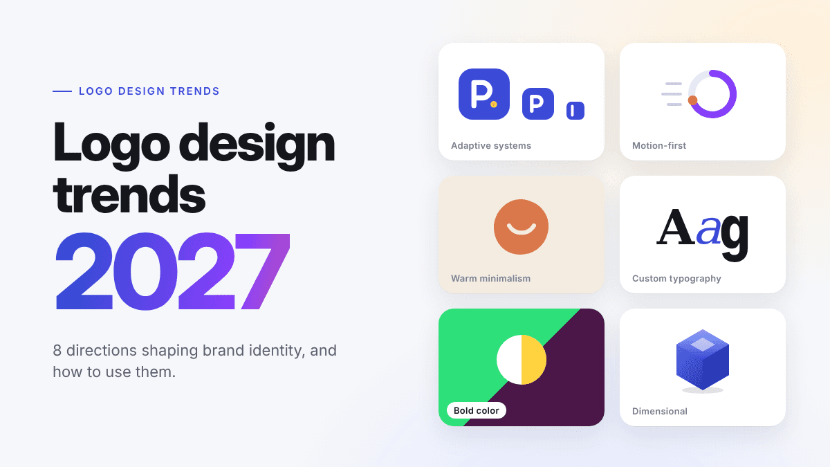
Every year brings a new wave of logo styles, and every year most of them fade. The trends worth following are the ones that solve a real problem: a logo that has to look sharp on a smartwatch, move in a video intro, and still hold up on a printed invoice. Looking ahead to 2027, the strongest directions share one idea: logos are becoming systems, not single images. Here are the trends we expect to shape brand marks next year, and how to use them without dating your brand.
1. Adaptive Logos That Change With Context
A single fixed lockup is no longer enough. More brands now design a family of marks: a full horizontal logo for websites, a stacked version for social profiles, a compact icon for app tiles and favicons, and sometimes a one-letter monogram for the smallest spaces.
In 2027 this goes further. Logos will adjust weight, spacing and even detail level depending on where they appear, much like responsive web design. A mark might show fine inner lines at billboard size and drop them entirely at 16 pixels.
How to use it: design your smallest version first. If your icon works at favicon size, scaling up is easy. Then build a simple set of 3–4 lockups and use them consistently.
2. Motion-First Identity
Brands now meet customers in short videos, app launches and animated stories far more than on letterheads. As a result, more logos are being designed with motion in mind from day one: a letter that draws itself, a symbol that assembles from parts, or a subtle loop that plays on hover.
The key shift is that the animation is not an afterthought added by a video editor. The shapes are chosen because they move well.
How to use it: keep motion short (under two seconds) and make sure the final frame is your standard static logo. If the animation is the only place your mark makes sense, it is too complicated.
3. Warm Minimalism
Flat, ultra-clean minimalism dominated the last decade, and many brands ended up looking identical. The 2027 version of minimalism keeps the simple shapes but adds warmth: slightly rounded corners, soft irregularities in strokes, earthy or muted color palettes, and typefaces with a little personality.
It still reads as clean and modern, but it feels made by people rather than generated by a template.
How to use it: start with a simple geometric form, then add one human detail, such as a hand-drawn curve, an off-white background tone, or a custom tweak to one letter in your wordmark.
4. Expressive, Custom Typography
Wordmarks continue to grow in popularity because a name is the one thing no competitor can copy. In 2027 expect more brands to customize their lettering: stretched or compressed letters, unexpected ligatures, mixed weights within one word, and serif revivals with sharp, modern details.
Typography-led logos also scale well and are easier to recognize when a brand name is short and distinctive.
How to use it: pick a base font that fits your brand voice, then modify just one or two characters. A small custom detail is memorable; rebuilding every letter rarely is.
5. Bold, Intentional Color
After years of safe blues and monochrome palettes, brands are using color as a primary identifier again. Expect saturated single-color identities, unexpected pairings like electric green with deep plum, and gradients used with restraint, usually within the icon rather than across the whole logo.
The important word is intentional. A strong color only works if it is used the same way everywhere.
How to use it: choose one signature color and commit to it. Always test a one-color and a black-and-white version of your logo to make sure it does not depend on color to work.
6. Dimensional and Tactile Effects
Subtle depth is returning: soft shadows, light 3D bevels, glassy and frosted textures, and embossed-looking finishes. These effects are driven partly by richer screens and partly by spatial and AR interfaces where flat icons can look out of place.
Used well, dimension makes a logo feel premium and modern. Used poorly, it becomes hard to read at small sizes.
How to use it: keep a flat version as your master logo and treat the dimensional version as a special-use variant for hero images, app icons and product packaging.
7. Geometric Symbols With a Story
Abstract marks are not going away, but the most successful ones in 2027 will carry clear meaning. Think of a symbol that combines the first letter of a brand with a shape that hints at what the company does, such as a leaf inside a letter for a sustainable product or a speech bubble formed by negative space for a communication app.
Customers remember logos they can "read," even subconsciously.
How to use it: list three words that describe your business, sketch a simple shape for each, and look for a way to combine one shape with your initial.
8. AI-Assisted, Human-Directed Design
AI tools have changed how logos get made. Founders can now explore dozens of directions in minutes instead of weeks, compare color palettes instantly and preview a logo on mockups before committing. The trend for 2027 is not "AI replaces design" but faster iteration with a person making the final decisions.
The brands that stand out will use AI to explore widely, then refine carefully: adjusting spacing, simplifying details and building out a consistent set of variations.
How to use it: generate several concepts with LogoAI, shortlist two or three, and then refine them. Check each finalist at small sizes, in one color, and on real-world mockups before you decide.
How to Follow Trends Without Dating Your Brand
Trends are useful as inspiration, but your logo should last for years. A few simple rules help:
- Keep the core simple. Apply trends to colors, effects and motion, which are easy to update, rather than to the basic shape of your mark.
- Test at every size. If it fails as a favicon or social avatar, it will fail in daily use.
- Build a system. A main logo, an icon, a one-color version and clear usage rules matter more than any single trend.
- Match your audience. A playful, dimensional logo may suit a gaming app but feel wrong for a law firm.
Final Thoughts
The logo trends for 2027 point toward flexibility: marks that adapt, move and stay recognizable in every format. Whether you lean into warm minimalism, bold color or custom typography, the goal is the same, a logo that is simple, distinctive and built to work everywhere your customers find you.
Ready to try a few of these directions for your own brand? Create your logo with LogoAI and explore concepts in minutes.
Ready to create your own logo?
Turn your brand name into professional logo concepts in seconds with LogoAI.
Generate my logo