How to Choose an AI Logo Concept: 10 Checks Before You Commit
Comparing AI logo concepts? Use this 10-point checklist to choose a direction that fits your brand, works across real touchpoints, and can grow with your business.
Choosing an AI logo concept is not about picking the option that looks the most impressive at first glance. The stronger choice is the concept that fits your brand, remains recognizable in real use, and can develop into a complete visual identity.
If you are comparing several AI-generated directions, use this 10-point checklist before you commit to one. If you are starting from scratch, you can explore AI logo concepts with LogoAI and use the same checklist to compare the results.
The short answer: choose the concept that performs best, not the one that looks prettiest
The right AI logo concept should pass four basic tests:
- It fits the brand and the audience.
- It is clear and recognizable without presentation effects.
- It is flexible enough for digital and physical applications.
- It can be refined into a consistent brand system.
A polished preview can influence your first impression, but the final decision should come from how the concept works—not only how attractive one presentation looks.
The best AI logo concept is the one that remains clear, distinctive, and usable after the first impression fades.
10 checks for choosing an AI logo concept
1. Does it fit the brand?
Start with the business, not the visual style.
Ask:
- What should customers feel when they see the logo?
- Does the concept match the brand’s category and price point?
- Would it make sense to the audience you want to reach?
- Is the personality clear without a long explanation?
A playful concept may work for a children’s product but feel wrong for a financial service. A luxury-looking wordmark may feel polished but create the wrong expectations for a local business.
2. Is the main idea clear in five seconds?
A logo does not need to explain everything about a business. It should have a clear visual idea that people can understand and remember quickly.
Look at the concept briefly, then look away. Can you describe its main shape, feeling, or visual idea? If the concept needs a long explanation before it makes sense, the design may be too complicated or too abstract for its role.
3. Does it feel distinctive rather than generic?
AI tools can generate attractive concepts quickly, but attractive does not always mean memorable.
Check whether:
- the symbol feels specific to this brand;
- the concept relies on a familiar stock icon;
- several businesses in the same category could use it unchanged;
- the design has one recognizable detail that people can remember.
A strong concept does not need to be unusual for the sake of being unusual. It needs enough character to avoid blending into a category full of similar marks.
4. Does the typography support the brand?
The typeface often determines whether a logo feels trustworthy, playful, premium, practical, or modern.
Check the business name letter by letter. Look for:
- readable letterforms;
- comfortable spacing;
- a suitable weight and proportion;
- a good relationship between the wordmark and the symbol.
A strong icon cannot fully compensate for a wordmark that is difficult to read or feels unrelated to the brand.
5. Is it recognizable at a small size?
Many logo concepts look strong in a large presentation but lose their identity as a social avatar, website header, app icon, or small printed mark.
Reduce each option and check whether:
- the main symbol is still recognizable;
- the business name remains readable;
- thin lines and small details remain visible;
- the icon and wordmark still feel balanced.
If a concept only works when it is displayed large, it may need a simplified version or a different direction before it becomes the primary logo.
6. Does it work in one color?
Color can make a concept feel memorable, but a reliable logo should not depend on gradients, shadows, textures, or a particular background.
Test each option in black and white, one dark color on a light background, and one light color on a dark background. This reveals whether the form, spacing, and contrast are doing enough work on their own.
A concept that collapses without its original colors may be visually appealing but less flexible in real business use.
7. Can it adapt to different layouts?
A business may need more than one logo arrangement. Check whether the concept can support:
- a horizontal version;
- a stacked version;
- an icon-only version;
- a version with or without a tagline.
You do not need to finalize every variation immediately. You do need to know whether the core idea can adapt without losing its identity.
8. Does it work in real business contexts?
Before choosing a final direction, list the first places where the logo will appear. For most small businesses, that may include a website header, social profile, business card, invoice, packaging, signage, or email.
Use a few relevant previews rather than dozens of decorative mockups. A business card can reveal spacing and small-size problems. A social profile can test recognition in a tight crop. Packaging or signage can show whether the logo has enough contrast at a distance.
To see how a direction behaves beyond the artboard, you can preview it across realistic brand applications. Treat the mockup as an application check, not as proof that the concept is strong.
9. Can you refine it without starting over?
The first usable concept is often a starting point, not the final answer.
Before committing, check whether you can improve details such as:
- typography and letter spacing;
- color combinations;
- icon proportions;
- layout and logo variations;
- the balance between symbol and wordmark.
If the concept has the right brand direction but one detail feels wrong, targeted refinement is usually more useful than discarding the entire idea. You can modify an AI-generated logo and keep the strongest parts while improving the areas that do not fit.
10. Can it grow into a complete brand identity?
A logo is only one part of a business identity. Before you commit, consider whether the direction can support:
- a repeatable color palette;
- useful type pairings;
- social media and marketing assets;
- consistent use across digital and print channels;
- future brand materials as the business grows.
A brand kit helps turn a selected concept into a broader system. The goal is not only to download one attractive logo file, but to choose a direction you can use consistently over time.
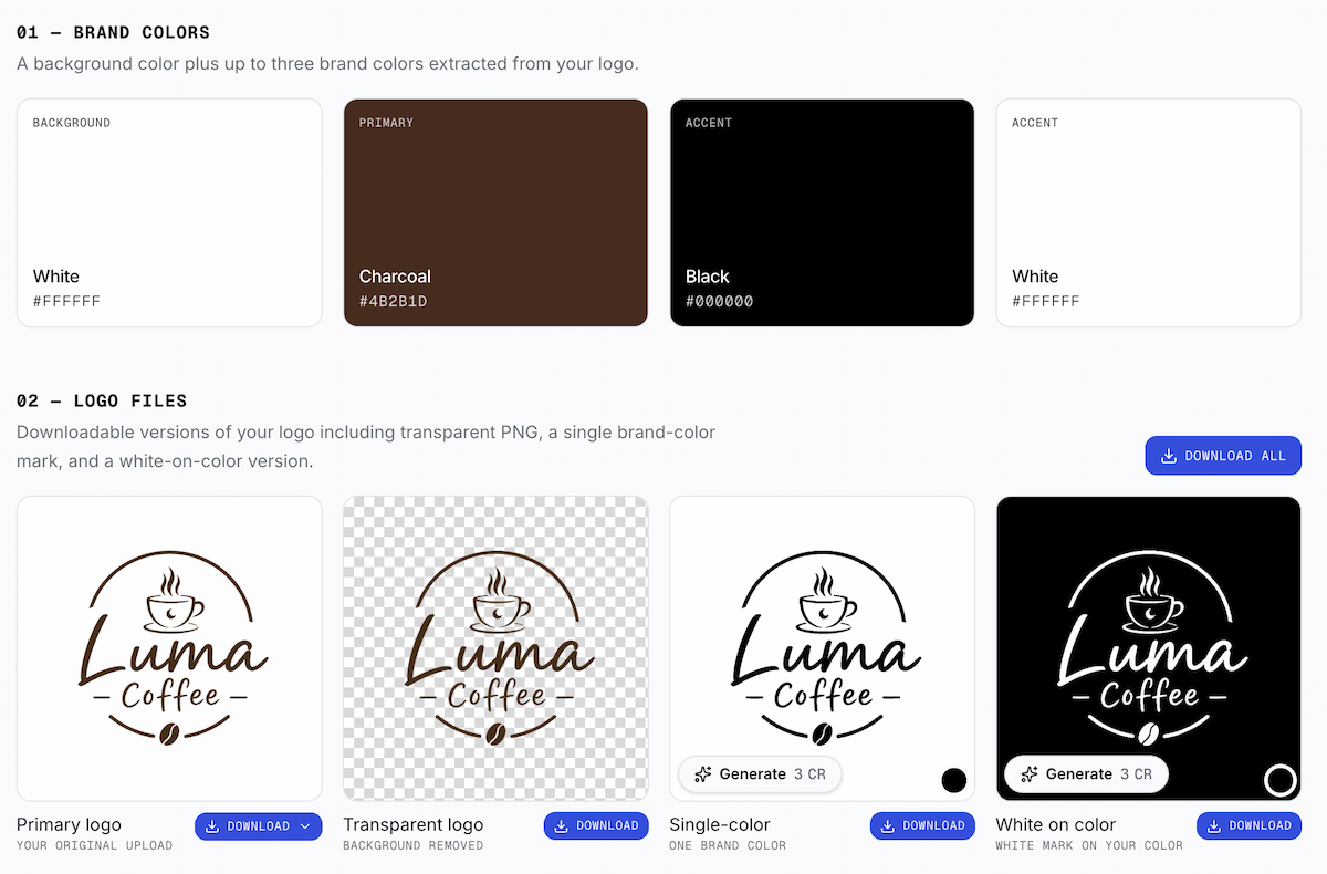
Example of a LogoAI brand kit showing brand colors, logo variations, and downloadable files generated from a logo.
A simple comparison table for several AI logo concepts
When two or three options all look appealing, score them against the same questions instead of relying only on your first emotional reaction.
| Check | Strong sign | Warning sign |
|---|---|---|
| Brand fit | The style supports the audience and positioning | The design is attractive but sends the wrong message |
| Clarity | The main idea is easy to describe | The concept needs a long explanation |
| Distinctiveness | It has a memorable point of view | It uses a predictable icon or layout |
| Typography | The name is readable and well balanced | The wordmark feels cramped or unrelated |
| Small-size use | The logo remains recognizable | Details disappear or merge together |
| One-color use | The form works without special effects | The design depends on its original colors |
| Flexibility | It supports several layouts and placements | It only works in one format |
| Real-world use | It holds up in relevant applications | It only looks good in a presentation |
| Refinement | Small changes can make it stronger | Fixing one issue requires starting again |
| Brand growth | It can support a wider identity system | It is difficult to use consistently |
Choose the concept with the strongest overall performance, not the one with the most impressive single feature.
Should you choose the logo you like most?
Personal preference is useful, but it should not be the only input.
First eliminate concepts that fail on clarity, brand fit, or flexibility. Then compare the remaining options based on which one can support the business over time. This turns a subjective decision into a more reliable design review.
Final takeaway
The right AI logo concept is not simply the most decorative option. It is the direction that fits the brand, stays recognizable, works across real touchpoints, and can be refined into a complete identity.
Use these 10 checks to compare concepts before you download or commit to one.
Ready to create your own logo?
Turn your brand name into professional logo concepts in seconds with LogoAI.
Generate my logo