How to Design a Bakery Logo That Works on Packaging and Storefronts
Learn how to create a bakery logo that stays recognizable on stickers, boxes, bags, and storefront signs, with the right variations and files for each application.
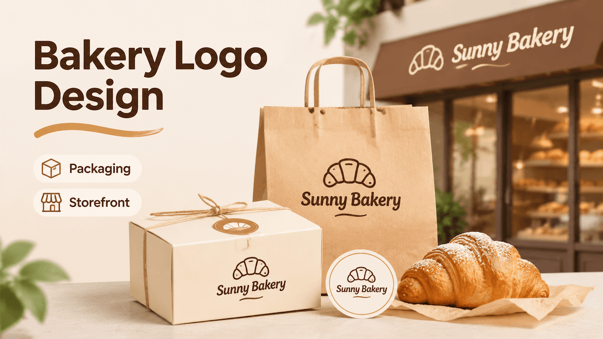
Learn how to create a bakery logo that stays recognizable on stickers, boxes, bags, and storefront signs, with the right variations and files for each application.
A bakery logo might appear as a small seal on a pastry box, a wide design on a paper bag, or a storefront sign viewed from across the street. A design that looks good on a screen won't necessarily work in all these situations. The key is to choose one recognizable visual direction, create variations for different surfaces, and test how the logo looks at actual sizes and viewing distances.
Start with the Surfaces Your Bakery Logo Must Serve
Before choosing a symbol or typeface, list where your logo will appear. A sticker, pastry box, paper bag, and storefront sign each give your design different amounts of space and different viewing distances.
Start with three groups of applications:
- Small packaging: stickers, seals, labels, and box corners.
- Medium packaging: pastry boxes, takeaway bags, tissue paper, and inserts.
- Storefront applications: fascia signs, windows, awnings, and nearby menus.
A horizontal logo may work well on a paper bag but become difficult to read when reduced to fit a round sticker. A detailed illustration might look attractive on a large sign but lose its defining features at a smaller size.
Decide which element customers should recognize first: the bakery name, a distinctive symbol, or a short monogram. If you're launching on a limited budget, prioritize one packaging format and one sticker size before expanding to additional materials.
Choose a Bakery Mark That Stays Recognizable
Bread, wheat, ovens, rolling pins, and pastry shapes are familiar bakery symbols, but combining too many of them can make a logo look generic or overly complicated. Choose one focal mark: the main element people should recognize first.
It could be a wordmark, which uses distinctive lettering for the bakery name; a symbol, such as a simplified croissant or bread shape; or a monogram, a mark built from the brand's initials. A combination of a symbol and wordmark can work well for a storefront, while a standalone symbol or monogram may be more practical for a small packaging seal.
Pay attention to typography and spacing. Thin strokes, tightly spaced letters, and decorative scripts can become difficult to read when printed small. Leave enough negative space—the empty area around letters and shapes—to keep the design from looking crowded.
Two or three colors can be a practical starting point for packaging, especially when you want the logo to work in both full-color and one-color applications. Treat this as a design guideline rather than a universal printing requirement, and check the colors against your intended packaging materials.
If you're unsure which direction suits your bakery, generate logos with AI lets you explore different logo concepts before committing to one. Start with your bakery name and a short business description, then compare different visual directions, from pastry-inspired symbols to typography-led designs and combinations of both. You can also start with an existing logo.
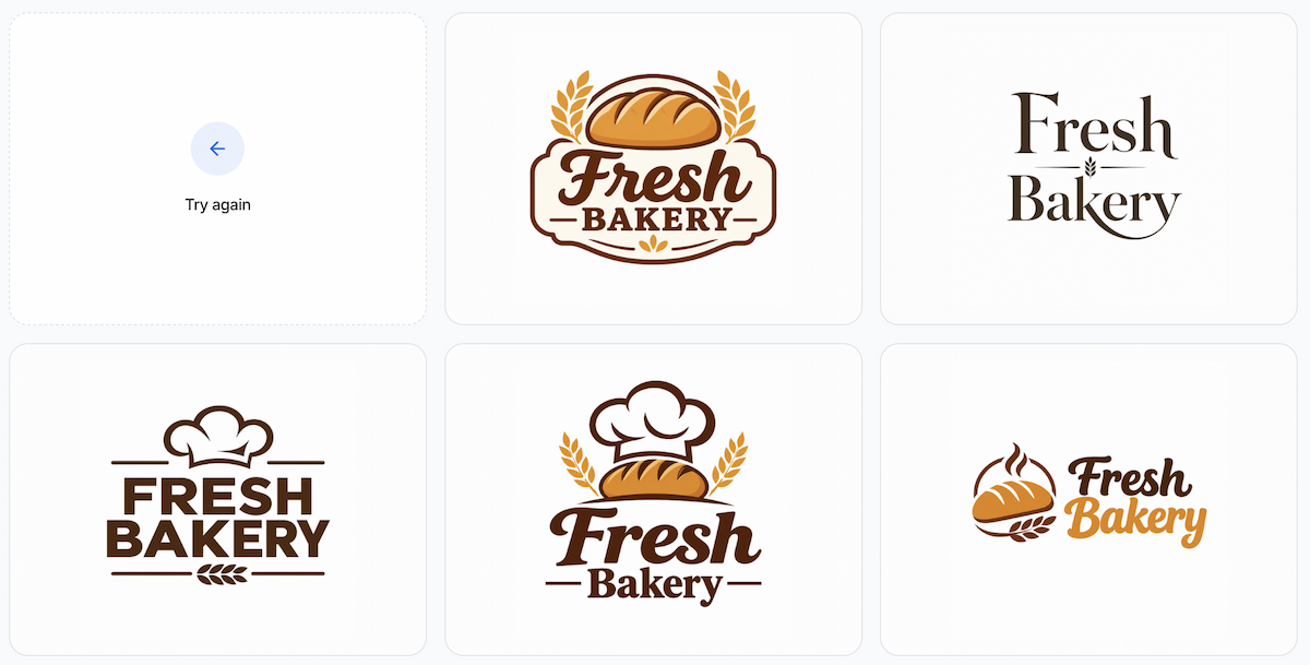
Explore several bakery logo directions before choosing a mark.
Once you find a promising concept, you don't have to start over to make changes. LogoAI's Refine Logo lets you adjust the icon, typography, colors, layout, and overall style of an existing design. For example, you could simplify a detailed pastry illustration, make the bakery name more prominent, or choose a heavier typeface that remains clear on a small sticker.
This makes it easier to move from an initial idea to a more considered logo that you can test across packaging and storefront applications.
Create, Test, and Prepare Your Bakery Logo for Different Surfaces
Once you've chosen a logo direction, the next step is to turn it into a set of usable brand assets. You don't need to manually recreate every variation. generate a full brand kit provides different logo versions, including transparent PNG, single-brand-color, white-on-color, standalone symbol, and inverted alternatives. It also presents your logo in realistic brand mockups, helping you see how the design works beyond a blank canvas.
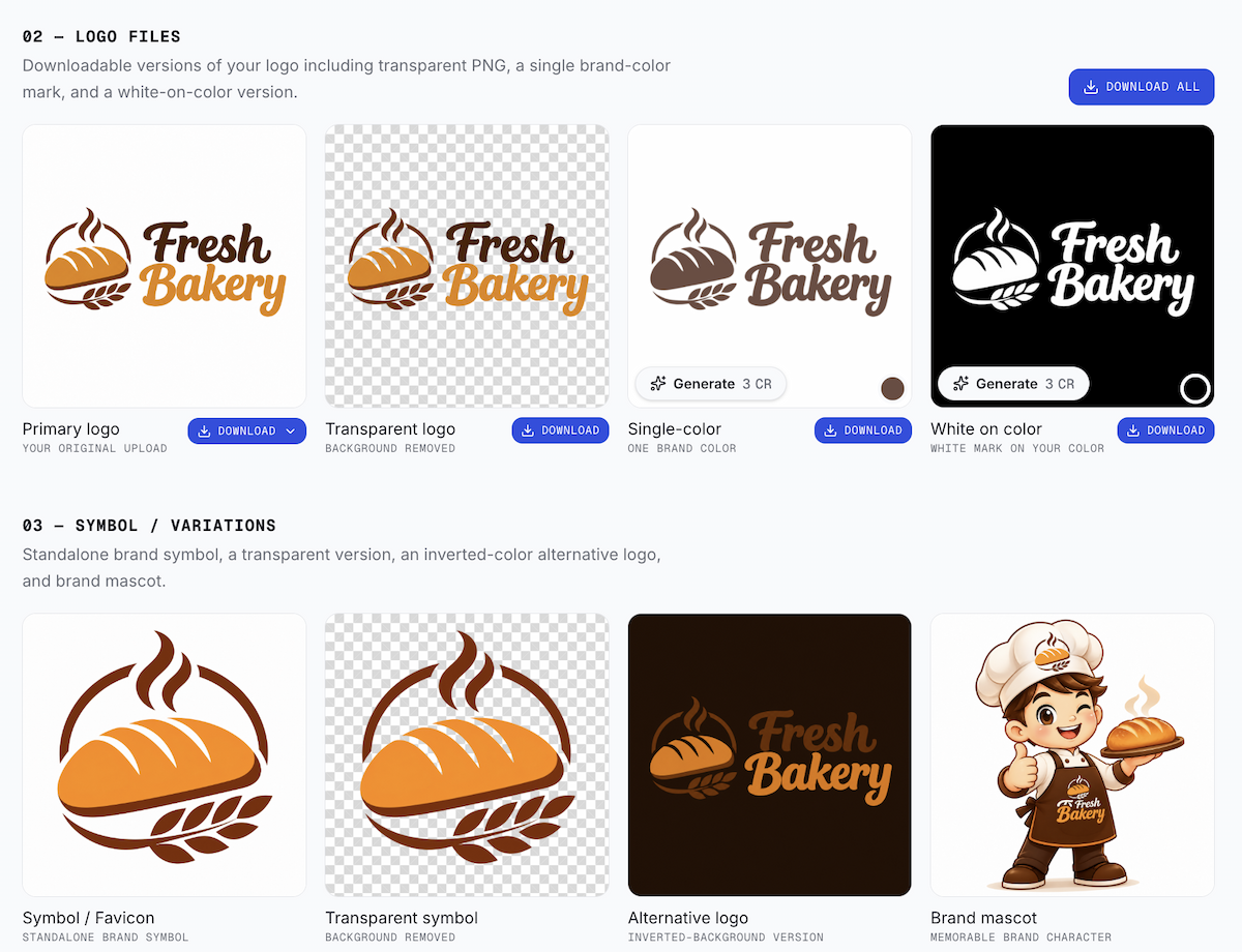
Use the Brand Kit to review logo files and symbol variations for different placements.
These variations serve different purposes:
- Primary logo: for wider surfaces such as pastry boxes, paper bags, and storefront signs.
- Standalone symbol or compact mark: for small stickers, packaging seals, and narrow spaces.
- Single-color and reversed versions: for one-color printing, stamps, and dark backgrounds.
- Transparent-background versions: for placing the logo on different packaging colors and layouts.
The mockup previews are especially useful when comparing how your bakery identity looks across different branded applications. Check whether the symbol remains noticeable, the bakery name is easy to read, and the overall design feels balanced. They give you a more realistic visual reference before deciding which variations to use.
You should still test the selected versions against their intended physical sizes and surfaces. A sticker around one inch wide can be a useful first stress test, not a universal printing requirement. Check the name, letter spacing, thin lines, symbol silhouette, and surrounding empty space.
For other applications, focus on different details:
| Application | What to check |
|---|---|
| Small stickers | Text readability, thin lines, and icon clarity |
| Pastry boxes | Logo placement, folds, and margins |
| Paper bags | Contrast, proportions, and overall visibility |
| Storefront signs | Recognition from a distance |
| Dark packaging | Contrast and reversed logo visibility |
Keep important elements away from folds, seams, handles, and edges. For storefront signs, reduce the logo preview, stand back, and check whether the bakery name or main symbol is recognizable before smaller details. Also compare it against likely sign backgrounds, such as a light wall, dark awning, or window.
Before sending artwork to a supplier, organize the files by use, such as bakery-primary, bakery-compact, bakery-single-color, and bakery-reversed. A transparent PNG is useful for previews and many digital workflows, while a vector or other scalable file may be required for signage and certain production methods. Ask the supplier which format it accepts.
Also confirm resolution, color mode, bleed, safe area, cut lines, dielines, and material requirements. Bleed is the artwork extending beyond the final cut edge, while the safe area keeps important text and graphics away from that edge. Avery's guide to bleed and safe areas explains these printing concepts. Always follow your own printer or sign vendor's production template if its specifications differ.
For related guidance on adapting one mark across channels, see how to keep branding consistent across platforms as you choose the version for each placement.
Run a Final Bakery Logo Proof Checklist
Before ordering packaging or producing a storefront sign, review the exported files in their intended contexts.
- The bakery name or focal mark is recognizable at the smallest planned size.
- The compact version does not depend on tiny text or fine decoration.
- The storefront version remains recognizable from the intended viewing distance.
- Boxes, bags, stickers, and signs share the same core shapes, colors, and proportions.
- Single-color, reversed, and transparent versions work on their intended backgrounds.
- Important elements stay inside the supplier's safe area and away from folds, cuts, or sign edges.
- You have inspected the exported files, not just the design canvas or mockup previews.
- You have approved a digital or physical proof before placing a large order.
If a version fails, fix the specific problem rather than redesigning everything. Remove unnecessary details, strengthen the main shape or wordmark, and repeat the size and distance checks.
FAQ
Should a bakery logo include bread or wheat symbols?
It can, but several familiar bakery symbols in one illustration can make the design look generic. Choose one recognizable cue and check that it works on both a small sticker and a larger sign.
Do I need separate logo versions for packaging and storefronts?
Usually, you need different versions rather than completely separate identities. A horizontal primary logo can work on wide surfaces, while a compact symbol or monogram is better for small stickers. Keep their core shapes and visual style consistent.
What file format should I send to a packaging printer?
It depends on the printing method and supplier. Transparent PNG files can work for some workflows, while vector formats such as SVG or other scalable artwork may be required for certain production processes. Ask your printer for its accepted formats and specifications before sending the final design.
Can a logo maker prepare my bakery logo for printing?
A logo maker can help create logo variations and provide files for different applications, but that doesn't guarantee they meet every printer's requirements. Check the exported file format, resolution, color setup, bleed, and safe area with your supplier before production.
Ready to create your own logo?
Turn your brand name into professional logo concepts in seconds with LogoAI.
Generate my logo