Why Does My Branding Look Inconsistent Across Different Platforms?
Your logo gets cropped, recolored, and resized differently on every platform. Here is why it happens — and how LogoAI's AI Brand Kit generator gives you one consistent identity across your website, social profiles, and everywhere else.
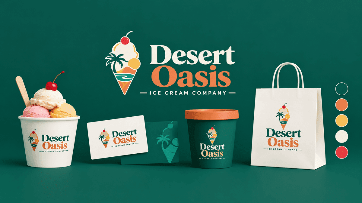
You designed a logo you love. Then you uploaded it everywhere — your website header, your Instagram avatar, your LinkedIn banner, your email signature — and somehow it looks a little different in each place.
On one platform the edges of your logo are cut off. On another the colors look slightly washed out. Your profile picture is a tight circle that chops the sides off your wordmark. Your website header shows the full logo, but the favicon in the browser tab is an unreadable blur.
If this sounds familiar, you are not doing anything wrong. This is one of the most common branding frustrations for small businesses, and it has clear causes — and clear fixes.
Let's break down why it happens, then walk through how to build a single, consistent identity that holds up everywhere.
Why does my logo look different on every platform?
Your logo looks different across platforms because every platform resizes, compresses, crops, and frames images on its own terms. You upload one file, but each destination reshapes it before your audience ever sees it.
Here are the four biggest culprits.
1. Circular and square crops
Most social platforms store your profile picture as a square, then display it inside a circular mask. That automatically cuts off the four corners of your image. If your logo has text, an icon, or important detail near the edges, those parts get sliced away.
A horizontal wordmark that looks great in your website header becomes cramped and unreadable when it is forced into a small circle.
2. Aggressive compression
Platforms re-compress uploaded images to save bandwidth. A logo saved as a JPEG gets compressed again on upload, which introduces artifacts, fuzzy edges, and dull colors — especially around sharp lines and flat color areas. This is why your crisp logo can look slightly muddy after uploading.
3. Different sizes and safe zones
A favicon is 32 pixels. A social avatar might be 400 pixels. A cover banner is wide and short. A logo that was designed at one size rarely scales gracefully to all of these without adjustment. Fine details disappear at small sizes, and a single fixed file cannot be optimal everywhere.
4. Light and dark backgrounds
Your logo might sit on a white website but appear on a dark app interface, a colored social header, or a photo background. A single-color logo with no transparent or inverted version will clash, get lost, or show an ugly background box.
The root problem: one logo file cannot serve every context. Consistent branding does not come from a single image — it comes from a system of coordinated variations.
How do I keep my branding consistent across social media and my website?
Consistency is worth the effort. Research repeatedly links a consistent brand presentation across channels to meaningful revenue growth — studies often cite increases in the range of 20–33% for brands that present themselves consistently everywhere. When people recognize you instantly, they trust you faster.
Here is what actually creates that consistency.
Build one source of truth
Every consistent brand starts with a single, defined set of assets that everything else references:
- Your primary logo and the specific variations that go with it
- Exact color values (HEX codes), not "that blue I liked"
- Purpose-built versions for each context — transparent, single-color, inverted, square, favicon
- Templates for repeatable content like social posts and banners
Without this system, every new platform becomes a guess. With it, every platform pulls from the same well.
Use the right variation for each context
This is the key insight most guides skip. Consistency is not posting the identical file everywhere — it is using the correct version of the same identity in each place:
- A transparent PNG so your logo sits cleanly on any background color
- A single-color mark for stamps, watermarks, and low-contrast placements
- A white-on-color version for dark headers and photo backgrounds
- A standalone symbol for tight circular avatars and app icons
- A favicon that stays legible at 32 pixels
Same identity, right tool for the job. That is what makes a brand feel put-together instead of improvised.
Match your colors and type everywhere
Use the same HEX codes on your website buttons, your social graphics, and your packaging. Pick one or two fonts and stick with them. Define three adjectives for your brand voice and keep your captions, emails, and headlines in that tone.
Keep templates so you never rebuild from scratch
Branded templates for social posts, covers, and announcements keep your feed visually unified without redesigning every time you publish.
How can a small business create consistent branding — without a design team?
Historically, all of the above required a designer, a brand guidelines document, and hours in design software. That is exactly the gap LogoAI was built to close. Instead of handing you one logo file and wishing you luck, LogoAI turns your logo into a complete, coordinated brand system automatically.
Here is how each feature maps directly to the problems above.
The AI Brand Kit generator: your whole system in one place
Open the AI Brand Kit generator with your logo — whether you just created it in LogoAI or imported one you already own — and it analyzes your design to build the full system around it. No brief, no manual setup.
It solves the "different on every platform" problem by generating every variation you need, from one identity.
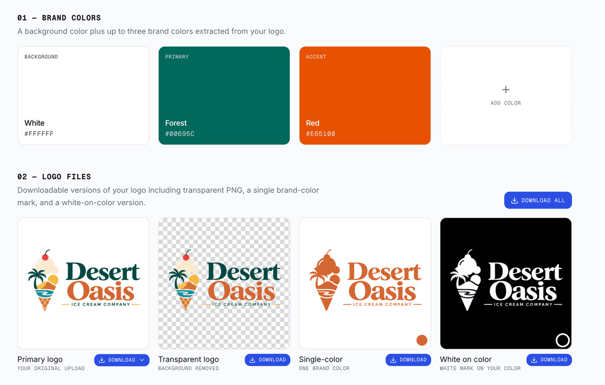
Coordinated logo files for every background
The Brand Kit produces the exact variations that background and contrast problems demand:
- Transparent logo — drops cleanly onto any colored or photo background
- Single-color mark — for watermarks and minimal placements
- White-on-color version — stays visible on dark headers and app UIs
No more white boxes behind your logo or a mark that vanishes on a dark theme.
A symbol and favicon that survive small crops
The Brand Kit extracts a standalone symbol from your logo — the perfect shape for a circular social avatar, where a full horizontal wordmark would get chopped. It also prepares a favicon built to stay sharp and recognizable at browser-tab size, so your identity holds even at 32 pixels.
Real brand colors with exact HEX values
LogoAI extracts your brand palette directly from your logo and shows the names and HEX codes. That gives you the single source of truth for color — the same values you can reuse on your website, your buttons, and every graphic, so your blue is always your blue.
On-brand social assets and templates
The Brand Kit generates ready-to-use social media assets — cover banners sized for LinkedIn, Facebook, X, and YouTube, plus about-us, milestone, and testimonial post graphics — all built from your colors, type feel, and personality. Your social presence stays cohesive with your website instead of drifting into a different look.
See it in the real world before you commit
The kit's mockups show your logo on stationery, merchandise, signage, and digital screens, so you can confirm it reads correctly across contexts — the way it will actually appear to customers — not just on a blank canvas.
Consistency in motion, too
Modern brands live in video and animation. The Brand Kit even includes an animated logo reveal so your identity stays on-brand in reels, intros, and stories — the same logo, now moving.
Refine everything in plain English
Want the palette darker or the mascot more playful? LogoAI's chat-based tweaks let you describe changes in plain words and regenerate, so your whole kit evolves together instead of piece by piece.
Bringing it all together
Your branding looks inconsistent across platforms because each platform crops, compresses, and reframes a single file differently — and one file was never meant to do every job. The fix is not more willpower; it is a system of coordinated variations built from one identity, with locked-in colors and purpose-made versions for every context.
That system used to be a designer's deliverable. Now you can generate it in minutes:
- Create a logo in the AI Logo Maker, or bring your own.
- Open the AI Brand Kit generator to produce your variations, colors, symbol, favicon, social assets, and mockups.
- Use the right version in each place — transparent for photos, symbol for avatars, favicon for tabs, white-on-color for dark UIs.
- Reuse your exact HEX codes and templates everywhere.
Do that once, and your logo stops looking like a different brand on every screen — and starts looking like your brand, everywhere your customers find you.
Ready to create your own logo?
Turn your brand name into professional logo concepts in seconds with LogoAI.
Generate my logo