Barber Logo Ideas for Men's Hair Studios: 6 Styles and When to Use Them
Compare six barber logo styles for modern men's hair studios and learn which directions to test first for a traditional shop, a name-led studio, or a more distinctive grooming brand.
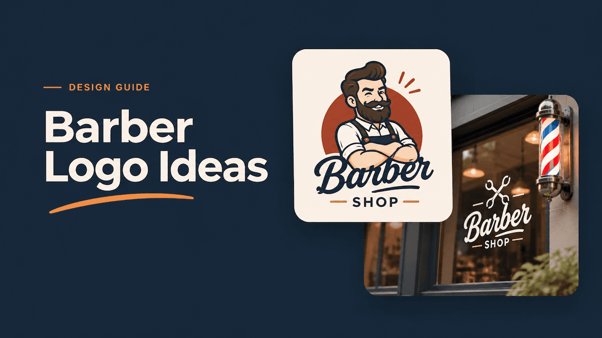
If you need barber logo ideas, start by matching the mark to the shop's promise. Wordmark and Combination are the clearest first tests for a men's hair studio; Emblem and Monogram suit heritage or premium positioning; Abstract and Mascot add personality when a literal barber symbol feels too familiar. Compare two directions under the same shop name before refining the details.
LogoAI's logo maker includes these six directions among its current style choices. Each balances name recognition, industry cues, and personality differently.
Which barber logo style fits your shop?
Start with the impression you want customers to get from the storefront or booking page:
| Shop direction | Styles to try first | Why they fit |
|---|---|---|
| Modern fade or styling studio | Wordmark and Abstract | A clean name or a restrained symbol can feel current without relying on familiar barber tools. |
| Traditional neighborhood barbershop | Emblem and Combination | A badge or a clear icon-and-name lockup can communicate craft, familiarity, and service quickly. |
| Appointment-led studio built around the owner | Monogram and Wordmark | The name or initials can carry more of the identity when the shop sells a personal point of view. |
| Youthful or community-focused shop | Mascot and Combination | A recognizable character can add personality, while a wordmark keeps the business name visible. |
These pairings are starting points. A traditional shop can still use an Abstract mark, and a modern studio can still use an Emblem. The useful question is whether the form supports the experience customers will have in the chair.
How to compare styles in LogoAI
To compare barber logo ideas fairly, keep the shop name and brief fixed while changing only the style. LogoAI's current flow lets you enter a business name, choose styles, and generate concepts. If the name does not explain the business, add a short description such as “a modern men's hair studio specializing in fades and textured cuts.”
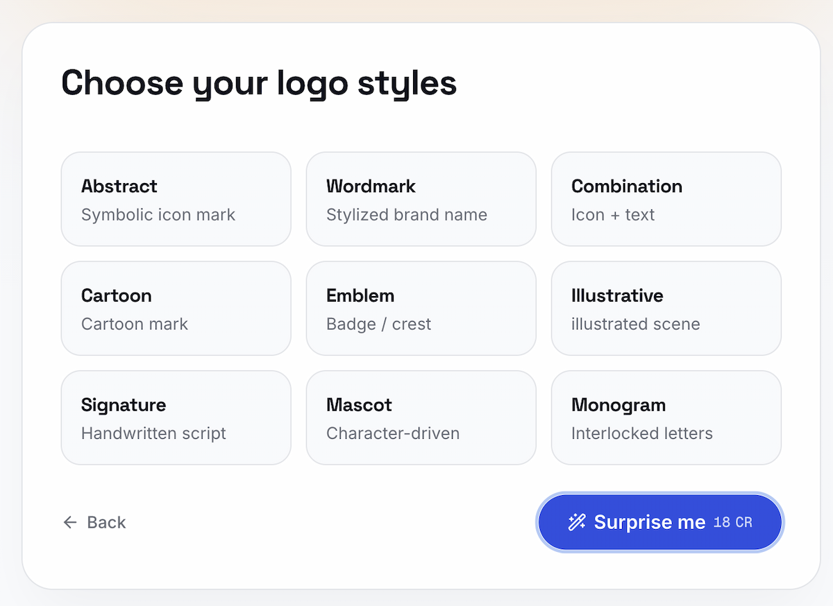
Use the same shop name and description for every comparison:
- Pick the two styles that best match the shop direction.
- Generate the concepts and compare the name, symbol, and overall tone together.
- Keep the direction that makes the shop easiest to understand and easiest to remember.
- If both options miss the brief, go back and test another pair.
Try “Northline Grooming” with the same description, then compare Wordmark and Combination. LogoAI's picker includes nine categories: these six cover the clearest decisions for men's hair studios; Signature, Cartoon, and Illustrative suit handwritten, playful, or scene-led concepts.
A two-style comparison gives you a practical first pass before you explore more directions. Generate logo concepts when you have a shop name ready.
Let the shop name lead: Wordmark and Monogram
A Wordmark makes the business name the main visual element. It suits a short name, a distinctive surname, or a modern studio that wants the sign to read clearly from the street. The design work happens in the lettering: weight, spacing, proportions, and one small detail can give the name a recognizable character.
A Monogram reduces the name to interlocked initials or a compact letterform. It can help when the full name is long or when you need a mark for a profile image, cap, apron, or product label. Keep the full name nearby in the primary lockup so new customers do not have to guess what the initials mean.
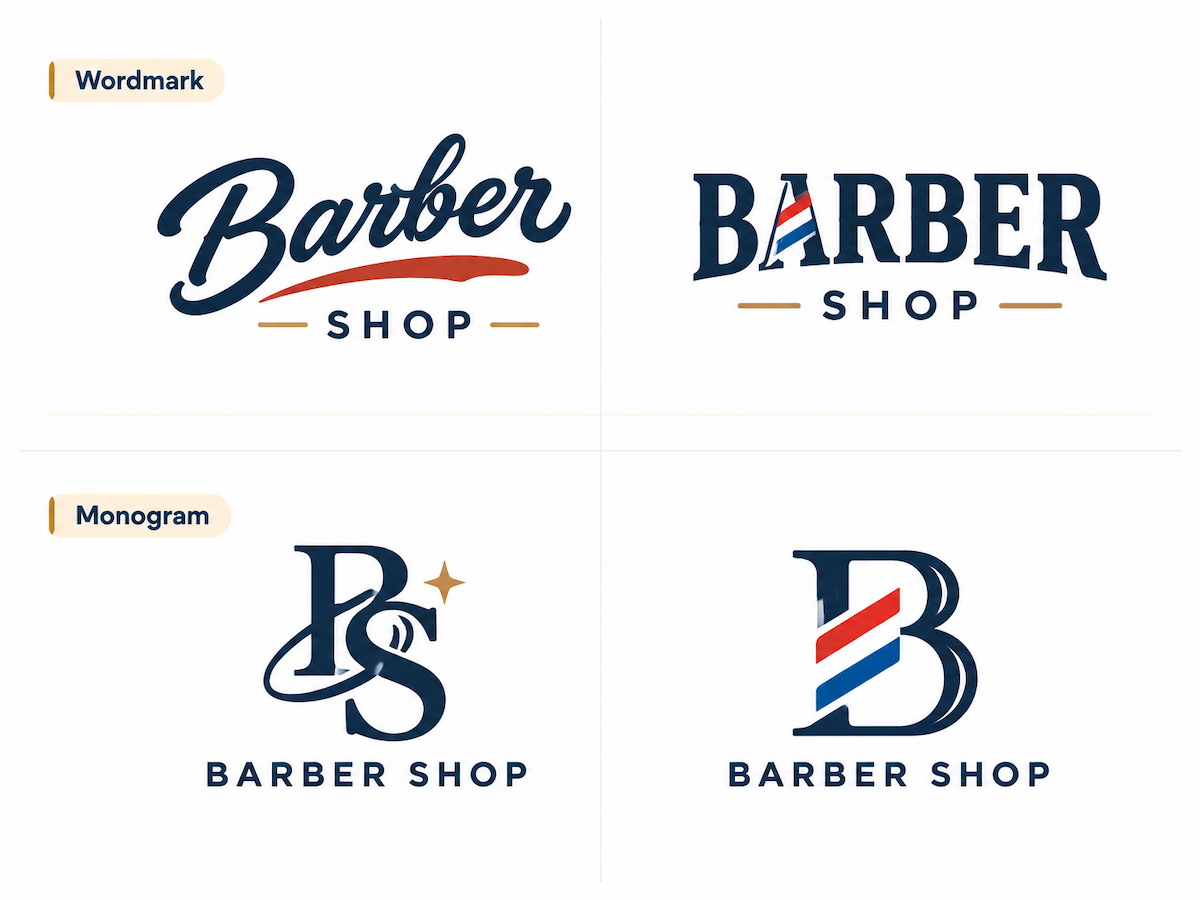
When you compare these two styles, ask whether the shop's name is strong enough to carry the identity. A distinctive typographic detail can make a name-led mark feel specific; a wordmark design breakdown explains how a small letterform change can add meaning without turning the logo into an illustration.
Pair the name with a symbol: Combination and Emblem
A Combination mark puts an icon beside or above the shop name. It is a useful first direction for a new business because the symbol can signal grooming while the text makes the name explicit. Scissors, a comb, a clipper, or a barber-pole reference can work, but one clear cue is usually easier to recognize than a collection of tools.
An Emblem encloses the name or symbol inside a badge, crest, seal, or ribbon. This shape works well for a shop that emphasizes heritage, classic shaves, or a neighborhood identity. It also fits merchandise, but small lettering around a circular border can disappear when the mark becomes a social avatar or a stitched patch.
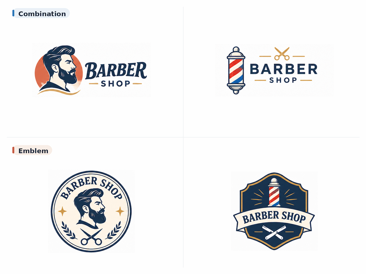
Choose Combination when the shop name needs an immediate grooming cue; choose Emblem when a badge or heritage signal carries more of the brand. In both cases, keep the name readable at the smallest size and build the mark around your own shop name.
Build a distinct personality: Abstract and Mascot
An Abstract mark uses shapes, negative space, or a simplified symbol without drawing a literal barber tool. It can help a modern studio move beyond the scissors-and-pole combination that appears across many logo galleries. The tradeoff is that the connection to barbering may be less immediate, so the name and surrounding brand need to carry more context.
A Mascot makes a character the center of the identity. It can suit a relaxed shop with a strong community voice or a business that wants a mark for apparel and social content. Keep the character simple enough to recognize as a small icon. A detailed portrait may look good in a large illustration and lose its expression when reduced.
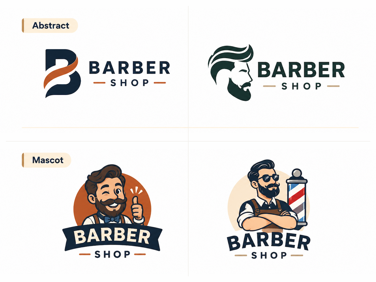
For either direction, describe the shop's real personality before choosing a symbol. A bold character for a quiet appointment-only studio can create the wrong expectation, while an abstract mark may feel too distant for a shop built around a familiar local barber.
Choose the concept that survives real use
Once you have a shortlist, test each concept in the places customers will encounter it:
- Storefront or window: Can someone read the shop name from across the street?
- Booking profile: Does the main shape remain clear in a small square or circular crop?
- One-color use: Does the mark still work on an apron, receipt, stamp, or vinyl decal?
- Dark and light backgrounds: Do the letters and primary shape keep enough contrast?
Check the name before you judge decorative detail. If the shop name disappears at small size, refine the type or use a more compact version. If the symbol becomes a generic scissors icon, remove detail or test a different direction. These checks help you choose a concept that can move from a large preview into everyday shop materials.
After you select a direction, LogoAI's Brand Kit can help you organize brand assets, including the chosen logo, colors, and alternate assets. If you plan to add the logo to a Google Business Profile, check Google's photo guidance before exporting. Treat mockups as visual checks, and confirm final dimensions, materials, and production requirements with the sign maker or printer.
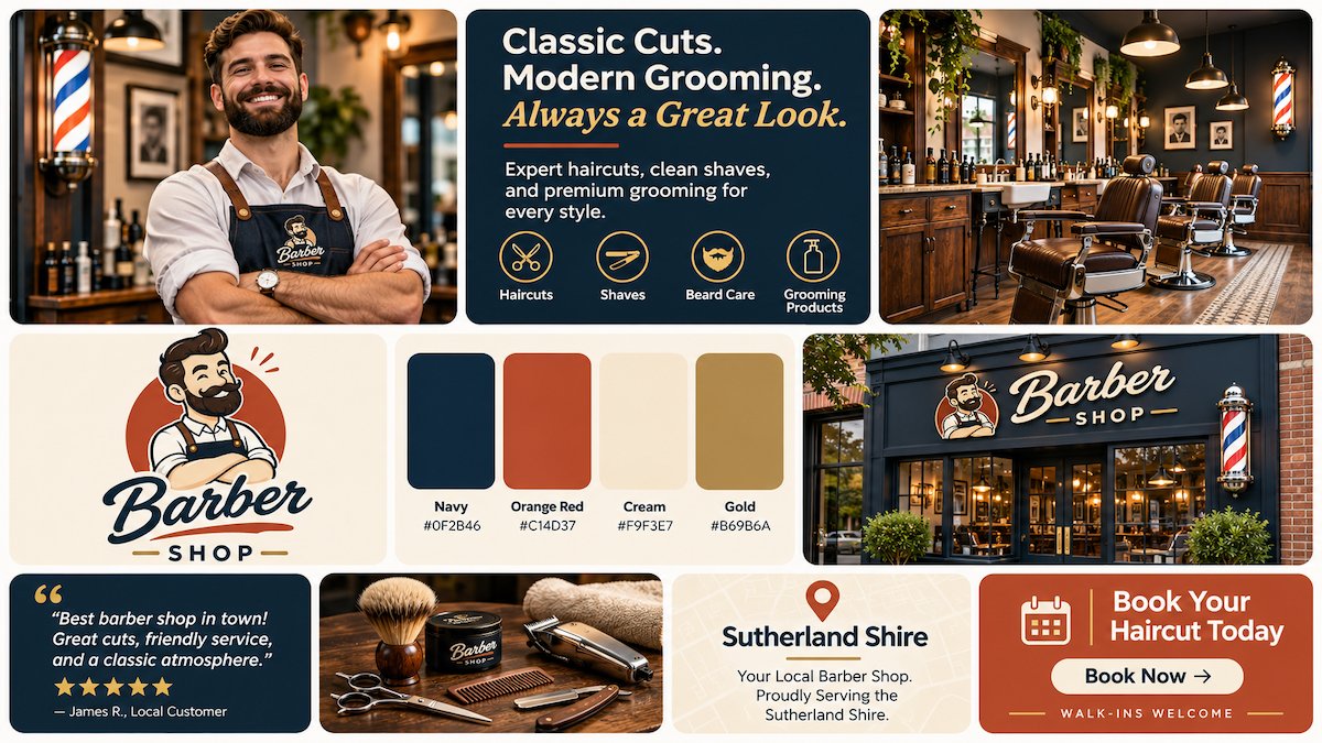
When a barber logo has to work on a storefront and a digital profile, choose the concept that stays legible while matching the shop's character. Keep the name fixed, compare two styles, and refine the direction customers understand fastest.
Ready to create your own logo?
Turn your brand name into professional logo concepts in seconds with LogoAI.
Generate my logo