Ask most people to describe a great logo and they will instinctively reach for an icon — the Apple apple, the Nike swoosh, the Twitter bird. But some of the most effective logos in the world are wordmarks: designs where the brand name itself, set in a carefully chosen typeface with deliberate typographic details, carries the entire visual identity. The Camping Outdoors logo is a textbook example of why wordmark logos work so well — and why they are often the smarter choice for growing brands. This post uses it as a lens to explore the enduring power of wordmark design.
What Is a Wordmark Logo?
A wordmark logo is a logo in which the brand name is the primary — and often the only — visual element. Unlike combination marks (which pair a symbol with a wordmark) or pictorial marks (which use a standalone icon), a wordmark relies entirely on typography, color, and occasionally a single embedded detail to communicate the brand's identity. Famous wordmark examples include Google, Coca-Cola, FedEx, and Visa — brands that have made their name itself the most recognizable visual asset they own.
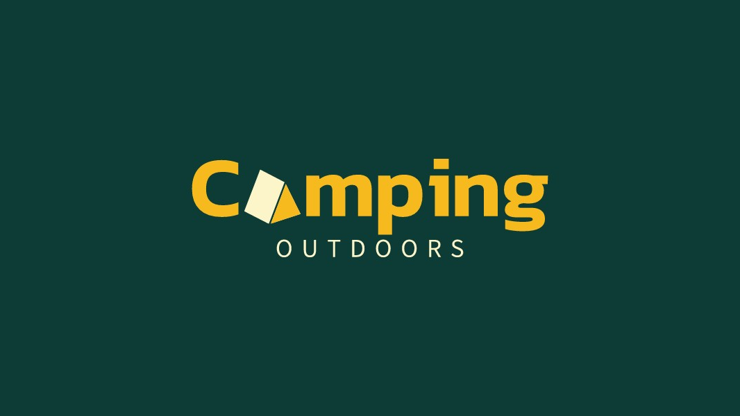
The Camping Outdoors logo sits in a hybrid category: it is primarily a wordmark, but it incorporates one small pictorial substitution — a tent shape replacing the letter "A" in "Camping". This is a common and highly effective approach that gives the logo the legibility and scalability of a wordmark while embedding a single iconic detail that reinforces the brand's identity at a glance.
The Tent-in-A Substitution: Storytelling in a Single Letter
The defining feature of this logo is the replacement of the "A" in "Camping" with a stylized tent shape. The tent is rendered as a simple geometric form — a slightly tilted diamond or rhombus — that reads unmistakably as a tent when seen in context. The tilt adds a sense of energy and informality, suggesting adventure and movement rather than static permanence.
This kind of letter substitution is one of the most powerful tools in wordmark design. By replacing a single letterform with a relevant symbol, the designer communicates the brand's core activity without interrupting the flow of the brand name. The viewer reads "Camping" and simultaneously sees a tent — the two meanings reinforce each other in a way that a separate icon placed next to the wordmark never quite achieves. The substitution also creates an ownable, memorable detail that distinguishes this wordmark from any generic outdoor brand typography.
What makes the execution particularly clean is the geometric simplicity of the tent shape. It is not a realistic illustration — it is an abstraction that shares the same visual weight and proportions as the surrounding letterforms, so it reads as part of the typeface rather than an intrusion into it. This integration is the hallmark of a well-crafted letter substitution.
Why Wordmarks Work So Well for Growing Brands
Wordmark logos offer several structural advantages that make them particularly well-suited for brands in their early and growth stages. First, they are inherently name-forward: every time someone sees the logo, they see and read the brand name. This is invaluable for brand awareness building, especially when the brand does not yet have the cultural saturation needed for a standalone icon to be recognized without its name attached.
Second, wordmarks scale exceptionally well. A well-designed wordmark remains legible and impactful at every size — from a favicon to a billboard — because it does not rely on fine detail or complex shapes that break down at small sizes. The Camping Outdoors wordmark, with its bold strokes and simple tent substitution, would be immediately recognizable on a business card, a product label, a vehicle wrap, or a social media profile picture.
Third, wordmarks are versatile across contexts. They work equally well in horizontal layouts (on website headers and email signatures) and in more compact formats, without requiring separate horizontal and stacked versions. This flexibility reduces the design overhead for growing brands that need their identity to work across a wide range of applications from day one.
Color and Typography: The Foundation of the System
The Camping Outdoors logo uses a bold, rounded sans-serif typeface in a warm golden-yellow, set against a deep forest green background. This color combination is immediately evocative of the outdoors — green for nature, forests, and trails; gold for sunlight, warmth, and adventure. The pairing has high contrast and strong legibility, and it positions the brand in the premium-outdoor segment rather than the budget-camping category.
The typeface weight is heavy enough to command attention and feel confident, while the rounded terminals soften the overall impression and prevent the logo from feeling aggressive or corporate. The "OUTDOORS" sub-line is set in a lighter, spaced-out uppercase treatment that creates a clear typographic hierarchy — the primary wordmark is read first, the category descriptor second — without introducing visual clutter.
How to Create Your Own Wordmark Logo
The principles behind the Camping Outdoors logo — a bold, legible typeface, a single meaningful letter substitution, and a color palette that communicates the brand's world — are applicable to virtually any industry. Whether you are building a brand in outdoor retail, food and beverage, technology, or professional services, a well-crafted wordmark is often the most durable and versatile logo choice you can make.
If you are ready to explore wordmark design for your own brand, the text logo maker on LogoAI offers a wide range of wordmark styles and typographic treatments to get you started. For brands that want to explore the kind of letter substitution technique used in the Camping Outdoors logo, the initial letter logo maker is an excellent starting point. And if you want to see how your wordmark translates into a complete brand identity — business cards, social media assets, and more — the AI logo maker can help you build a full brand system around your wordmark in minutes.