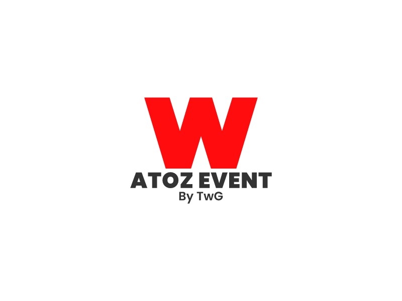
Some of the most effective logo designs are built on the simplest possible idea — and the ATOZ EVENT logo is a perfect example. A single bold red "W" sitting above a clean all-caps wordmark. No gradients, no complex iconography, no decorative detail. Just geometry, color, and type working together with complete confidence. This post breaks down the specific design technique behind this letter mark and explains why such a stripped-back approach often produces the most memorable results.
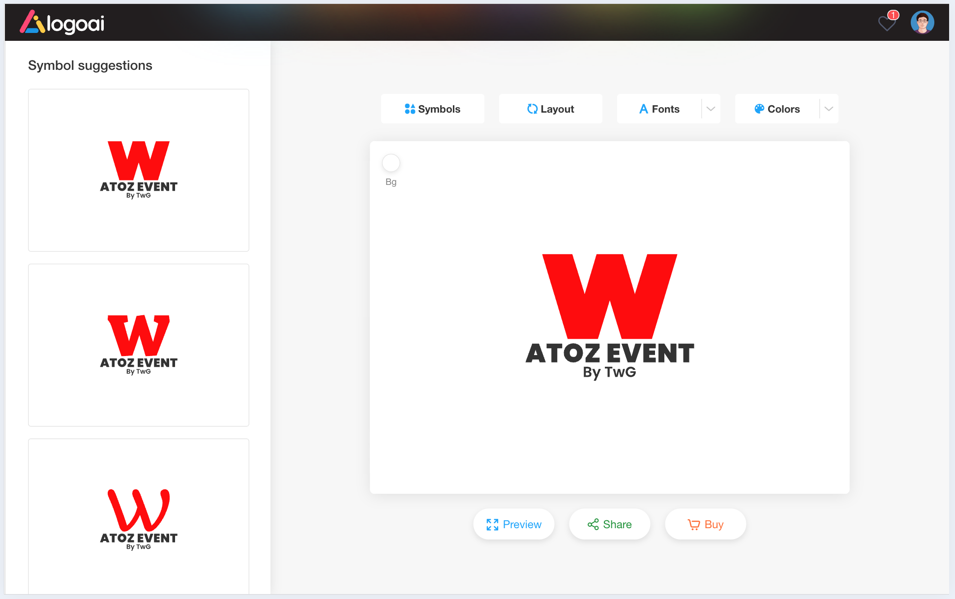
 👉 Click on this letter W logo design to create your own letter logo design
The Technique: Bold Monogram as Dominant Icon
The core technique at work here is the oversized initial letter mark — a design approach where a single capital letter is scaled up dramatically to function as a standalone icon rather than simply the first letter of a word. The "W" in this logo is not decorative; it is the entire visual identity. It is large enough to be read as a symbol, not a character, which means it can function independently as an app icon, a social media avatar, a watermark, or an emblem on merchandise without any supporting text.
This technique is deceptively simple to execute but requires precise decisions about proportion, weight, and color. Get any one of those three elements wrong and the mark collapses. Get them all right — as this logo does — and you have something that looks effortlessly authoritative.
Why the "W" Shape Works So Well as a Lettermark
Not every letter makes an equally strong monogram. The "W" is particularly well-suited to this treatment for a structural reason: its natural geometry creates a strong, wide base with two upward-pointing peaks, giving it a natural sense of stability and dynamism simultaneously. The letter reads as planted and grounded at the bottom while reaching upward at the sides — a visual tension that makes it feel active rather than static.
The specific cut of the "W" used here emphasizes this quality. The inner V-shaped negative space is deep and sharp, creating a strong contrast between the red form and the white background. This negative space is not wasted — it becomes part of the visual rhythm of the mark, giving the eye a place to rest before moving back out to the outer strokes. The result is a letterform that feels balanced and intentional at every point.
The Role of Red: Maximum Impact, Minimum Complexity
The choice of pure red for the "W" is not accidental. Red is the highest-energy color in the visible spectrum — it commands attention, communicates urgency and excitement, and has strong cultural associations with events, entertainment, and celebration. For an event management brand, it is almost the ideal color choice: it signals that something is happening, that there is energy in the room, that this is a brand built around live experiences.
Critically, the red is used without modification — no gradient, no shadow, no texture. This restraint is what gives the mark its punch. A gradient would soften the impact and add visual complexity that the design does not need. Flat, saturated red against white is as high-contrast as a two-color combination can get, which means the logo reads instantly at any size and in any context. It will be equally legible on a business card, a banner, a website header, or a stage backdrop.
The Wordmark: Supporting Without Competing
Below the "W" icon, the wordmark "ATOZ EVENT" is set in a bold, condensed sans-serif in dark charcoal — a deliberate contrast to the red icon above. The all-caps setting and tight letter-spacing give the wordmark authority and presence without allowing it to compete visually with the dominant "W". The secondary line "By TwG" is set in a lighter weight and smaller size, functioning as a sub-brand attribution that adds context without cluttering the composition.
The typographic hierarchy here is clear and well-executed: the red "W" is read first, "ATOZ EVENT" is read second, and "By TwG" is read third. This three-level hierarchy ensures that the logo communicates the right information in the right order — brand symbol, brand name, parent company — without requiring the viewer to work for it.
Proportion and Spacing: The Hidden Work
One of the less obvious but most important aspects of this logo is the proportion between the icon and the wordmark. The "W" is significantly larger than the text below it — roughly three times the cap height of the wordmark. This ratio is what establishes the icon as the primary element and the wordmark as secondary, creating the visual hierarchy described above. If the "W" were only slightly larger than the wordmark, the two elements would compete for attention and the logo would feel unresolved.
The spacing between the icon and the wordmark is also carefully considered. There is enough breathing room between the base of the "W" and the top of "ATOZ EVENT" that the two elements read as distinct components of a system rather than a single merged block. This separation is what allows the icon to be used independently — cropped out of the full lockup — without losing its identity.
What This Technique Teaches Us About Logo Design
The ATOZ EVENT logo is a reminder that simplicity is not the same as laziness. Every element in this mark — the letter choice, the weight, the color, the scale, the spacing — is the result of a deliberate decision. The apparent effortlessness of the design is the product of discipline: the willingness to remove everything that is not essential and trust that what remains is enough.
If you want to apply this technique to your own brand, the starting point is always the same: identify the single most important visual element your logo needs to communicate, and build everything else around it. For ATOZ EVENT, that element was the initial "W" — bold, red, and impossible to miss. If you are ready to explore initial letter logo designs for your own brand, the initial letter logo maker on LogoAI is the fastest way to start. You can also browse the full AI logo maker to experiment with monogram styles, color combinations, and typographic pairings — and discover how much a single well-chosen letter can do for a brand.