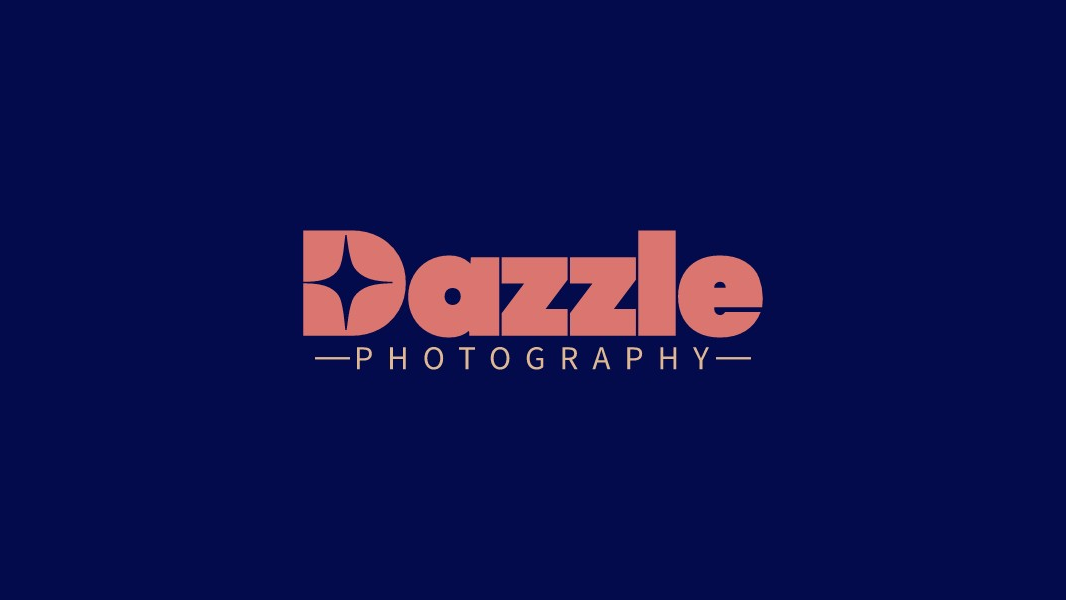
A great wordmark logo does not just spell out a brand name — it embodies the brand's personality in every curve, weight, and color choice. The Dazzle Photography logo is a compelling example of how a single typographic treatment, combined with one well-placed detail, can communicate an entire brand story without the need for a separate icon. This post breaks down the design decisions that make this wordmark stand out in a crowded photography market.
The Star-in-D Technique: Turning a Letter into an Icon
The most striking feature of this logo is the treatment of the capital "D". Rather than using a conventional letterform, the designer has cut a four-point star shape — sometimes called a sparkle or lens flare — into the counter space of the "D". The result is a letter that simultaneously reads as a "D" and as a camera lens catching a burst of light. This is a classic example of negative space design: using the empty area within or around a shape to embed a second meaning.
The four-point star is a particularly resonant symbol for a photography brand. It evokes lens flares, light bursts, and the sparkle of a perfectly captured moment — all concepts that sit at the emotional heart of what photography is about. By embedding this symbol directly into the first letter of the brand name, the designer has created a logo that communicates its industry and personality in a single glance, without requiring a separate icon element.
What makes the execution especially clean is the precision of the star's geometry. The four points are symmetrical and sharp, and they align perfectly with the inner curves of the "D" — suggesting that the star was designed specifically for this letterform rather than borrowed from a generic symbol library. This level of craft is what elevates the technique from a gimmick to a genuine design asset.
Bold Slab-Influenced Typography: Weight as a Statement
The typeface used for "Dazzle" is a heavy, condensed display font with slab-like proportions — thick strokes, minimal variation between thick and thin, and tight letter-spacing that gives the wordmark a solid, block-like presence. This weight is a deliberate choice. Photography brands often default to thin, elegant typefaces to signal artistry and refinement, but Dazzle takes the opposite approach: the boldness of the wordmark says confidence, impact, and visual power.
The condensed proportions of the typeface allow the full word "Dazzle" to sit in a compact, nearly square footprint — wide enough to feel substantial, but tight enough to maintain visual cohesion. The double "z" in the middle of the word benefits particularly from this treatment: the repeated letterforms create a rhythmic visual pattern that makes the wordmark feel energetic and dynamic, almost like a visual echo of the word's meaning.
The "Photography" Sub-Line: Restraint as Contrast
Below the main wordmark, the word "PHOTOGRAPHY" is set in a thin, widely-spaced uppercase serif — a deliberate contrast to the heavy, condensed primary wordmark above. The em-dash decorations on either side ("—PHOTOGRAPHY—") add a subtle editorial quality, referencing the visual language of magazine mastheads and fine art print credits. This detail positions Dazzle not just as a photography service, but as a brand with a considered aesthetic sensibility.
The typographic contrast between the two levels — heavy sans vs. light serif, condensed vs. spaced-out, large vs. small — is what gives the logo its visual interest and sophistication. Each level occupies its own register, so there is no competition for attention. The primary wordmark is read first, the sub-line provides context second, and the overall composition feels complete and balanced.
The Color Palette: Navy and Coral-Pink
The color combination of deep navy and warm coral-pink is one of the most effective pairings in contemporary brand design. Navy communicates depth, professionalism, and timelessness — it is a color that has been associated with quality and authority across industries for decades. Coral-pink, by contrast, is warm, energetic, and distinctly modern — it has a vitality and approachability that prevents the logo from feeling overly corporate or cold.
Together, the two colors create a high-contrast pairing that is visually arresting without being aggressive. The coral wordmark on the navy background has excellent legibility and a cinematic quality — it would not look out of place as a title card in a film or a masthead in a premium photography magazine. The warmth of the coral also has a photographic resonance: it echoes the golden tones of warm-light photography, sunset shoots, and the rich color grading associated with high-end portrait and lifestyle work.
What This Logo Teaches Us About Wordmark Design
The Dazzle Photography logo demonstrates that a wordmark can be just as visually rich and symbolically layered as an icon-based logo — if the typographic decisions are made with the same level of intention. The key lessons here are: choose a typeface weight and style that embodies your brand's personality rather than defaulting to what is conventional for your industry; use negative space or typographic substitution to embed a secondary meaning into your letterforms; and build contrast into your typographic hierarchy so that each level of information occupies a distinct visual register.
If you are designing a logo for a photography, creative, or visual arts brand, the photography logo templates on LogoAI offer a strong starting point for exploring wordmark styles, color palettes, and typographic treatments. The AI logo maker can also help you experiment with bold wordmark approaches and discover the combination that best captures your brand's visual identity. And if you want to explore the kind of negative space technique used in the Dazzle "D", the initial letter logo maker is a great place to start.