A podcast logo has one job above all others: to make someone stop scrolling and press play. In a medium where the cover art is often the first — and sometimes only — impression a potential listener gets, the design has to communicate personality, genre, and credibility in a single glance. The "One Last Thing" Podcast logo does exactly that, and it does it through a set of design decisions that are worth examining closely. This post breaks down why this logo works and what it teaches us about designing for the podcast format.
The Vintage Microphone: An Icon That Does the Heavy Lifting
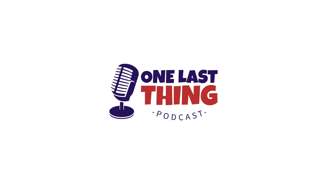
The centrepiece of this logo is a detailed illustration of a vintage broadcast microphone — the kind associated with 1940s and 1950s radio studios, late-night talk shows, and the golden age of audio storytelling. This is a deliberate and smart choice. While many modern podcast logos opt for abstract icons or minimal geometric marks, the vintage microphone immediately communicates audio, voice, and conversation in a way that is universally understood.
The illustration is rendered in a flat, two-tone style using the same deep navy-purple as the wordmark. The microphone grille is depicted with horizontal lines that add texture and visual depth without introducing photorealistic complexity — the result is an icon that feels both classic and contemporary, with enough detail to be interesting at large sizes while remaining legible at thumbnail scale. For a podcast that appears in app stores and streaming platforms where cover art is displayed at 300×300 pixels or smaller, this level of clarity is essential.
The microphone is positioned to the left of the wordmark, slightly overlapping it — a compositional choice that creates visual integration between the icon and the text, making the logo feel like a unified system rather than two separate elements placed side by side.
Two-Color Wordmark: Hierarchy Through Contrast
The wordmark "ONE LAST THING" is set in a bold, condensed display typeface with strong slab-serif characteristics — thick strokes, minimal contrast, and a confident, no-nonsense presence. The two-color treatment — "ONE LAST" in deep navy-purple and "THING" in bright red — creates an immediate visual hierarchy that guides the eye and emphasizes the most distinctive word in the brand name.
This is a well-established technique in editorial and entertainment design: using color to create emphasis within a wordmark, so that the most memorable or meaningful word is visually foregrounded. "THING" in red is the word that carries the most personality and intrigue — it is deliberately vague and conversational, the kind of word that makes you ask "what thing?" — and the red color ensures it is the word the eye lands on first after registering the microphone icon.
The navy-purple and red combination is a classic American palette — patriotic, bold, and authoritative — that positions the podcast in a confident, opinionated register. It suggests a show with strong points of view and a willingness to engage with substantive topics, which is exactly the kind of brand signal that attracts a loyal, engaged audience.
The "-PODCAST-" Sub-Line: Category Clarity with Character
Below the main wordmark, the word "PODCAST" is set in a smaller, slightly curved or arched treatment with em-dash decorations on either side. This detail serves a practical purpose — it immediately categorises the brand for anyone encountering it for the first time — but it also adds a layer of visual character that elevates the logo beyond a purely functional mark.
The curved baseline of the sub-line echoes the circular base of the microphone stand, creating a subtle visual rhyme between the icon and the typography. The em-dashes frame the word in a way that feels editorial and considered, referencing the visual language of magazine subheadings and vintage print design. These are the kinds of small details that separate a logo that merely communicates from one that genuinely delights.
What This Logo Teaches Us About Podcast Branding
The One Last Thing Podcast logo succeeds because every element — the vintage microphone, the two-color wordmark, the arched sub-line — works together to tell a consistent story about the brand's personality: knowledgeable, conversational, bold, and with a sense of history and craft. There is no visual noise, no unnecessary decoration, and no ambiguity about what this brand is or what it stands for.
For anyone designing a podcast logo, the key lessons are: choose an icon that communicates your medium and genre without being generic; use color to create hierarchy and personality within your wordmark; and add one small typographic detail that gives your logo a sense of craft and intentionality. If you are building a podcast brand from scratch, explore the podcast logo templates on LogoAI for a wide range of styles — from vintage and bold to minimal and modern. The AI logo maker can help you customise any template to match your show's unique voice and visual identity. For inspiration on how other creators have approached podcast branding, the LogoAI logo gallery is a great place to explore real-world examples across every genre and style.