Disney Logo History: How the Castle and Wordmark Evolved
Trace the Disney logo from its handwritten wordmark to the 3D castle, then apply the brand lessons to a small business logo.
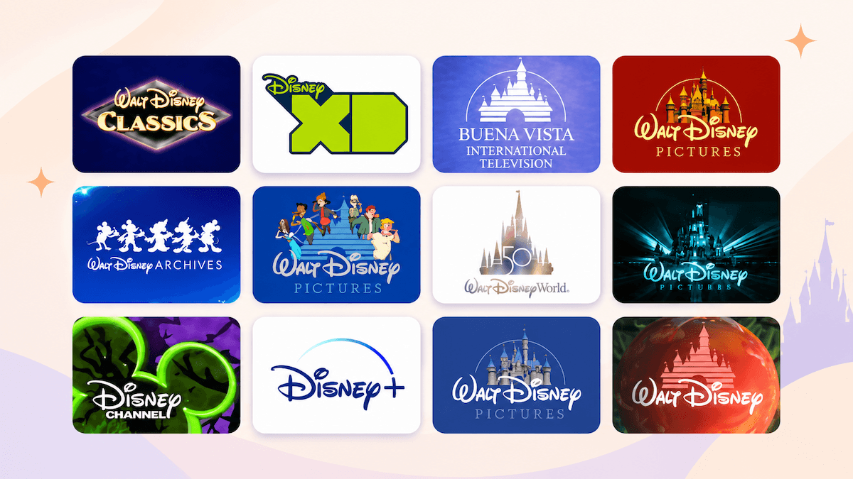
Disney's logo is recognizable because it combines a distinctive handwritten wordmark with a simple story cue: a castle that promises a world of imagination. The mark has changed from a hand-drawn company name to a cinematic, computer-generated opening, but the central idea has stayed easy to recognize across films, parks, products, and digital services.
The evolution of the Disney logo
The timeline below follows the main Disney studio identity. Disney has also used separate marks for divisions, channels, anniversaries, and individual productions, so the version on screen can vary by context.
| Period | Main visual change | What stayed recognizable |
|---|---|---|
| Early wordmark | Handwritten Walt Disney lettering | Signature-like rhythm and connected strokes |
| 1985 | Flat castle added to the studio opening | Disney wordmark and storybook association |
| 2006 | Detailed CGI castle and moving camera sequence | Castle, wordmark, and glowing arc |
| Modern versions | Context-specific animation and simplified applications | Core Disney lettering and castle language |
Early Disney wordmark
Before the castle became part of the studio opening, Disney relied mainly on a stylized wordmark. The lettering was based on Walt Disney's signature and developed through several versions of the company's name, including Walt Disney Productions and Walt Disney Pictures.
The hand-drawn quality gave the name a personal feel. Its connected strokes were less formal than a conventional corporate typeface, which made the wordmark feel like a signature from a storyteller. That quality also gave Disney a visual asset that could work without a separate symbol: even when the name appeared on its own, the letterforms were distinctive.
The wordmark was refined over time rather than replaced wholesale. The proportions, looping capital letters, and sweeping rhythm remained familiar while the surrounding production text and presentation changed with the era.
1985: The introduction of the castle
The castle entered the Walt Disney Pictures identity in the mid-1980s. It appeared in the 1985 opening for The Black Cauldron, while an earlier version was also used for Return to Oz. The flat design placed a stylized castle above the Disney wordmark, with horizontal lines suggesting the structure and an arch framing the scene.
The castle connected the company name to the physical experience of Disney parks and to the fairy-tale settings in its films. The silhouette drew on Disney park castles rather than depicting one building in exact architectural detail. That made it flexible enough to represent the wider Disney brand.
For the next two decades, the 2D castle became the version many audiences associated with Disney movies. Blue backgrounds, white castle lines, the arcing shape, and the familiar wordmark created a short visual signature that could be recognized before the film began. Disney's official D23 logo history also shows how the company kept returning to the Walt Disney name while updating the surrounding identity over time.
2006: The 3D castle redesign
In 2006, Disney rebuilt the opening as a computer-generated sequence. The new version debuted with Pirates of the Caribbean: Dead Man's Chest and replaced the flat striped castle with a more detailed structure. The camera moves through a broad landscape toward the castle, the gates open, and a glowing arc sweeps across the sky.
The redesign changed the logo's role. The earlier mark behaved like a printed emblem that happened to move. The 2006 sequence behaved like a miniature film scene, with depth, lighting, atmosphere, and camera movement. The castle could now carry the scale of a theatrical opening while still resolving into a compact brand image.
The 3D version also combined visual cues associated with Sleeping Beauty Castle and Cinderella Castle. The result was a fantasy landmark that belonged to Disney as a whole. The wordmark remained central, but the castle gave the opening a stronger sense of place and motion.
The modern Disney logo
Today's Disney identity is a family of related versions rather than one identical file used everywhere. The modern film opening keeps the handwritten Disney wordmark, a detailed castle, and a luminous arc, then adapts the lighting, color, framing, and animation to the production or platform.
Corporate, parks, streaming, television, and anniversary materials may simplify the castle or use the wordmark on its own. Film intros can be longer and more atmospheric, while a small digital placement may need a compact wordmark or symbol. The continuity comes from the same recognizable ingredients and the same promise of story and wonder.
This approach explains why the logo can feel current without losing its history. Disney updates the presentation around the core assets instead of discarding the assets that audiences already know.
What makes the Disney logo so iconic?
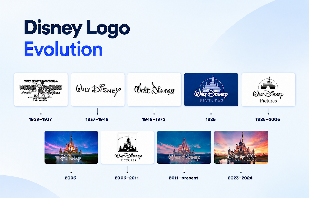
Disney logo evolution timeline across major historical stages.
The signature typography
The Disney wordmark is memorable because it has a strong silhouette before a viewer reads every letter. The large W and D create visual anchors, while the connected strokes give the name a flowing rhythm. The lettering feels authored rather than mechanically typeset, which supports Disney's association with storytelling.
A distinctive wordmark also reduces the amount of explanation a brand needs. When the shape of the letters is familiar, the name can remain recognizable in one color, at a small size, or without the castle.
The castle symbol
The castle is a compact symbol for a much larger idea. It can suggest a destination, a fairy tale, a film opening, and a sense of arrival in a single shape. Because Disney audiences encounter castles in parks, movies, merchandise, and intros, the symbol gains meaning through repeated use.
The castle also gives the wordmark a visual setting. Instead of showing the company name in isolation, the logo places it inside a world the audience is invited to enter.
Colors and magical effects
The classic blue and white treatment made the 2D logo clear against a dark screen. The later CGI versions add gradients, warm light, stars, mist, and a glowing arc. These effects are useful because they create motion and atmosphere in film openings, where a static mark would have less time to establish the mood.
The effects are supporting elements, not the entire identity. If the glow or animation is removed, the castle and wordmark still carry the recognition. That separation helps the logo work in print, on packaging, in an app, or in a small social profile image.
Consistency across different media
Disney repeats the same core cues across very different touchpoints. A movie intro can use a full animated sequence, while a park sign or product package may use a flatter version. The execution changes with the medium, but the wordmark, castle language, and sense of story remain connected.
Small businesses can apply the same principle by defining which parts of a logo are fixed and which parts can adapt. A short brand consistency checklist can record the approved wordmark, symbol, colors, spacing, and small-size version so every collaborator starts from the same rules.
What can small businesses learn from Disney's logo?
1. Build a visual symbol people can recognize quickly
A memorable symbol does not need to describe every product you sell. It needs a clear shape and a repeatable connection to the brand's story. Start by choosing one idea your audience should associate with the business, then reduce it to a form that can work beside the name and on its own.
Test the symbol in one color and at a small size. If the shape disappears when it is reduced, simplify the details before adding decorative effects.
2. Keep the visual system consistent
Disney's logo has changed, but the changes stay connected to a stable set of assets. A small business can define a primary logo, a compact symbol, a color palette, and a few type roles, then use those rules across its website, packaging, social accounts, and presentations.
Consistency becomes easier when the files and rules live together. After choosing a direction, you can build a brand kit with logo versions, colors, mockups, and social assets in one workspace.
3. Design for different sizes and situations
A logo that looks good on a large sign may be unreadable in a browser tab or a social avatar. Prepare a full lockup, a horizontal version, and a standalone symbol when the layout requires them. Check each version at its actual display size, then review it on light and dark backgrounds.
The goal is a system that stays recognizable when the available space changes. A responsive set of logo files usually serves a business better than one detailed artwork file forced into every placement.
Create a logo that tells your brand story
Disney's history shows how a brand can update its presentation while keeping the visual idea people already remember. For a small business, the process starts with a clear story, a recognizable symbol, and rules that make the identity easy to use.
If you are starting from a business name or a rough direction, you can generate logo concepts, compare symbols and lettering, and refine the route that fits your audience. Move the selected logo into a Brand Kit when you are ready to prepare the versions and assets your business will use in the real world.
Historical note: dates and sequence details in this article follow Disney's published logo history and commonly documented studio logo releases. Specific intros can vary by film, division, re-release, and platform.
Ready to create your own logo?
Turn your brand name into professional logo concepts in seconds with LogoAI.
Generate my logo