The Small Business Brand Style Guide: What to Include and How to Use It
A practical guide to turning an existing logo into a small business brand style guide with clear rules for logo use, colors, typography, imagery, and voice.
A small business usually needs a brand style guide that fits on a few pages and answers everyday questions: Which logo file should we use? What are the exact colors? Which fonts belong in a headline? How should a caption sound?
A useful guide turns those decisions into rules that a founder, employee, or freelancer can follow without calling a designer each time. Start with the identity you already have, define the choices that repeat, and add examples where a rule could be misunderstood. If your logo is ready, create a brand guideline to start the process.
How to start from your existing logo
A logo is enough to begin. Upload it and let LogoAI turn the visual cues in the mark into an editable Brand DNA profile. You get a starting point for the palette, type direction, personality, voice, mission, vision, and slogan that will shape the rest of the identity.
When the profile feels right, save it and your brand gets a home of its own. The Brand Page keeps Home, Profile, Guideline, Assets, Social, and Generate Mockups together, so your profile and the assets built from it stay in one place.
Open Guideline to see those decisions laid out as a 10-page brand manual. Edit the parts that need your judgment, download the PDF, and return to the saved Brand Page whenever the brand changes. Then test the guide on a website section, a social post, and a presentation page before you hand it to a freelancer or teammate.
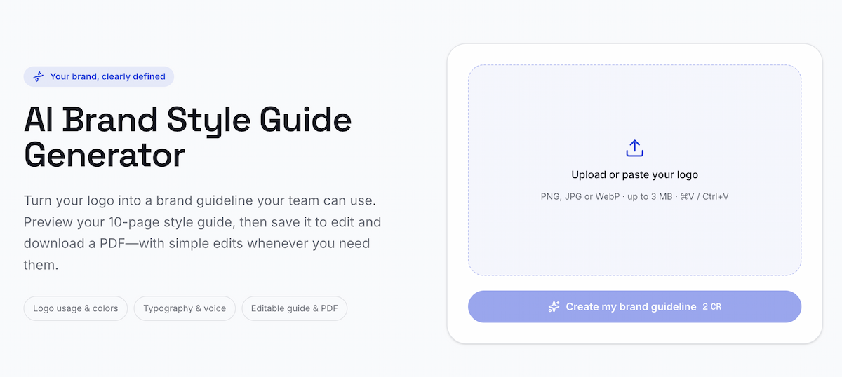
The starting screen begins with a logo upload before the brand guideline is created.
What a small business needs from a brand style guide
A brand style guide is a shared reference for applying your identity. It should help someone produce a website section, social post, presentation, email, or printed piece that still feels like it came from the same business.
For most small teams, the guide needs five things:
- A clear primary logo and the situations where alternate versions are allowed.
- Exact color values for digital work, including HEX codes.
- A simple type system with roles for headlines, body copy, and optional accents.
- A small set of image and layout cues.
- A short description of the brand voice, with examples of language to use.
The test is practical: hand the guide to someone who did not design the logo. If they can make a reasonable first draft without guessing, the guide is doing its job.
The minimum sections to include
1. Logo use and clear space
Show the primary logo on a light background and a dark background. Add the versions people can use, such as a transparent file, a single color mark, or a white mark on a colored background.
Define a few rules that prevent common mistakes:
- Keep the logo's proportions intact.
- Leave a consistent area of empty space around it.
- Do not stretch, rotate, recolor, or add effects to the artwork.
- Use the standalone symbol when a square or circular space cannot fit the full wordmark.
You do not need a page of design theory. One correct example and two or three incorrect examples are easier to follow than a long paragraph.
If your logo appears fuzzy or crowded after it is uploaded to a website or social profile, fix a blurry logo before you document the final files. The guide should point to assets that are ready to use.
2. Color values people can copy
Name the colors and record their values. For a small business, HEX values usually cover website styles, social graphics, and other digital work. You can add RGB values when a collaborator needs them for software that uses screen color settings.
A simple table is enough:
| Role | Color | HEX | Use it for |
|---|---|---|---|
| Primary | Deep green | #254B40 |
Buttons, headers, and key surfaces |
| Background | Warm cream | #F4EEE7 |
Page backgrounds and print-friendly areas |
| Accent | Muted gold | #D6A65B |
Small highlights and calls to action |
Use your own colors in the finished guide. The example above only shows the level of detail to record. If the logo uses one color, keep the palette honest instead of inventing extra accents.
3. Typography roles
Choose fonts by role rather than listing a long collection of typefaces. Most small businesses can start with one font for headings and one for body copy. Specify the weight, size range, and where each font appears.
For example:
- Headings: a serif font in bold or semibold.
- Body copy: a sans serif font in regular weight.
- Buttons and labels: the body font in medium weight, with sentence case.
Link to a source your team can access, such as the Google Fonts library, and note any fallback font for a website or presentation. The purpose is to make the choice repeatable when a freelancer opens a new file.
4. Imagery and layout cues
A small guide does not need a full photography manual. State the choices that affect recognition:
- Use natural light or a specific level of contrast.
- Leave room around products or people when text will sit beside the image.
- Prefer clean backgrounds, close crops, or another style that matches your current materials.
- Keep corner radius, border, and spacing choices consistent in templates.
Add two or three representative examples. A sentence such as "Use bright, candid photos with room for a headline" gives a collaborator more direction than "be authentic."
5. Brand voice
Write three or four useful voice cues and show them in a sentence. "Friendly" is hard to apply on its own. "Warm, direct, and specific. Explain the next step in plain language" gives a writer something to work with.
Include a short do and do not list:
| Use | Avoid |
|---|---|
| "Book a 20-minute consultation" | "Unlock your growth journey" |
| Concrete verbs and short sentences | Vague promises and filler |
| A helpful, confident tone | Jokes that distract from the offer |
Your voice section should also cover common places where tone changes, such as customer support, social captions, and promotional headlines.
How to choose rules people can follow
Every rule should answer a decision someone has to make. Replace abstract advice with a visible choice:
- Instead of "Use the logo thoughtfully," say "Use the horizontal wordmark in website headers and the symbol in square profile images."
- Instead of "Choose on-brand colors," list the HEX values and name the surfaces where each color belongs.
- Instead of "Sound professional," show one sentence that matches your voice and one that does not.
Keep the guide short enough to open during a real task. Put the most repeated decisions first, and move background explanations into a separate brand document if you need them later.
A useful rule also has a test. You can check whether a logo has enough space around it, whether a color matches its HEX value, or whether a caption uses the agreed voice cues. Tests make the guide easier to maintain because a new teammate can verify a choice instead of debating it.
A one-page review checklist
Before you send the guide to a freelancer or add it to a shared folder, review one sample from each place your business uses the brand.
Website
- Does the logo remain legible at desktop and mobile sizes?
- Are the primary and background colors copied from the guide?
- Are the headline and body roles used consistently?
Social media
- Does the profile image use the right square or symbol version?
- Do a post and a cover banner use the same palette and type roles?
- Does the caption sound like the voice examples?
Print and presentations
- Is the logo file large enough for the intended output?
- Are the colors being reproduced in the format your printer or slide tool expects?
- Can someone find the correct asset without opening several old folders?
Collaborations
- Can a freelancer tell which files are approved?
- Are the do and do not examples clear enough to prevent common edits?
- Is there one owner who reviews changes to the guide?
Save one approved sample beside the guide. It gives new collaborators a concrete reference when a written rule leaves room for interpretation.
When a small business needs a fuller brand book
A short guide is enough when a small team is applying an established identity across routine work. Expand it when the business has several teams, multiple locations, a licensing partner, a packaging system, or a large volume of paid creative.
A fuller brand book might add:
- Grid and spacing systems for complex layouts.
- Detailed accessibility and contrast requirements.
- Print color specifications confirmed with a production partner.
- Photography, illustration, motion, and campaign rules.
- Approval roles and version history.
Add those sections when they prevent a real problem. A longer document that no one opens is less useful than a short guide with current files and clear examples.
Brand style guide, brand kit, and brand identity: what is the difference?
A brand style guide explains the rules for using the identity. Brand DNA is the editable profile behind those rules, covering the business, audience, personality, voice, and purpose. A Brand Page is the saved workspace where the profile, guideline, assets, social tools, and mockups stay connected.
A brand kit usually refers to the visual assets collected for use across those channels. The terms describe different parts of the same workflow, so give collaborators one Brand Page to return to instead of sending them separate files and documents.
Final check
A practical brand style guide answers the questions that slow down everyday work. It names the approved logo files, records the colors and type roles, gives people a few image and layout cues, and shows how the brand speaks. Test it on a real website section, social post, and presentation before sharing it.
Ready to create your own logo?
Turn your brand name into professional logo concepts in seconds with LogoAI.
Generate my logo