How to Create a Brand Style Guide with 5 Real Examples
Learn how to create a brand style guide with five real examples, practical usage rules, and LogoAI’s new editable 10-page brand guideline and PDF generator.
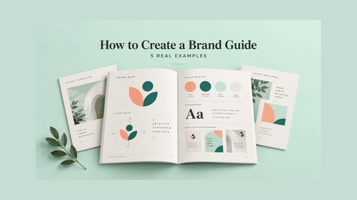
A brand guide explains how to represent your business consistently. It combines your brand’s purpose and personality with practical rules for logos, colors, typography, imagery, and everyday applications. A useful guide helps someone make the right decision without asking the founder to review every design.
To create a brand guide, start with your brand strategy, organize your approved assets, define measurable usage rules, and show those rules in realistic examples. Then make the document easy to find, use, and update.
We reviewed five supplied guideline documents: ClientEarth, Freedom 250, Starling Bank, British Swimming, and Aimtec. Each demonstrates a different way to make branding instructions useful. These are examples from particular editions, including historical identities, rather than a claim about each organization’s current branding.
What belongs in a brand guide
A brand guide, sometimes called brand guidelines or a brand style guide, should answer the questions that arise when people create materials for your business.
| Section | Questions it should answer |
|---|---|
| Brand foundation | Who do we serve, what do we promise, and how should we sound? |
| Logo system | Which version belongs in each situation? |
| Spacing and size | How much room does the logo need, and how small can it go? |
| Colors | Which colors are approved, and what are their roles and values? |
| Typography | Which fonts and weights belong in headings, body text, and interfaces? |
| Imagery and layout | What makes a photo, illustration, or composition feel like our brand? |
| Applications | What should a website, social post, presentation, or printed item look like? |
| Governance | Where are the files, who approves exceptions, and which version is current? |
Not every document needs to cover everything. Starling’s supplied version explicitly focuses on online logo usage and colors. Aimtec’s document is a logo guide and refers to a separate corporate identity document. Define your scope clearly rather than promising a complete brand manual and delivering only a logo sheet.
1. Begin with the meaning behind the design
Start with a short explanation of the business: its audience, purpose, promise, and personality. This gives designers and writers a reason for choosing one direction over another.
Example: ClientEarth connects brand DNA to visual identity. Its 2020 guide introduces mission and vision before the design rules. On PDF page 5, a Brand DNA diagram puts vision, mission, and positioning at the center, surrounded by principles, personality, relationships, and services. The document then moves into logo and typography guidance.
The lesson is to explain what the identity serves before explaining how to reproduce it. For your own guide, one focused page may be enough. Replace generic values with behavior: if your brand is straightforward, show what a straightforward product description sounds like.
Read the ClientEarth brand guidelines PDF.
If you need help organizing that foundation, start with LogoAI Brand DNA. You can begin with a logo or website, then review and edit the suggested profile. Treat inferred strategy as a starting point to validate against your actual customers and business.
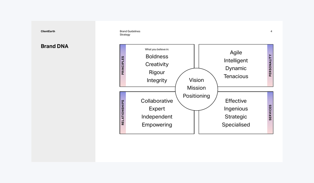
ClientEarth 2020 guidelines, PDF page 5: strategy is organized before visual usage rules.
2. Define your approved logo family
Show the primary logo first, followed by the alternatives people are allowed to use. Depending on your business, that might include a horizontal arrangement, a stacked version, a symbol, and single-color variants.
Explain the purpose of each version. A compact symbol might suit a profile picture; a full wordmark may be necessary where the business name is unfamiliar. Do not leave collaborators to invent new arrangements from separate files.
Example: Freedom 250 distinguishes identification from decoration. Its supplied guide separates a primary logo, secondary logo, and icon. It explains that the flag-only graphic is a supporting decorative element, not a replacement for the primary identifier in formal brand contexts. That is a useful distinction for any business with patterns, mascots, or secondary symbols.
Download the supplied Freedom 250 guide from its source archive. Archive access may require signing in; the Freedom 250 guide listing identifies the nine-page edition.
Your guide should make the decision easy: “Use this version in the website header; use this compact version in small square spaces.” Pair every example with the actual approved file.
3. Make spacing and minimum sizes measurable
“Give the logo enough room” sounds reasonable but leaves too much to interpretation. Use a recognizable part of the logo as a measuring unit, and draw the required clear space around it.
Example: Starling Bank uses its symbol as the reference. In the supplied Version 2.1 guide, the clear-space rule is one half of the S mark. The online-use guidance also gives separate minimum heights: 20 pixels for the horizontal logo and 60 pixels for the vertical version.
These are Starling’s specifications for that edition, not universal requirements. The transferable lesson is to define a repeatable measurement and test each arrangement separately. A tall stacked logo and a wide wordmark will not necessarily share the same minimum size.
Download the supplied Starling Bank guide from its source archive. The archive may require signing in. This is an older identity, and Starling’s former official PDF address now redirects to its homepage.
Test your own mark in a mobile header, a profile picture, and the smallest printed application you expect to use. Record the point at which its lettering or detail becomes unreliable.
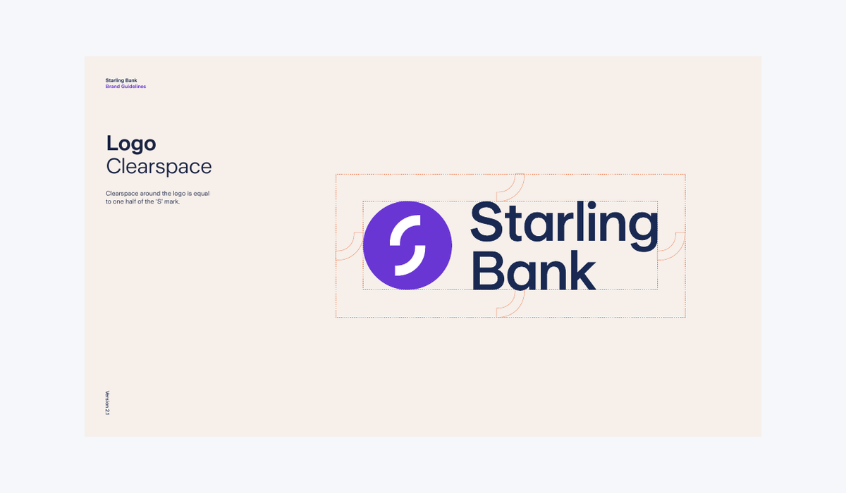
Starling Bank Version 2.1, PDF page 4: clear space is measured using half of the S mark. Historical identity shown.
4. Specify color and typography roles
A palette needs more than colored circles. Label primary, neutral, and accent colors, and record the values required for your channels. Include HEX or RGB for digital work and approved print specifications where needed.
Freedom 250’s typography and palette page brings Georgia and DM Sans together with named primary and accent colors. It also specifies weights and includes HEX, RGB, and CMYK references. The useful idea is to put the information a designer needs in one easy-to-scan place.
For your guide, go further by assigning roles: which font is used for headings, which is used for paragraphs, and which color is reserved for emphasis? Show a real headline and paragraph instead of only an alphabet specimen.
Check the values before distributing the document. Color conversions, print materials, and display conditions can affect results; a table of numbers does not replace production testing. Also check text contrast in the actual combinations people will use.
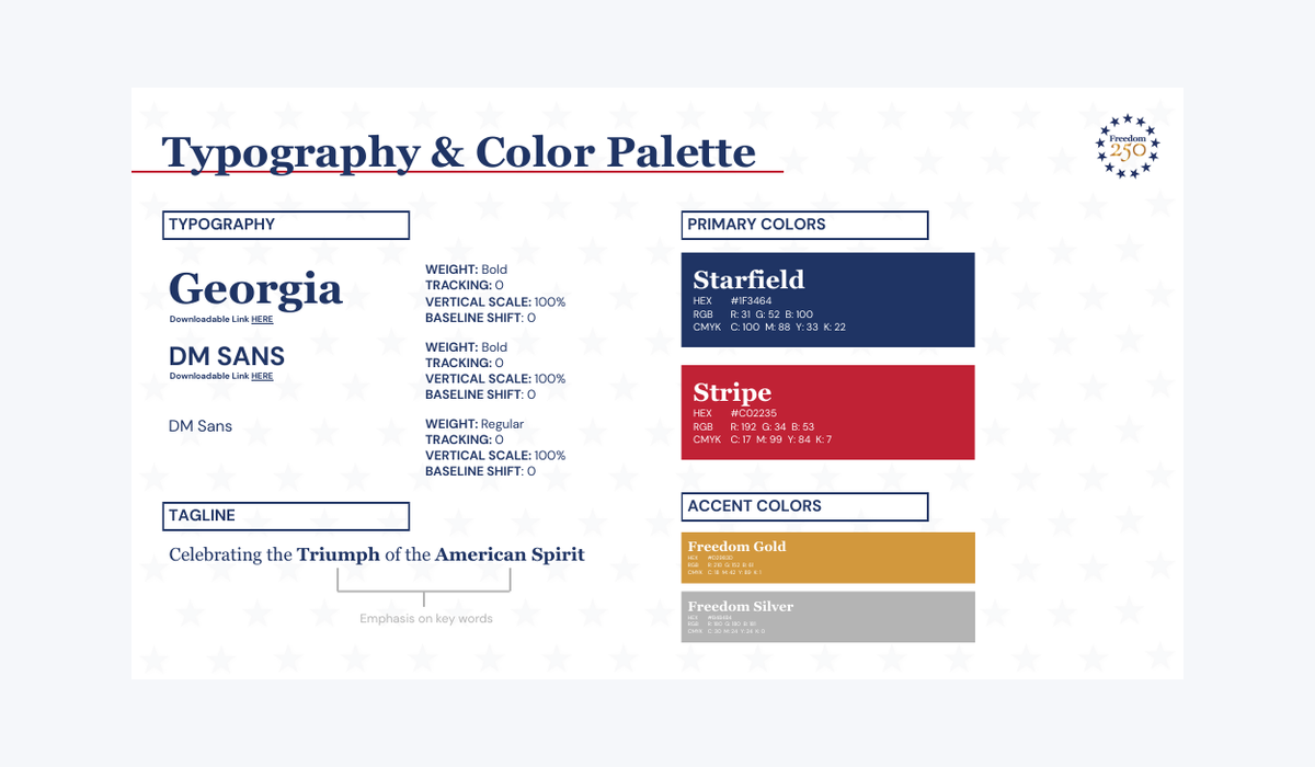
Freedom 250 supplied guide, PDF page 4: fonts, weights and color specifications appear together.
5. Show what happens on difficult backgrounds
Your logo will eventually appear over a photograph, a dark panel, or a background you did not anticipate. Explain the fallback options before someone improvises.
Example: Aimtec shows background decisions visually. Its logo guide includes sections for colored backgrounds, grayscale backgrounds, and photographs. PDF page 13 pairs instructions with photo examples: it considers contrast and background detail, demonstrates treatments to improve readability, and shows a white holding block as a fallback when appropriate.
The takeaway is to build a small decision sequence: use the approved full-color mark when it remains clear; select an approved alternate when necessary; use a permitted holding treatment if the background remains unsuitable.
Read the Aimtec logo guidelines PDF.
Your rules should fit your own identity. A white box is not automatically acceptable for every brand. Show the solution you approve rather than asking users to borrow another organization’s exception.
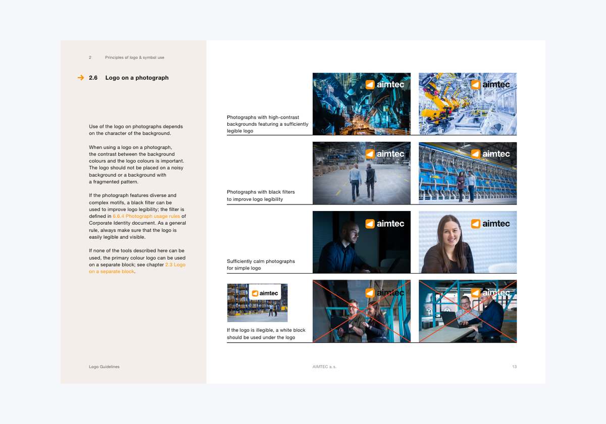
Aimtec logo guidelines, PDF page 13: photographic examples show readable placements and fallback treatments.
6. Plan for partners and co-branding
When two organizations share a page, logo size and placement can become a last-minute negotiation. Document the common arrangements in advance.
Example: British Swimming defines partner layouts by application. The supplied Version 2 guide shows horizontal and vertical arrangements with British Gas. It reserves the vertical arrangement for clothing and social media avatars, with the horizontal arrangement used elsewhere. It also addresses sub-brands and sponsor designations.
This historical example demonstrates why a guide should cover relationships between marks, not only a single logo in isolation. For your own business, specify alignment, separation, minimum space, and approval responsibility. Provide ready-made arrangements for recurring partnerships.
Read the British Swimming Version 2 guidelines PDF.
Avoid turning one brand’s partner hierarchy into a universal rule. The right arrangement depends on the partnership and agreed requirements.
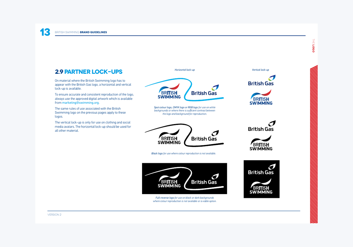
British Swimming Version 2, PDF page 13: approved partner arrangements for different applications. Historical partnership shown.
7. Include both correct and incorrect examples
People understand rules faster when they can see the consequences. Build a short page showing common mistakes alongside the approved treatment: stretching, unapproved colors, crowded placement, altered lettering, and poor background contrast.
Use mistakes your team is likely to make. If you regularly produce social posts, show a crowded mobile layout. If you print merchandise, show what happens when fine detail becomes too small.
The examples should teach a decision, not merely decorate the guide. Add a short explanation such as “Use the white logo here because the dark lettering disappears against the photo.” Keep your instructions consistent across sections so a general prohibition does not accidentally contradict an approved exception.
8. Turn your rules into a usable brand kit
A guide explains the decisions. A brand kit supplies the assets needed to apply them. Teams need both.
Use LogoAI Brand Kit to develop coordinated assets from your logo, then review the results and select approved versions. Explore realistic applications with the LogoAI Mockup Generator, including business cards, clothing, signage, and digital screens.
Mockups help you spot inconsistencies, but they are not production specifications. Keep final artwork, exact color values, and export requirements separate from illustrative previews.
Organize downloads by purpose, use descriptive filenames, and provide one shared location for the current guide. Add an owner, a version date, and a contact for questions. Retire superseded files so your team does not accidentally revive an old identity.
How to create your brand style guide with LogoAI
The examples above show what good guidelines need to communicate. Our new AI Brand Style Guide Generator helps you apply those principles to your own business. It turns your logo and brand profile into a 10-page reference you can review, edit, and download as a PDF.
Step 1: Upload your logo and add context
Sign in, then upload or paste a PNG, JPG, or WebP logo up to 3 MB. Add an optional sentence explaining what your business does and who it serves. A logo can suggest colors and a visual direction, but a little business context helps make the proposed brand story more relevant.
For example, “We are a neighborhood bakery serving families with handmade sourdough” provides a clearer starting point than a business name alone. Review suggested mission, vision, and slogan text against what your business actually promises.
Step 2: Preview the 10-page guideline
The preview brings together a cover, brand foundation, personality and voice, primary logo, spacing and scale guidance, color palette, typography, logo usage examples, illustrative applications, and a quick reference.
Look for the same qualities demonstrated by the five guides: a clear purpose, usable measurements, defined color roles, and examples that explain decisions. LogoAI includes HEX and RGB values and recommends supporting headline and body fonts from Google Fonts. These are font recommendations, rather than a guarantee that AI has identified the exact typeface in your logo.
Step 3: Save and edit your guide
Click Download to open the saved guideline. You can export immediately or use Edit beside Download PDF to customize the content first. Guideline edits save automatically and remain separate from the shared brand profile.
Review spacing and size suggestions against your original artwork. Check the voice example, confirm business details, and make sure the illustrative layouts suit your channels. The generated document gives you a useful starting point; your approved choices make it a reliable reference.
Step 4: Download the PDF and keep it current
Export the PDF for your designer, freelancer, or teammates. Include the approved logo files alongside it so they have both instructions and assets. For print work, confirm production colors and minimum sizes with your print provider; digital HEX and RGB values are not a complete print specification.
When your saved brand profile changes, use Update from Profile if you want to bring those changes into the guideline. This replaces customized guideline text and settings, so review your edits before applying it. Updates are explicit rather than silently overwriting your guide.
Brand DNA defines the foundation, Brand Kit supplies visual assets, and the guideline documents how to use the identity. Together, they help turn a logo into a brand that other people can apply consistently.
A practical outline for your first brand guide
For a small business, start with these sections and expand when a real need arises:
- Brand purpose, audience, promise, and voice.
- Primary logo and approved variations.
- Clear-space diagrams and tested minimum sizes.
- Colors, typography, and readable combinations.
- Background, imagery, and layout examples.
- Correct usage and common mistakes.
- Website, social, print, and partner applications.
- Asset links, document version, and approval contact.
There is no required page count. The strongest test is practical: can someone unfamiliar with your business create a plausible social post or presentation using only the guide and its files? Note where they hesitate, then improve that section.
Common questions about creating brand guidelines
Is a brand guide the same as a brand kit?
No. The guide explains usage and decisions; the kit contains usable assets. They can live together, but a folder of logos does not explain how to use them.
Can AI create a brand guide?
Yes. LogoAI can generate an editable 10-page style guide from your logo and brand profile, with a downloadable PDF. Review the suggested business statements, fonts, spacing, and usage examples before sharing it. AI helps prepare the reference; you approve the rules your team will follow.
Can I use another brand’s guide as a template?
Use its structure and teaching methods as inspiration. Develop your own identity, measurements, examples, and rules. The PDF links here are references for studying how guidelines communicate decisions.
When should I update my guide?
Update it when approved assets, channels, partnerships, or positioning change. Also revise it when the same question keeps appearing: repeated uncertainty is a sign that a rule needs a clearer example.
Create a guide people can actually use
The five examples show that useful brand guidelines turn intentions into specific choices. Explain the strategy, define the assets, make measurements visible, and demonstrate everyday decisions. Start with your approved logo and create your brand style guide. Review the recommendations, download the PDF, and give your team a clear reference for its next design.
Ready to create your own logo?
Turn your brand name into professional logo concepts in seconds with LogoAI.
Generate my logo