How to Make a Logo Intro Feel Like Your Brand
Learn how to make a logo intro feel on-brand by starting with your brand identity, choosing the right motion direction, and creating a short, reusable animation.
Making a logo move is easy. Deciding how to animate your logo in a way that actually fits the brand is much harder.
The problem is often not how the logo moves, but why it moves that way.
Why should the symbol rotate? Why should the shapes fly into the frame? Why should the reveal feel fast and energetic instead of slow and restrained?
If those decisions are based only on what looks visually impressive, the result can easily feel like a generic motion template. A stronger logo intro starts with the identity behind the logo and uses motion to reinforce it.
That means thinking about the brand before thinking about the animation.
A Good Logo Intro Needs a Reason to Move
One of the easiest mistakes in logo animation is adding movement simply because you can. If you are learning how to animate a logo without distorting it, the key is to let motion serve the logo rather than arbitrarily changing its shape, type, or color.
Shapes slide in, objects rotate, particles appear, and the camera moves — but none of those choices necessarily say anything about the brand.
A professional logo intro does not need to explain the entire business in a few seconds, but the movement should still feel intentional.
A playful brand may naturally support more energetic motion. A premium brand may feel more convincing with slower pacing, controlled camera movement, and subtle lighting. A technology brand might suit precise geometric transformations, while an illustrated mascot may invite more character-driven animation.
The same principle applies to recognizable elements inside the logo. If the design contains a symbol, character, object, or distinctive shape, that element can become part of the animation instead of simply moving the whole logo as one flat graphic.
A coffee mascot, for example, might come to life through a warm, playful scene. A geometric software logo might work better if its shapes assemble or transform with clean, controlled movement.
The animation does not have to literally explain what the business does. It just needs to feel believable for that identity.
The question is not:
What effect would look cool here?
A better question is:
What kind of motion would make sense for this brand?
That small change in thinking can make the difference between an animation that feels decorative and one that feels designed.
Let the Brand Guide the Motion
Before deciding how a logo should move, look at what the brand already communicates.
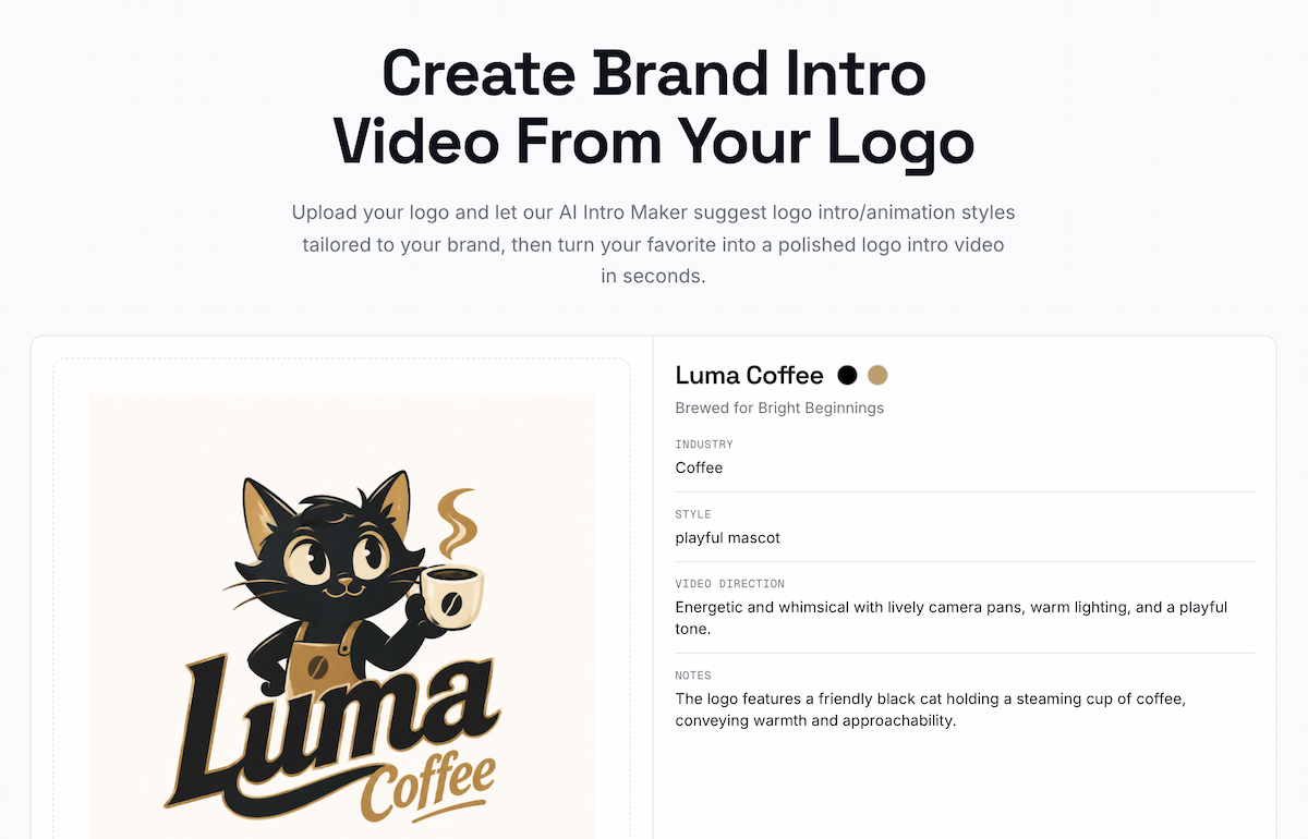
LogoAI first analyzes the logo’s Brand DNA before suggesting animation directions.
The industry provides context. The visual style suggests a personality. Colors influence mood. Typography can feel playful, technical, elegant, bold, or understated. Mascots, products, symbols, and distinctive shapes can all suggest possible motion ideas.
Even two brands in the same industry may need very different intros.
A playful coffee brand built around an illustrated mascot might suit warm lighting, expressive movement, and a more energetic scene. A minimalist specialty coffee brand could work better with restrained motion, subtle texture, and a cleaner reveal.
They may sell a similar product, but the motion should not feel the same because the brands do not feel the same.
This is where template-first workflows can become limiting.
If the first decision is whether to choose a glitch effect, particles, 3D motion, or a light reveal, you are choosing the effect before understanding what the brand actually needs.
A better workflow starts by identifying the brand first, then using that information to shape the animation direction.
This is the approach behind the LogoAI Logo Intro Maker.
After you upload a logo, LogoAI first analyzes its Brand DNA, including the industry, visual style, overall video direction, and recognizable elements within the design.
That analysis becomes the creative starting point for the intro.
LogoAI then develops 8 cinematic intro directions around the brand, giving you several different ways the same identity could come to life.
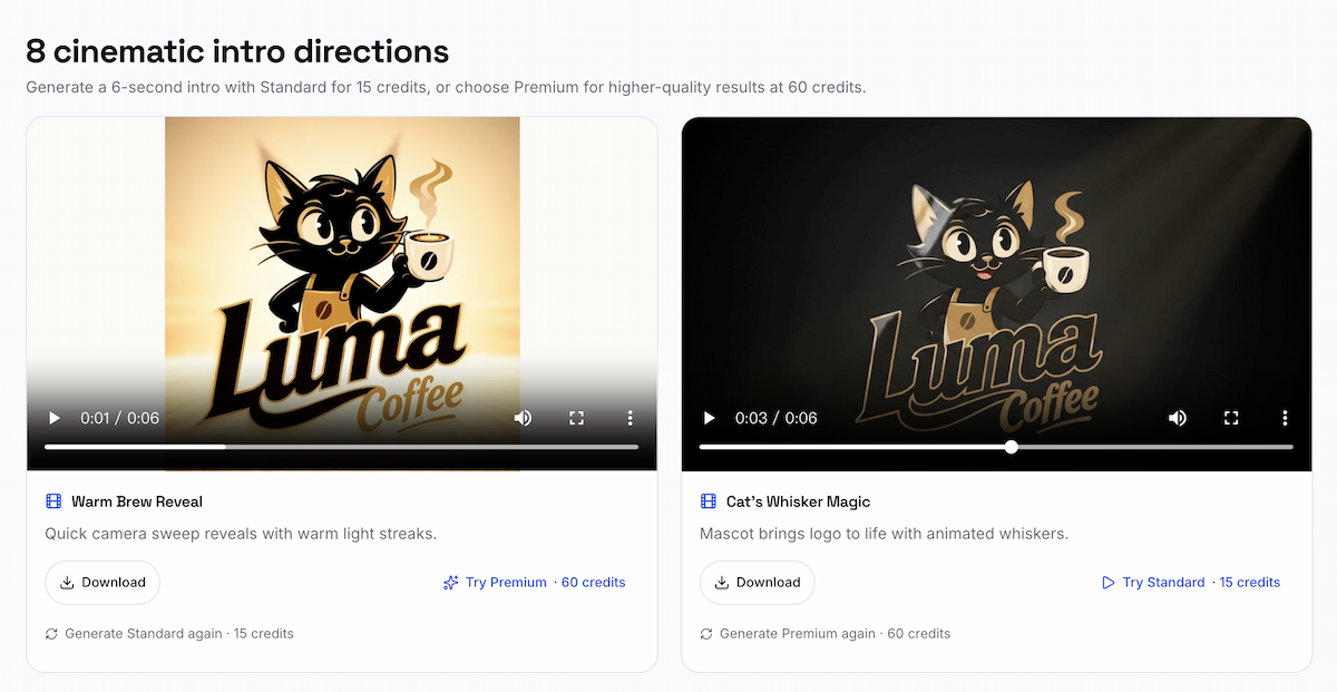
Each logo gets 8 cinematic intro directions, which can be generated in Standard or Premium mode.
One direction might focus on a recognizable mascot or object. Another could build around the product or industry. A more minimal brand might lead to a restrained cinematic reveal with simpler movement and lighting.
The point is not to generate the same animation eight times with different effects.
It is to give you several creative directions that begin with the logo and the identity behind it.
This is especially useful if you already have a logo but do not know what kind of animation would suit it.
With a general video generator, you may still need to decide what should happen in the scene, what should move, how the camera should behave, and what kind of visual atmosphere you want before writing a detailed prompt.
Here, that creative step happens first.
The workflow becomes:
Upload your logo → Analyze the brand → Explore 8 cinematic directions → Choose the one that feels right → Generate the intro
Each direction can then be generated as a 6-second video, with Standard available for faster generation and Premium for a more polished result.
The most important part happens before generation: the motion direction comes from the brand rather than from a generic effect library.
Keep the Intro Short, Clear, and Reusable
Even the right animation direction can stop working if the intro becomes too long or too complicated.
A logo intro should create a recognizable brand moment and then move into the actual content.
For most branded videos, a few seconds is enough.
The viewer does not need to understand everything about the company from the intro alone. They only need to recognize the brand and get a consistent sense of its visual personality.
That is also why simpler ideas often work better over time.
A dramatic animation may be impressive the first time you see it, but if the same intro appears before dozens of YouTube videos, product demos, tutorials, presentations, or social posts, it needs to remain comfortable to watch repeatedly.
A useful logo intro should also be flexible enough to work across different types of content. Temporary information such as promotions, dates, or episode titles can change, while the core brand moment should remain reusable. That repeatable system also helps you keep your branding consistent across platforms, rather than creating a different-looking intro every time.
When comparing possible intro directions, ask yourself:
Does this motion feel like the brand?
Is the logo still easy to recognize?
Would this still feel right after being used across many videos?
If the answer is yes, the intro is probably doing its job.
A strong logo intro is not about adding as much movement as possible. It is about finding a visual idea that feels intentional, recognizable, and connected to the identity behind the logo.
If you already have a logo but are unsure how it should move, the LogoAI Logo Intro Maker starts from that exact problem: it analyzes the brand behind the logo, develops 8 cinematic directions around it, and lets you choose the one that feels most natural before generating the final intro.
Ready to create your own logo?
Turn your brand name into professional logo concepts in seconds with LogoAI.
Generate my logo