Is Your Business Name Too Long for a Logo? Here's What to Do
Is your business name too long for a logo? Learn when to shorten it, how to improve typography and layout, and how to make your logo work at any size.
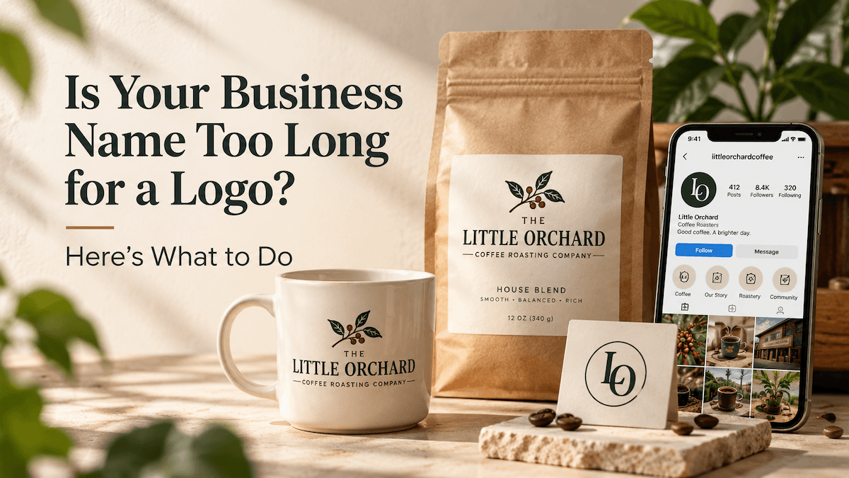
Your business name might sound perfect—until you try to turn it into a logo.
Imagine starting a coffee brand called The Little Orchard Coffee Roasting Company. The name has character and tells people what you do. But fitting all six words into a website header, coffee cup, or Instagram profile is another story.
Should you shorten it? Make the font smaller? Or give up on a text-based logo entirely?
The good news is that a long business name doesn't have to result in a crowded logo. With a brand logo maker like LogoAI, you can start with your business name, generate original logo concepts, and explore different typography and layouts without relying on pre-made templates.
But before experimenting with designs, there's a more useful question to answer: Which parts of your business name actually need to stand out?
1. Do You Need Your Full Business Name in Your Logo?
Not necessarily. Your logo should help people recognize your brand, but that doesn't mean every word in your registered business name needs equal visual attention.
Let's look at our fictional coffee company:
The Little Orchard Coffee Roasting Company
The most distinctive part is “Little Orchard.” The rest describes the business.
That gives us two practical directions.
Keep the full name, but create a clear hierarchy.
You might emphasize “Little Orchard” while keeping “Coffee Roasting Company” in smaller type. Customers can still see the complete name, but their attention goes to the part they're most likely to remember.
Use a shorter brand name, if that's what customers already know.
If the business consistently introduces itself as “Little Orchard,” that shorter version might be enough for the primary logo.
Many businesses have longer formal names than the names customers encounter on packaging, websites, and storefronts. The two don't always need to be identical. In the United States, the Small Business Administration explains that an entity name, a DBA, a trademark, and a domain name serve different purposes and do not normally have to match.
However, shortening a name purely for design convenience can create confusion. If people know your company by its full name, replacing it with unfamiliar initials or an invented nickname may weaken recognition.
The key is to distinguish between your formal business name and the name you want customers to remember.
For a new brand, making that decision early can save a lot of unnecessary redesign work.
2. How Can You Make a Long Business Name Look Good in a Logo?
Before removing words, try changing how they're arranged.
A long name often looks awkward because of poor typography, not because it contains too many characters.
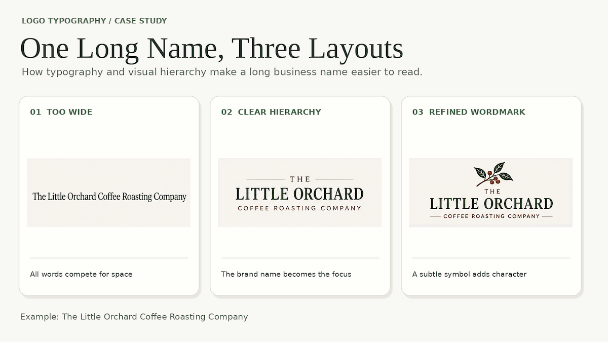
For example, displaying our coffee company's entire name in one horizontal line would create an unusually wide logo.
A more balanced option might look like this:
THE LITTLE ORCHARD
COFFEE ROASTING COMPANY
Nothing has been removed. But the name now has a clear reading order, and the distinctive words receive more attention.
Here are three design decisions that can make a noticeable difference.
Make typography the main feature.
When your logo contains several words, a strong wordmark may work better than a complex illustration paired with text.
The typeface, letter spacing, and proportions can create personality without adding unnecessary elements.
A refined serif typeface might suit a specialty coffee roaster, while a softer, more approachable typeface could work for a neighborhood café.
Avoid using overly decorative fonts simply to make the logo feel unique. With a long name, readability matters even more.
Use line breaks deliberately.
Two or three lines can create a more compact composition, especially for names that naturally divide into a brand name and a business description.
However, don't break phrases randomly just to create a symmetrical shape.
“The Little Orchard” and “Coffee Roasting Company” belong together as meaningful groups. Keeping them intact makes the logo easier to scan.
Don't make everything compete for attention.
A long name already contains plenty of visual information.
Adding an elaborate icon, a detailed frame, decorative flourishes, and multiple font styles can quickly overwhelm the design.
Instead, identify one focal point—usually the distinctive brand name—and let supporting elements play a quieter role.
If an AI-generated logo feels too busy, you may not need an entirely new concept. Try refining the typography, simplifying the symbol, or adjusting the layout.
3. What If Your Logo Still Doesn't Work at Small Sizes?
Even a beautifully designed long-name logo has limitations.
A full wordmark might look excellent on a storefront but become difficult to read when reduced to a social media avatar or website favicon.
The answer isn't to shrink everything until it fits.
Instead, consider creating a small family of logo variations that serve different purposes.
For our fictional coffee brand, that could include:
- Primary logo: The full company name, with a clear hierarchy, for storefronts and larger brand materials.
- Compact wordmark: “Little Orchard,” for packaging and website headers, provided this is the brand's established public-facing name.
- Small-space symbol: A simple, recognizable icon or an “LO” monogram for profile pictures, favicons, and other compact applications.
A monogram can be useful when space is limited, but initials aren't automatically recognizable. Someone discovering the coffee brand for the first time might have no idea what “LO” means.
That's why a symbol often works better as a supporting version of the logo rather than replacing the business name everywhere.
The most important thing is consistency. Your primary logo and simplified versions should feel like parts of the same identity, sharing recognizable typography, colors, shapes, or proportions.
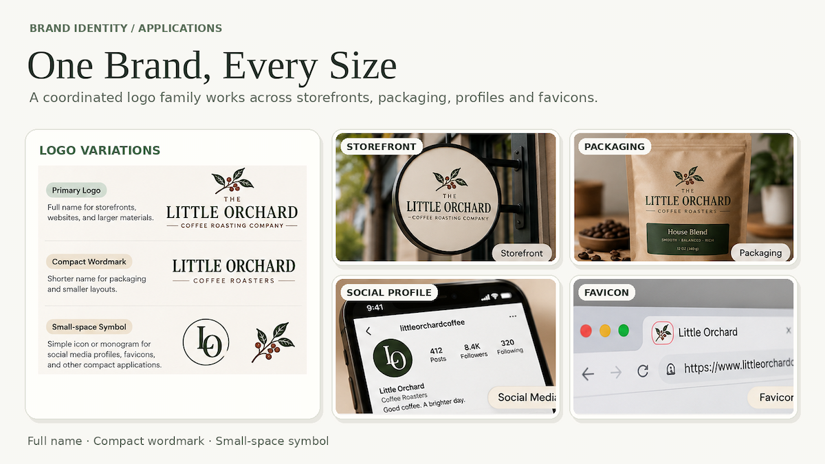
Once you've settled on a primary design, you can create matching logo variations for different uses with LogoAI's Brand Kit rather than forcing the same full-name logo into every space. For a closer look at how to plan those versions, see how to generate variations from a base logo.
For example, you can prepare transparent and alternative-color logo versions, along with a standalone brand symbol that can serve as a favicon or be used in other compact applications.
This makes it easier to maintain a consistent identity across your website, packaging, and social media without requiring every application to display the complete business name.
Of course, not every variation will work perfectly. A symbol still needs to be recognizable at small sizes, and a shortened wordmark should use a name your customers actually know.
Before settling on a design, test it in the places where people will actually see it.
Can you read the name on a mobile screen? Does the symbol remain recognizable when reduced? Does the logo work on both light and dark backgrounds?
If the full logo fails at a small size, that's not necessarily a sign that the design is wrong. It may simply need a more compact companion.
A long business name isn't a reason to settle for an awkward logo—or to rename your business.
Sometimes, a clear typographic hierarchy is enough. Sometimes, a shorter public-facing name works better. And sometimes, the smartest solution is to create a full logo alongside a simplified version for smaller spaces.
The goal isn't to fit every word into every design. It's to make your business recognizable wherever its logo appears.
Ready to create your own logo?
Turn your brand name into professional logo concepts in seconds with LogoAI.
Generate my logo