How to Make a Podcast Logo Read Clearly at Small Sizes
Learn how to simplify a podcast logo, test it at real thumbnail sizes, and prepare versions that stay recognizable across podcast players and social profiles.
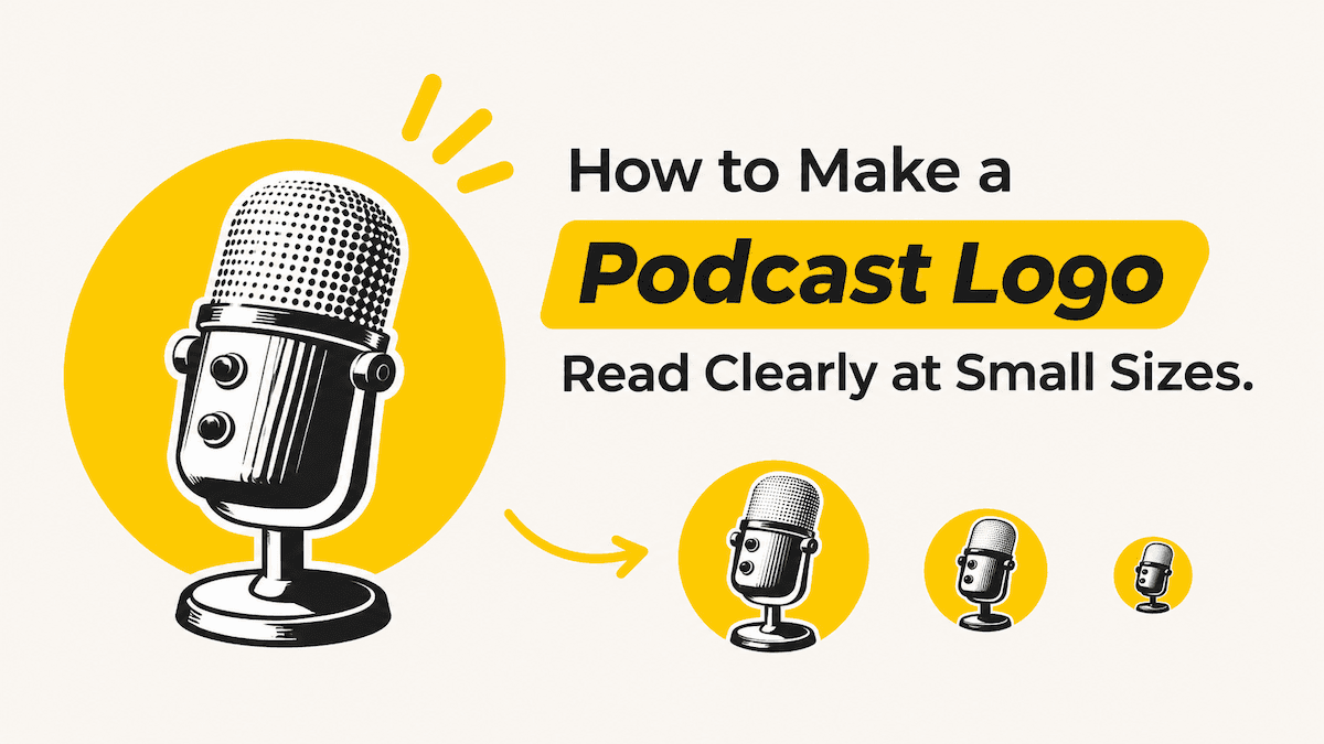
A podcast logo can look polished on a large design canvas and still fail in a podcast app or social avatar. At small sizes, listeners need to recognize one clear idea quickly. The fix is to choose a primary cue, remove details that collapse, test the mark at the size people will see, and prepare a compact version for tighter spaces.
A show cover, a full logo lockup, and a small avatar do not have to be identical. They should share the same recognizable identity, but each version can give different elements more room.
Why Podcast Logos Often Become Unreadable at Small Sizes
Small displays remove the space your design depends on. A thin outline becomes a blur, a long show name turns into a line of noise, and a detailed microphone illustration loses its silhouette. The design has not changed; the amount of visual information the viewer can separate has.
Three problems appear most often:
- Too many elements compete. The show title, host name, tagline, category label, icon, and background pattern all ask to be read first.
- Fine details disappear. Thin strokes, narrow letterforms, small counters, and intricate textures merge when the image is reduced.
- Contrast weakens in context. A color combination that works on a white design board may blend into a dark app interface, a profile crop, or a compressed preview.
A large master file does not solve these problems by itself. Resolution helps preserve edges, but it cannot make five small lines of text readable in a tiny square.
Podcast artwork also appears in more than one place. Apple describes a Show Cover as a square image shown at different sizes across apps and devices, and recommends a prominent title, strong contrast, a safe area, and high-resolution imagery. Check the destination platform’s current requirements when you prepare the final file.
Think of the large canvas as the source, not the proof. The proof is what remains when the design is reduced and placed beside other shows.
Decide What Your Podcast Logo Should Communicate First
If you are starting from scratch, the easiest way to create a podcast logo is to enter your show name into LogoAI’s AI Logo Maker, along with a short description of your podcast. It generates multiple logo concepts from your input, giving you different creative directions to explore without designing everything yourself.
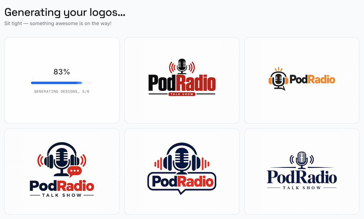
LogoAI generates multiple podcast logo concepts from a show name and description.
You can compare symbols, typography, and compositions to see which direction best represents your show. Once you have a few options, consider how each one will work at smaller sizes before settling on a design.
Start by choosing the one thing a new listener should recognize first. For most independent shows, that is the podcast name. For a host-led show with a short name, it may be a distinctive symbol or portrait. A topic cue can support that recognition, but it should not make the title compete with a second headline.
A simple hierarchy usually works:
- Primary cue: the show name or a distinctive symbol.
- Supporting cue: one image, shape, or color treatment that signals the subject or tone.
- Optional detail: a host name or short descriptor only when it adds useful context.
If the show name is long, give the title the space it needs. Do not make it smaller just to preserve a tagline or host line. Extra words such as “Podcast,” host credentials, or decorative elements can be removed when they compete with the main identity.
The main logo formats have different jobs:
- Wordmark: the show name is the mark. This works well when the title is short and distinctive.
- Symbol: an icon or shape carries the identity without text. This is useful for avatars and other tight crops.
- Combination mark: the symbol and wordmark appear together. This gives the cover more context, but it needs a separate compact version for small spaces.
Move the strongest direction into the preview stage before adding more detail. A tagline or host credential can live in the show description when it cannot remain readable in the mark.
Preview Your Podcast Logo at Different Sizes and Prepare the Right Versions
Once you have a logo, the next step is making sure it works across different sizes, devices, and platforms. This is where LogoAI’s Brand Kit fits into the workflow.
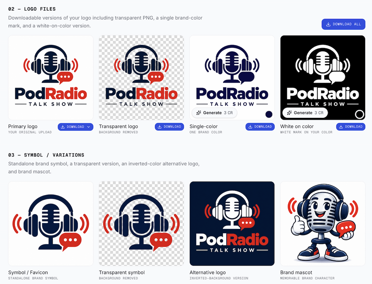
Brand Kit Generator preview of logo files and symbol variations.
When you create a logo with LogoAI, the selected concept can continue into Brand Kit Studio as part of the same workflow. There you can review application mockups and prepare the logo variations needed for different placements. Together, these files form a complete working Brand Kit for the show. If your logo came from another tool or a designer, you can upload it directly to the Brand Kit Generator instead. It can then be used to prepare the same types of logo variations and supporting brand assets, so you do not need to recreate the logo from scratch.
Preview across different sizes and devices
Use Brand Kit’s mockups, social assets, and logo files to review the same identity across application contexts, then open the actual platform preview when one is available. Check the same direction in three views:
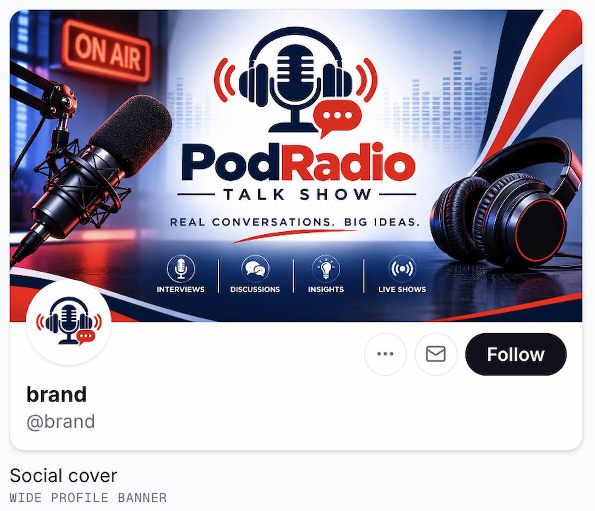
A social cover mockup shows how the same podcast identity can appear in a wide profile banner.
- Podcast list or player tile: Can you identify the show name or symbol before reading the surrounding description?
- Social avatar: Does the focal point remain visible after a square or circular crop?
- Larger cover view: Does the design still feel intentional, with no awkward spacing or accidental overlaps?
If a platform preview is not available, make reduced test copies and inspect them on your phone. A 150 px preview is a useful first stress test; a 75 px preview exposes details that are too dependent on large-screen viewing. These are editorial checks, not universal platform requirements.
Check logo readability
At each size, ask:
- Can I identify the show in a second?
- Is the title still the strongest text?
- Does the symbol have a recognizable silhouette?
- Does the topic cue support the title without competing with it?
- Does the contrast hold against both light and dark surroundings?
- Has any detail become visual noise?
Choose the right logo variations
Use the version that matches the space rather than forcing the full lockup everywhere:
- Full Logo: the complete show mark for the cover and larger brand placements.
- Standalone Symbol: the icon or reduced mark for avatars and tight square spaces.
- Transparent Logo: useful over a prepared background, but not automatically suitable for a platform that requires a solid cover background.
- Monochrome Logo: useful for one-color graphics or situations where color is not reliable.
- White / Reversed Logo: useful on a dark background when the primary colors lose contrast.
The current Brand Kit page accepts PNG, JPG, or WEBP uploads and presents logo files such as transparent, monochrome, and white versions, along with a standalone symbol, reversed-background option, mockups, and social assets. Brand Kit organizes the variants; it does not score thumbnail readability or choose the correct version for you.
Make adjustments if needed
If a title, icon, or color treatment still fails the check, return to the logo refinement workflow and adjust the direction before exporting again. Change the typography, icon, colors, or layout, then repeat the preview. Brand Kit provides the files and application assets; it does not automatically repair a complex logo. If the source file itself is soft, check a blurry logo at its real placement size before deciding whether the issue is resolution or design.
For the cover file, check the destination platform’s current rules. Apple’s current Show Cover specifications list 3000 × 3000 pixels as the preferred size, PNG or JPG export, and no transparency for Apple Show Covers. Use Apple’s Show Cover requirements as an Apple-specific reference, then confirm the requirements for any other platform where you will publish.
Before publishing, run this checklist:
- The show name or symbol remains recognizable at the smallest test size.
- The primary cue is obvious without the show description.
- The icon remains easy to recognize.
- Small text and decorative details are not carrying essential meaning.
- The title and symbol stay inside the safe area.
- The contrast works on light and dark surroundings.
- The cover, avatar, and social versions share the same visual identity.
- The exported file matches the destination platform’s current dimensions, format, and background rules.
- You inspected the exported file in context, not only on the design canvas.
A strong podcast logo keeps the information people need when the available space gets small.
Ready to create your own logo?
Turn your brand name into professional logo concepts in seconds with LogoAI.
Generate my logo