How to Design a Real Estate Logo That Works on Yard Signs and Social Media
A practical decision guide for choosing a real estate logo that stays readable on yard signs, listing pages, and square social profiles.
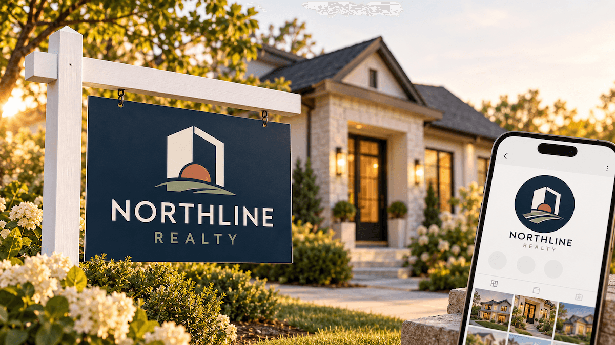
Real estate logos get judged in places where people have little time to look at them. A driver may see a yard sign for only a few seconds, while a client may see the same mark inside a small social profile circle. Build for both situations from the start: one clear primary version, a compact mark, and colors that stay legible in print and on screen.
What should a real estate logo communicate first?
Start by naming the service you want people to remember. A residential agent, a luxury brokerage, a property manager, and a commercial team may all work in real estate, but each one speaks to a different client and use case. Write down the market, the type of client you serve, and the action the logo should support, such as a roadside inquiry, a listing search, a referral, or a seller meeting. Use that brief to guide the name, symbol, type, and color choices. If you are starting from a business name, you can create logo concepts by describing the market, audience, and tone.
A wordmark keeps an agent or brokerage name easy to recognize. A symbol helps the identity work at avatar size. A restrained palette lets signs, listing graphics, and business cards feel like part of the same business. Treat these pieces as one system so you do not have to force a crowded lockup into every layout.
Which logo layout works on a yard sign and a social profile?
Most real estate businesses need three related versions before they order signs or open social accounts:
| VERSION | BEST USE | WHAT TO CHECK |
|---|---|---|
| Primary horizontal logo | Yard signs, website headers, listing presentations, email signatures | The business name is readable from a distance and the symbol does not overpower it. |
| Stacked or compact logo | Square posts, profile cards, flyers, and narrow sign panels | The mark stays balanced when the available width is limited. |
| Symbol-only mark | Social avatars, favicons, watermarks, and small corner placements | It remains recognizable without the full business name and does not become a generic house shape. |
Make the versions feel related. Keep the same core symbol, type direction, and color logic across them. You can create matching logo versions while keeping the approved colors, symbols, and supporting assets together. A compact version is a layout choice, not a separate identity. If the name is long, use a deliberate line break or a shorter descriptor instead of shrinking the type until it becomes hard to read.
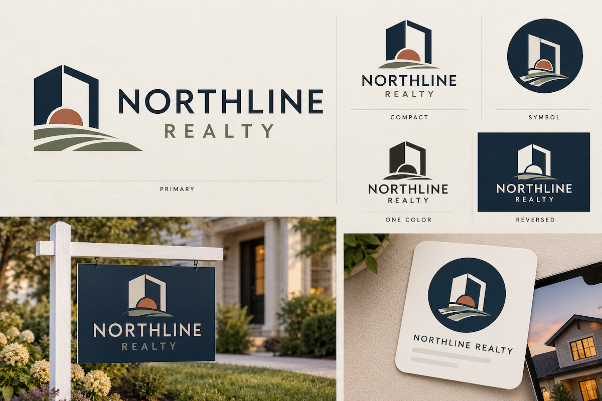
Example of one real estate identity adapted into primary, compact, symbol-only, one-color, reversed, yard-sign, and social versions.
How should you choose colors and type for real estate?
Choose colors for the places where the logo will appear. A dark wordmark on a light sign is easy to read in daylight. A reversed white version gives you an option for dark photography, vehicles, or evening events. Test the palette against the paper, vinyl, screen, or photo that will carry it.
Typography has the same practical job. Look for letterforms with open counters and clear spacing. Test the brokerage name or agent surname at the smallest size you expect to print. Script lettering can add personality, but it should not be the only way a viewer can identify the business.
A house outline, roof, key, or skyline can signal the category quickly. These symbols are common, so give yours a detail that makes it easier to tell apart from local competitors. Put the mark beside two or three competing businesses and check the symbol, type category, and overall silhouette.
For text such as a phone number or call to action, check the WCAG contrast guidance before approving a sign layout.
How do you test a real estate logo before using it?
Before you order signs or update profiles, test the logo in the places where it will do real work:
- Roadside test: View the primary logo at the approximate size and distance of a yard sign. Can someone read the name in one glance? Is the phone number or call to action separate enough from the mark?
- Listing test: Place the logo beside a property photo and a listing headline. It should support the listing without competing with the home image or disappearing into it.
- Profile test: Crop the compact version into a square avatar. Check the center, the safe area, and the smallest visible details on a phone screen.
- One-color test: Convert the mark to one dark color and one light color. If the shape collapses, it depends too heavily on effects or color contrast.
- Neighbor test: Put the mark beside two or three local competitors. Look for accidental similarities in the symbol, type category, and silhouette.
After you make rough sign and profile compositions, use logo mockups to inspect the identity in realistic scenes. A mockup can reveal weak contrast or an unbalanced layout, but a printer or sign vendor still needs to approve the artwork. Ask for the vendor's accepted file types, color requirements, bleed rules, and minimum type size before ordering.
If you need a broader reference for dimensions across web, social, and print, use this logo size guide alongside the real placement tests above.
What files should you hand to a sign vendor?
Send a small, clearly named package instead of every experiment. Include:
- the primary horizontal logo in a transparent, high-resolution format;
- the compact or stacked version for narrow layouts;
- the symbol-only mark for avatars and small placements;
- a one-color dark version and a reversed light version;
- the vector or print-ready file your vendor accepts, such as SVG or PDF;
- the brand colors and type choices, with any minimum-size or clear-space notes you have agreed on.
A high-resolution PNG works well for many digital uploads. A vector file is useful when a sign, vehicle graphic, or other physical application must scale. Confirm the supplier's specification before exporting the final package.
When is a real estate logo ready to launch?
Launch when the same identity passes five checks: the name is readable on a sign, the compact mark survives a square crop, the colors hold up on light and dark backgrounds, the one-color version keeps a clear shape, and the files match the vendor's requirements. If one check fails, fix the layout or asset version before adding more decoration. A good set of real estate logo files should work on the road, in a listing feed, and when someone sees the business through a referral.
Ready to create your own logo?
Turn your brand name into professional logo concepts in seconds with LogoAI.
Generate my logo