Should Your Favicon Be Your Logo? A Practical Symbol vs. Wordmark Guide
A full logo rarely fits a 16px browser tab. Learn when to use a standalone symbol, initial, or simplified favicon—and how to test it before launch.
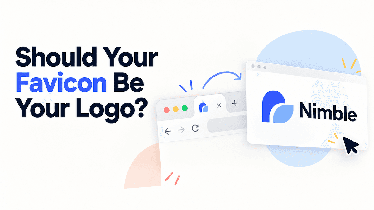
A favicon should usually be related to your logo, but it should not usually be a tiny copy of the entire logo. A full lockup often contains a wordmark, symbol, and spacing that disappear in a browser tab. The safer choice is a simplified, square-friendly mark that keeps one recognizable cue from the primary identity.
The practical rule is simple: use the full logo where people have room to read it, and use a symbol, initial, or simplified mark where the available space is tiny.
Why does a favicon often need a different version of the logo?
A favicon appears in browser tabs, bookmarks, and other compact interface locations. MDN describes a favicon as a tiny website icon that is usually 16 × 16 pixels. At that size, a long wordmark becomes a blur, a tagline becomes noise, and thin details can merge into one shape.
That does not mean your favicon should look like a different brand. It should preserve a visual relationship with the primary logo through one or more of these cues:
- the same core symbol;
- the first letter or a distinctive monogram;
- the same dominant color pair;
- a recognizable shape or negative-space idea.
A favicon is a small identity shortcut, not a miniature brand guideline.
Should you use a symbol, an initial, or the full logo?
Choose the version that stays recognizable without relying on text that cannot be read at the target size.
| Version | Use it when | Main risk |
|---|---|---|
| Standalone symbol | Your logo already has a simple icon that makes sense on its own | The symbol may be too generic without the wordmark nearby |
| Initial or monogram | Your name has a distinctive first letter, or the full name is long | A single letter can look interchangeable with competitors |
| Simplified custom mark | The primary logo has detail but one shape can carry the idea | Simplification can remove the feature that made the logo memorable |
| Full logo or short wordmark | The mark is already compact and readable in a square | Text usually fails first as the icon gets smaller |
If your business is new, do not assume that a symbol is automatically better. Test whether someone who has seen your full logo can connect the small mark to the same brand. A clean lettermark can be more useful than a complicated illustration, while a distinctive symbol can be stronger than an arbitrary first initial. For a broader look at how to build related logo variants from one identity, see how to generate logo variations from your base logo.
How can you test a favicon before you commit to a logo?
Run the same four checks on every serious logo direction. Use the actual-size preview rather than judging an enlarged mockup.
1. Check 16, 24, and 32 pixels
View the mark at 16 × 16, 24 × 24, and 32 × 32 pixels. The smallest version is the stress test. If the shape turns into a blob, thin strokes vanish, or the mark needs a caption to make sense, simplify it or choose another variant.
The question is not whether the favicon is detailed. The question is whether its main silhouette survives.
2. Check light, dark, and one-color backgrounds
Place the mark on a light background, a dark background, and a neutral mid-tone. Then test a one-color version. Gradients and shadows can make a large preview attractive while hiding weak contrast or fragile edges.
A higher-contrast variant is the practical choice for a favicon because it has to remain legible on varied browser surfaces. Do not depend on one carefully controlled background to make the mark readable.
If the mark only works on one background, it is not ready to be your only small-size variant.
3. Check the square crop
Put the mark inside a square with comfortable padding. Make sure the important shape is centered and that no part of the symbol is cut off when the browser or platform applies its own mask.
A horizontal lockup often needs a separate icon crop. Do not squeeze the full logo into a square just to avoid making a second version; that usually creates awkward spacing and unreadable text.
4. Run a three-second recognition test
Show the favicon for three seconds, hide it, and ask a teammate what they remember. They do not need to name the company immediately. They should be able to describe the same basic shape or letter you intended them to notice.
Repeat the test at least once with someone who has not seen the logo before. If the answer changes completely between people, the mark may be visually busy or too dependent on context.
What should you do if the generated favicon fails the test?
Before starting over, use the Brand Kit connected to the logo. A logo generated in LogoAI already has an associated Brand Kit, whose Symbol / Variations section can create practical brand assets including:
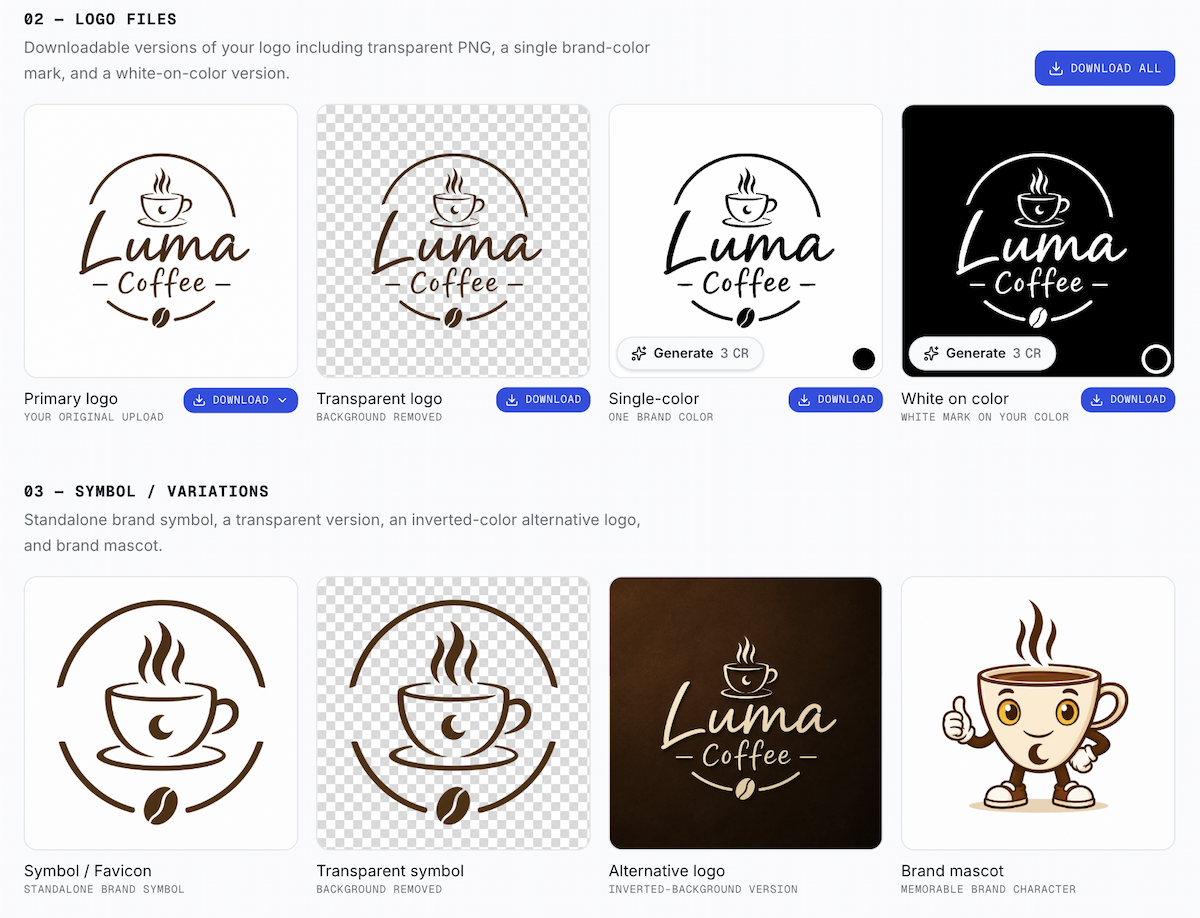
- a Symbol / Favicon for compact square placements;
- a Transparent symbol for flexible backgrounds;
- an Alternative logo for inverted or dark surfaces;
- a Brand mascot when the identity needs a character-led asset.
Use the generated Symbol / Favicon as the first candidate, then run the four tests above. If the result is too detailed or loses the core idea, regenerate or refine the source logo and review the new variant in the same Brand Kit. If your logo started as a local file, upload it to the Brand Kit and generate the supporting variants there.
The goal is not to force one file into every placement. The goal is to make each version feel like the same brand while respecting the space available.
How should you prepare favicon files for a website?
Ask for a small set of files rather than one resized image. Browsers can choose among multiple icon files when each file declares its intended size and format, so hand off the tested 16px and 32px variants to your developer.
A developer might wire a simple PNG set like this:
<link rel="icon" href="/favicon-16.png" sizes="16x16" type="image/png">
<link rel="icon" href="/favicon-32.png" sizes="32x32" type="image/png">
The exact file set depends on your site and app requirements, but the design decision comes first: each file should use the same tested favicon variant, with enough padding and contrast to remain clear.
A pre-launch checklist for your logo and favicon
Before you finalize the identity, confirm that:
- the full logo is readable in the website header and on a business card;
- the standalone symbol, initial, or simplified mark is recognizable at 16 pixels;
- the small mark works on light and dark surfaces;
- the one-color version keeps its silhouette;
- the square crop has balanced padding;
- the favicon still feels connected to the full logo when shown side by side;
- your developer has the tested sizes and transparent or background-specific variants they actually need.
If one concept passes the large-logo test but another passes the favicon test, choose the direction that can support both without losing its identity. A logo is a system of related versions, not a single image that has to survive every context unchanged.
Choose the favicon variant that stays recognizable at its smallest real size, then use the full logo wherever the layout gives the brand room to speak.
If you are still exploring directions, compare the symbol and wordmark together, and run the four tests before downloading a final kit.
Ready to create your own logo?
Turn your brand name into professional logo concepts in seconds with LogoAI.
Generate my logo