Small Business Branding on a Budget: What to Build First
A practical way to set a small-business brand budget: choose a clear logo direction, test it on real customer touchpoints, and add only the assets you will use next.
Small business branding on a budget is a sequencing problem. Define one clear visual direction, create a usable logo, and apply it to the few places customers will see next. A full identity system can wait until there is a real use for it. This approach helps avoid spending time on assets that do not support a current customer interaction.
A founder in a recent r/startups discussion described having a moodboard but struggling to make the logo, fonts, illustrations, and website feel like one brand on a limited budget. That is one person’s experience, not market-wide evidence. It illustrates a practical problem: deciding which parts of a brand need to feel consistent first.
What should you decide before spending on brand assets?
Write a one-sentence brief with the business, the people it serves, and the impression it should leave. For example: “A neighborhood meal-prep service for busy families; warm, practical, and easy to trust.” This is a working description, not a tagline. Use it to compare design options.
Next, list the three places where customers are most likely to encounter the business soon: perhaps a website header, social profile, menu, invoice, or proposal. These are the first contexts your logo and visual choices need to work in. Set aside the total amount you can spend on those needs, then avoid adding assets that do not solve one of them.
How do you choose a logo direction you can use?
When exploring AI-generated concepts, begin with the business name and choose a logo style to explore. In the logo maker, if the name does not already include an industry cue, the form may show one optional details field. When it appears, you can add the one-sentence brief above: “A neighborhood meal-prep service for busy families; warm, practical, and easy to trust.” It is a single free-text description, not separate audience or preferred-color fields.
Compare the concepts against the same practical checks:
- Is the business name readable at the smallest size where customers will see it?
- Does the mark remain recognizable on both light and dark backgrounds?
- Does it feel appropriate for the customer experience you described?
- Can you tell it apart from businesses customers might compare it with?
If one direction is close, refine it with one specific change at a time, such as simpler lettering, a less detailed symbol, or a different color palette. Review each new result because other details may change as well. Ask a few people who resemble your intended customers what kind of business they think it is before explaining the brief.
Which brand materials should you make first?
Choose assets according to the next real customer touchpoints, not a generic launch checklist.
Logo versions are useful when they solve a specific fit problem, such as a full wordmark for a website header and a compact symbol for a social avatar. These examples of common logo variations can help you decide whether an alternate version is useful for your business.
| Where customers will see the business | Useful first items |
|---|---|
| Website and social profile | A readable primary logo, a compact version, and colors that work on the page background |
| Menu, invoice, or proposal | A clean wordmark and a simple one-color version |
| Storefront or product display | A logo variation that suits the surface, then a supplier-approved production proof before ordering |
A mockup can help you judge how a direction may look in context, but it does not confirm final dimensions, materials, or print readiness. Verify those details with the printer or supplier.
How can you build a small, consistent starter kit?
After choosing a logo direction, use a brand kit tool to explore supporting versions and applications. For example, the brand kit studio works from an uploaded logo or a logo selected in the Logo Maker flow, and offers brand colors, logo file variations, mockups, social graphics, and other assets. Treat those as options: keep only the items that match the touchpoints you listed.
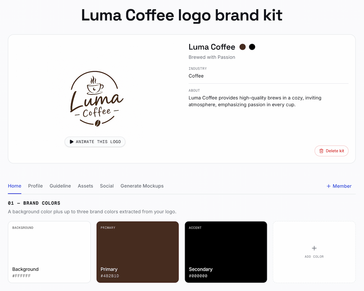
Check every selected item at its intended size and background. A logo that works in a large mockup may be hard to read as a small profile image. A social graphic may need a different crop from a website header. Make the adjustments that address those actual use cases before creating more variations.
What can wait until the business needs it?
Several mockups, a large library of campaign graphics, and a brand video can wait if there is no near-term channel or campaign for them. A long brand manual can also wait when one person is making the materials. A short note with the chosen logo, colors, and approved versions may be enough to keep early materials consistent.
Add an asset when it removes a repeated decision, supports a new customer touchpoint, or helps another person apply the visual identity correctly. Otherwise, keep the budget and the workload focused on the next customer interaction.
How do you know the starter identity is ready?
Place the logo and selected materials in the three contexts you named. Ask someone who was not involved in the design to check whether the business name is legible, the materials feel like the same business, and the style fits the experience you intend to provide.
Use the feedback to identify one next fix. If the profile version is unclear, simplify it. If the website and menu feel unrelated, reuse the same colors and logo treatment. A small business does not need every possible brand asset at launch; it needs a clear direction that works wherever customers meet it now.
Ready to create your own logo?
Turn your brand name into professional logo concepts in seconds with LogoAI.
Generate my logo