Why Do AI-Generated Logos Look Generic? A Practical Evaluation Guide
A neutral framework for evaluating AI-generated logos, comparing directions, refining a concept, and checking whether it works in real brand applications.
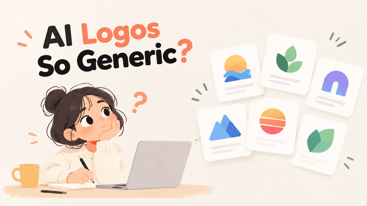
AI-generated logos often look generic for a simple reason: the first result usually reflects broad category patterns more strongly than the specific business behind the name. A polished mark can still feel interchangeable with dozens of competitors.
The practical response is not to add endless prompt adjectives. Give the generator the smallest useful amount of context, compare several directions, refine one decision at a time, and test the result in the places where the logo will actually appear. This process helps you judge a logo on relevance and usability rather than novelty alone.
Why do AI-generated logos look generic?
Most generic results come from four causes:
- Broad inputs: words such as “modern,” “professional,” and “minimal” describe a mood shared by many brands.
- Category shortcuts: familiar symbols and color combinations are efficient ways to signal an industry, but they do not automatically express a particular business.
- First-result bias: a clean-looking concept feels finished even when it has not been compared with alternatives.
- Too many directions at once: asking for playful, premium, bold, friendly, and futuristic qualities together can produce a compromise that feels like none of them.
Discussions in r/branding and r/growthmarketing show the same practical concern: people want the speed of AI generation without ending up with a template-like identity.
1. Start with the smallest useful brief
You do not need a long creative brief to begin. Start with the brand name and add one short sentence only if the name does not make the business clear.
Useful optional context includes:
- what the business sells or helps people do;
- who it serves or where it operates;
- one quality the brand should communicate;
- a color preference or a visual direction to avoid;
- the first place the logo will be used.
For example, “Modern coffee brand” gives limited context. “A neighborhood coffee subscription for busy apartment renters” gives the generator a clearer situation to interpret.
Avoid stacking mood words until the prompt becomes contradictory. One relevant fact is usually more useful than five adjectives. You can add more context later if the first set of concepts misses the business. LogoAI follows this low-input pattern: its AI Logo Maker starts with the brand name, keeps extra details optional, and lets the user choose styles or use a surprise selection.
2. Generate several directions before choosing one
The first generation is an exploration step. Compare options that differ in meaningful ways, such as:
- a wordmark that makes the name do most of the work;
- a combination mark that balances a symbol and the name;
- a compact mark for small placements;
- a more abstract structure that does not rely on a literal industry icon.
The point is not to invent these directions manually. A generator can propose them. The important decision is to review the set together instead of judging each concept in isolation.
Ask what each option is communicating and whether that message is relevant to the business. “It looks professional” is a weak reason to choose a logo. “The name stays readable, and the shape relates to the way the service is delivered” gives you a testable reason. A style selector or surprise option can widen the first set of concepts, but you still need to compare what the resulting marks communicate.
3. Check whether the concept is specific enough
A familiar symbol is not automatically a bad symbol. The question is whether the concept contains a choice that belongs to this business rather than to the category in general.
Use a simple lineup test:
- Put the candidate beside five competitor logos or representative search results.
- Hide the business names and taglines.
- Ask someone unfamiliar with the project which mark they remember and what differences they notice.
If the candidate disappears into the lineup, try a different generated direction or refine the relationship between the symbol and the name. Adding decoration is rarely the best first response. A clearer concept, more distinctive lettering, or a different composition may solve the problem with fewer elements.
4. Refine one decision at a time
Once a direction has a clear reason to exist, refine it in small steps. Useful changes include:
- simplifying the symbol;
- changing the lettering or spacing;
- adjusting the relationship between the icon and wordmark;
- trying a different color treatment;
- testing a compact or one-color version;
- removing an effect that competes with the main shape.
Avoid asking for an undefined improvement such as “make it better.” A focused request creates a result you can compare with the previous version. If a change reduces readability or makes the concept less relevant, keep the earlier version and try a different change. For example, LogoAI’s AI Logo Modifier supports focused changes to an existing logo’s icon, colors, typography, or layout; those controls are useful only when you judge each revision against the same criteria.
5. Treat typography as part of the identity
Many generic logo concepts pair a familiar icon with interchangeable typography. Review the wordmark as carefully as the symbol.
Check:
- whether the business name is readable without the icon;
- letter spacing and awkward joins between characters;
- capitalization and the visual weight of the type;
- whether a long name needs a compact arrangement;
- whether the typography fits the audience and the price or service level implied by the business.
A short name may be strongest as a wordmark. A long name may need a compact mark for small spaces. These are use decisions, not universal rules, so compare the options at the sizes where customers will first see them.
6. Test the logo outside the generation screen
A logo is not ready because it looks balanced on a large canvas. Test it in realistic conditions:
- a website header or app navigation;
- a small social avatar or favicon;
- a business card or document header;
- a dark background and a light background;
- one-color black and white;
- the smallest size you expect to use.
The USPTO’s logo testing exercise recommends checking black-and-white versions, very small and very large sizes, and recognition from a distance.
At small sizes, look for counters that close, thin strokes that disappear, and lettering that becomes hard to read. If the full lockup fails but the symbol remains clear, use a compact version. If both fail, simplify the design before building more assets around it.
7. Keep the chosen logo consistent after approval
A distinctive logo can still look generic when the rest of the brand changes from one channel to another. Decide which colors, fonts, logo versions, and background treatments are approved, then keep those choices together in one accessible place.
Document the practical rules that collaborators need:
- the default logo and its filename;
- light, dark, and one-color versions;
- clear space and minimum size;
- color values for digital and print work;
- the typefaces or approved substitutes;
- examples of incorrect stretching, recoloring, cropping, or low-contrast placement.
The guide does not need to be long. It needs to remove the decisions that people would otherwise make inconsistently. LogoAI’s Brand Kit Studio is one example of a workspace that keeps a chosen logo with colors, fonts, and matching graphics; the same information can also be organized in another asset library.
A neutral way to compare logo generators
When reviewing any tool, score the workflow rather than only the most attractive output:
| Criterion | Question to ask |
|---|---|
| Input effort | Can you begin with a name and add context only when needed? |
| Range | Does the first generation provide genuinely different directions? |
| Control | Can you change the icon, typography, layout, or colors without starting over? |
| Legibility | Does the result work at small size and in one color? |
| File readiness | Are the formats appropriate for the places you plan to use the logo? |
| Consistency | Can you keep approved colors, fonts, and variations together? |
This framework makes the comparison more useful than asking which generator produces the most impressive first image.
Final checklist
Before approving an AI-generated logo, confirm that:
- the brand name and optional context give the generator a clear starting signal;
- you compared several generated directions;
- you can explain why the selected concept fits this business;
- the name remains readable without relying on the icon;
- the logo works in one color and at a small size;
- refinements were specific enough to evaluate;
- the candidate remains distinguishable in a competitor lineup;
- approved files, colors, fonts, and usage rules are organized for future collaborators.
AI can make exploration faster, but distinctiveness still comes from comparison, judgment, and iteration. A logo earns its place when it is relevant to the business, recognizable in use, and consistent after the initial generation.
Ready to create your own logo?
Turn your brand name into professional logo concepts in seconds with LogoAI.
Generate my logo