Why Redesign Your Logo? 7 Signs It’s Time—and How AI Can Help
Learn when to redesign your logo, how to protect brand recognition, and how LogoAI Redesign helps you explore smarter updates from your existing mark.
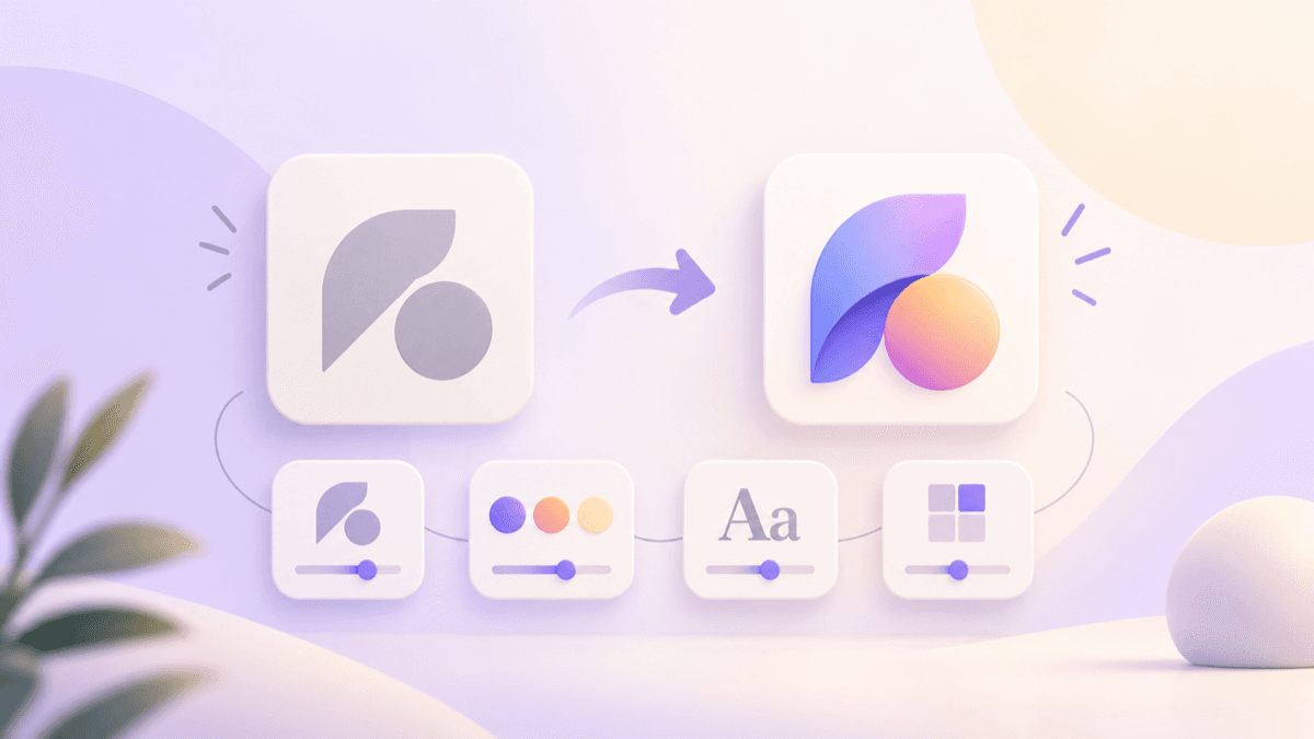
Your logo does not need to be replaced simply because design trends change. But when it no longer represents the business you have become—or fails in the places customers encounter it—a thoughtful redesign can make the brand clearer, easier to use, and more memorable.
A logo redesign updates an existing mark while preserving the recognition you have already earned. It can be as focused as simplifying a crowded icon or as broad as revisiting the typography, colors, layout, and overall visual direction. The goal is not novelty for its own sake. It is to give the business a logo that works now and can keep working as the business grows.
When is it a good idea to redesign a logo?
The strongest reason to redesign is a practical or strategic problem, not boredom. Your customers may know the old logo, but the business may have changed its audience, offer, tone, or ambition. A mark created for a small local service can feel too informal for a national audience. A design made before mobile-first marketing may become illegible in a profile image.
Here are seven signs it may be time to revisit it.
1. Your business has changed direction
A new product line, market, audience, or positioning may need a different visual signal. If the original logo describes what you no longer sell or implies a personality you have outgrown, the gap can create confusion.
Start by defining what should remain recognizable and what needs to change. LogoAI Brand DNA can help organize your audience, positioning, personality, voice, mission, and vision before you make visual choices. Treat its suggestions as a starting point and edit them until they match the business you are building.
2. The logo is difficult to read at small sizes
Detailed illustrations, thin lettering, lengthy taglines, and complicated color treatments often break down in a favicon, mobile header, social avatar, or product label. A redesign can simplify the mark without abandoning the central idea.
Test the existing logo at the smallest size customers actually see. If the name blurs, the symbol becomes unrecognizable, or the design depends on details that disappear, create a compact variation or simplify the original arrangement.
3. Your logo does not work across real applications
A brand does not live only on a white presentation page. It needs to work on light and dark backgrounds, photos, business cards, signage, packaging, digital screens, and social content.
Often the answer is a system rather than one completely new logo: a primary version, a compact layout, a symbol, a single-color version, and a reversed mark. LogoAI Brand Kit can help you explore coordinated color treatments, transparent files, alternative versions, and practical applications from an approved logo.
4. The identity feels inconsistent
When every campaign uses a different palette, type direction, or logo arrangement, customers have fewer cues to connect those touchpoints to the same business. A redesign is an opportunity to make a few core decisions that everyone can follow.
Do not try to make every asset identical. Build a small visual language: approved logo versions, a defined palette, complementary typography, and a clear image style. Consistency makes a young brand look more established and makes an established brand easier to recognize.
5. The logo looks dated for the wrong reasons
Age alone is not a problem. Some marks remain effective for decades because their proportions, typography, and distinctive shapes still work. Redesign when the design no longer reflects your intended position, feels generic among competitors, or relies on visual effects that reduce clarity.
Avoid redesigning only to chase a temporary trend. Strong updates remove friction and sharpen meaning; they do not erase every recognizable feature at once.
6. A merger, name change, or new team requires a reset
Structural changes give customers a reason to expect an updated identity. A redesigned logo can mark the next chapter, provided the rollout explains what is changing and why. Preserve useful equity where you can: a familiar color family, distinctive symbol, or typographic character can help existing customers make the connection.
7. You have outgrown the original file and process
Sometimes the design itself is acceptable, but the files and workflow are not. A blurry raster image, a missing source file, no transparent version, and no guidance for collaborators all create daily friction. Redesigning or carefully rebuilding the system can solve those operational problems as well as visual ones.
How to redesign a logo without losing recognition
Begin with an audit. Collect the current logo files, list where they are used, and note recurring problems. Ask customers and team members what they recognize first: the name, shape, color, or an icon. Those are the pieces to protect unless your strategy calls for a larger change.
Then choose the scope. A refresh may improve spacing, proportions, contrast, or typography while retaining the existing idea. A redesign can explore a new icon, layout, color direction, or style. A rebrand reaches further, changing the strategic story and the identity system around it.
Give each proposed change a reason. “The horizontal lockup remains readable in the navigation bar” is a better criterion than “this version feels newer.” Test candidates in the environments that matter: at small sizes, on dark and light backgrounds, on your website, and beside your actual content.
Explore directions with LogoAI Redesign
LogoAI Redesign gives you a practical way to explore an update from an existing logo rather than starting from a blank page. Upload or paste a PNG, JPG, or WebP logo, choose a refinement direction, and add notes about the parts you want to keep.
The guided directions cover Simplify, Icon, Colors, Typography, Layout, and Style. Use them to ask a focused question of the design:
- Simplify an icon that loses detail at small sizes.
- Test a new color direction while keeping the existing symbol and name.
- Try a horizontal lockup for wide spaces or a stacked version for square placements.
- Explore typography that better reflects a premium, playful, technical, or approachable personality.
- Consider a new style when the current mark no longer fits the business.
Be precise in the notes. For example: “Keep the leaf symbol and the brand-name spelling. Create a simple horizontal layout in a deep green and warm cream palette. Remove the tagline and make the result legible in a mobile header.” Clear constraints help you compare useful options instead of unrelated redesigns.
LogoAI Redesign runs an instruction across multiple AI models, showing different interpretations side by side. Review each result carefully for misspelled lettering, altered symbols, weak contrast, or unintended changes to the brand’s meaning. Keep refining a promising direction rather than accepting the first visually impressive output.
Turn the chosen logo into a durable system
Once you have selected a direction, document how it should be used. The Brand Guideline Generator creates an editable guide with logo usage, colors, typography, personality, voice, mission, vision, and examples. Review and revise the recommendations, then download the PDF for your team, designer, or agency.
The most effective launch is deliberate. Update the website, social profiles, email signature, sales templates, and key customer-facing materials together where possible. If the change is substantial, explain it in a short announcement. Customers do not need a long design lecture; they need a clear sense that the business is evolving while remaining recognizable.
A better logo should make everyday work easier
Redesigning your logo is worthwhile when it removes a real obstacle: poor legibility, an outdated business story, inconsistent applications, or missing files. The right update protects the brand equity you have built while making the next stage easier to communicate.
Start with the existing mark, decide what needs to change, and use LogoAI Redesign to compare focused directions. Choose the version that works across the places your customers actually see—not just the one that looks most different.
Ready to create your own logo?
Turn your brand name into professional logo concepts in seconds with LogoAI.
Generate my logo