-1684899410.jpg)
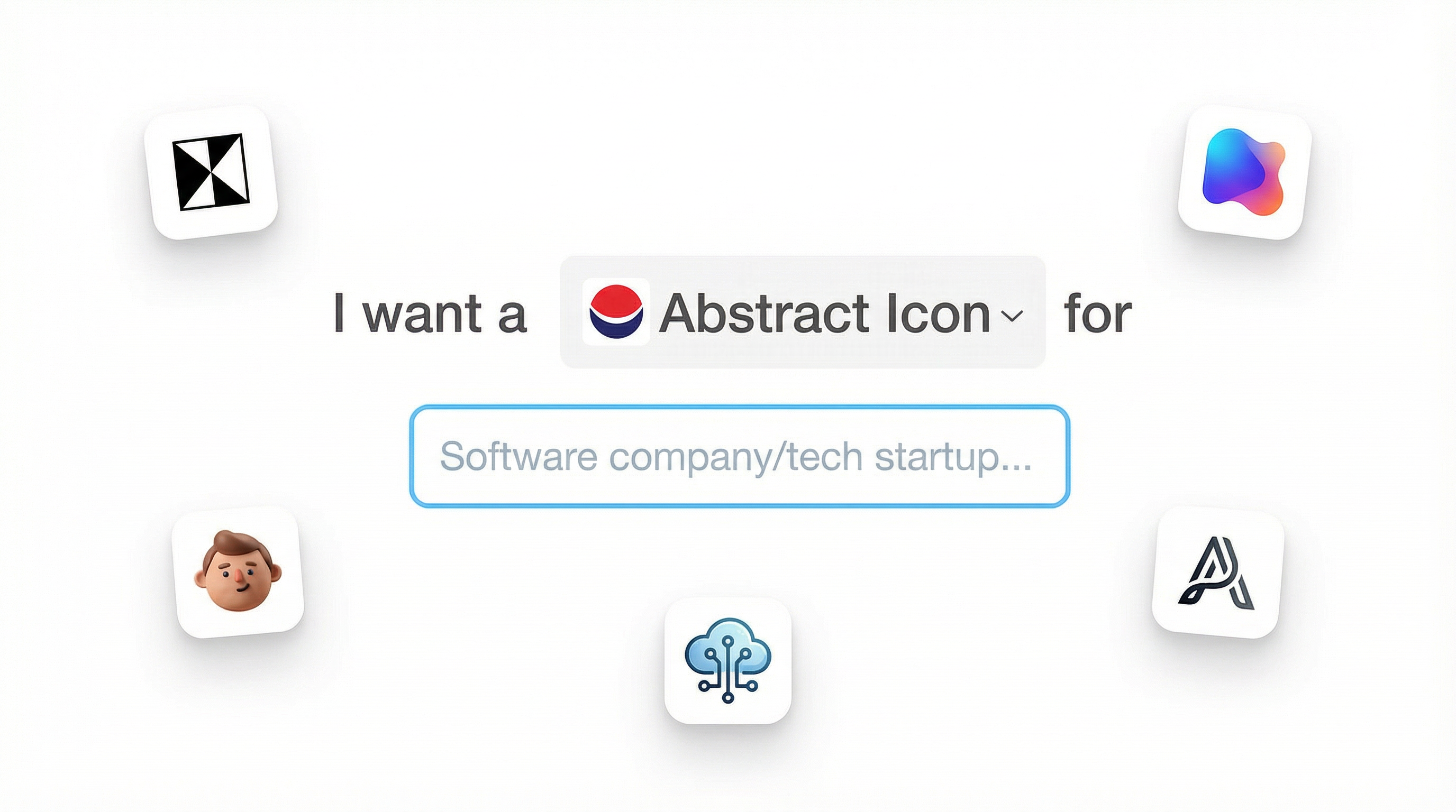
Font pairing, an essential and impactful tool when you design a new logo, with the right font pairings, you can create a visual hierarchy, convey a particular mood or idea, and create a sense of contrast that lends a certain personality to your brand's design. In this blog post, we're thrilled to offer you invaluable insights into how to come up creative logo design using this technique. Let's get started!
Split Your Logo Name Into Two Parts
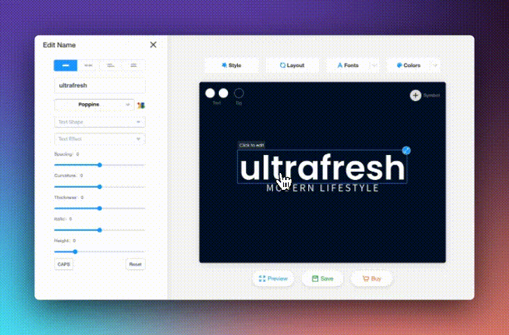
- First, you need to split the name into two parts. To do this, simply click on the "Splitted" option. Once done, you're ready to implement various font pairing techniques to your logo.
- Positioned to the right of the "Split" option, you'll notice additional features such as "Justified" and "Left Align" give you additional control over the text alignment in your logo.
- You can further refine your design by adjusting elements such as text shape, text effect, spacing and more. These options can be found on the left side of the panel.
Now, you're free to choose different fonts and colors for each part of your logo name. Here are some easy-to-follow tips you can try out when pairing your fonts.
💡LogoAI's Design Tip For Logo Font Pairing
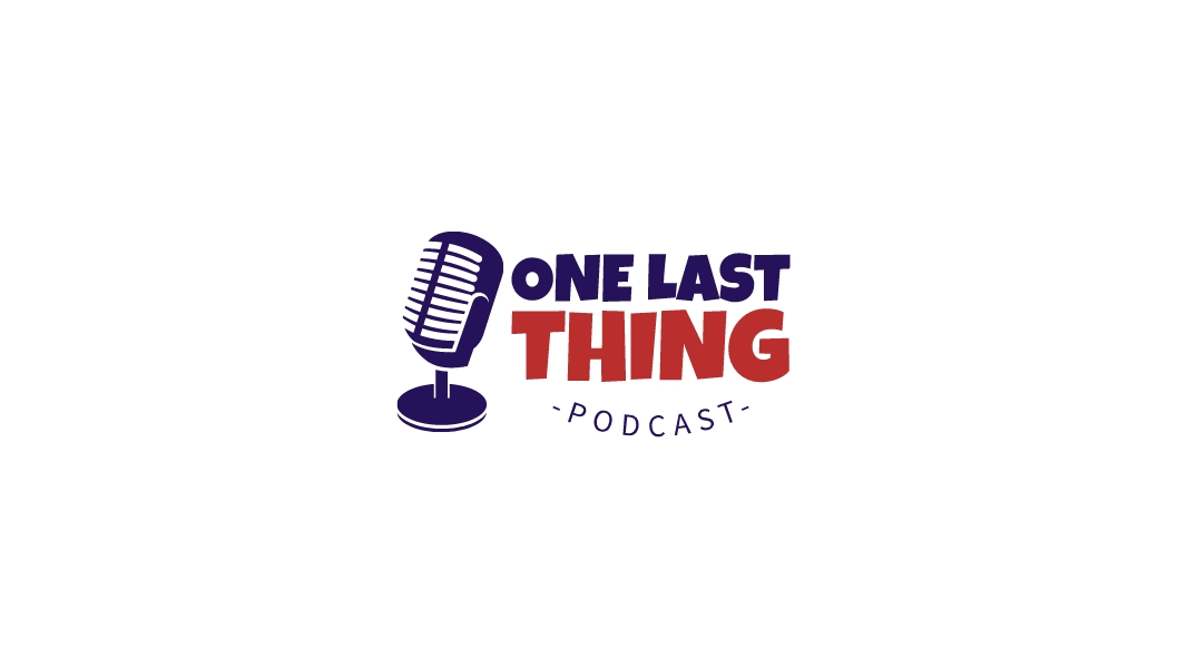
01. Mixing Thick and Thin Fonts
To create visual interest and hierarchy in your logo design, consider mixing thick and thin fonts. Use a thicker, bolder font for the primary text, and a thinner, lighter font for any secondary information . This contrast helps to guide the viewer's eye and emphasizes the most important elements.
 👆Click to edit logo
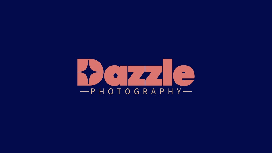
02. Combine A Modern Sans-serif With A Traditional Serif
Pairing different font styles can give your logo a unique look and feel. For instance, you might pair a modern, clean sans-serif font with a more traditional, elegant serif font. The key to achieving balance here is to ensure the fonts complement each other without clashing.
 👆Click to edit logo
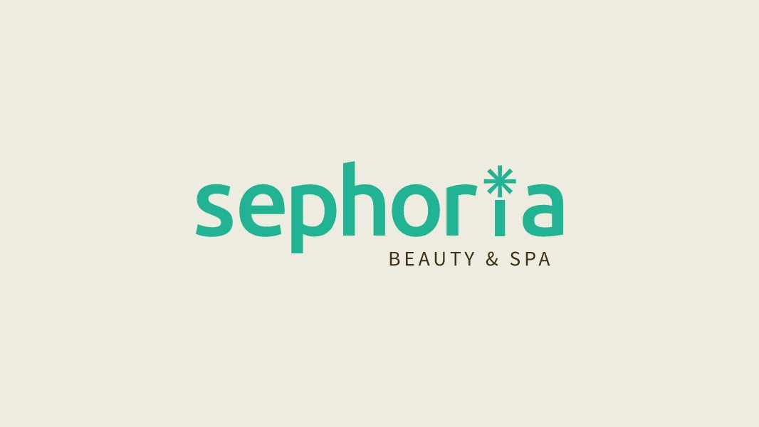
03. Consider Using A Different Color Scheme
Different colors can emphasize particular words or letters, enabling a brand to highlight the most important aspects of their name or slogan. Additionally, color can evoke specific emotions and associations, helping a brand align its image with its intended message.

04. Balance A Special Effect Font With A Standard Font
Special effect fonts make your logo stand out, giving it a unique personality. But too much can be overwhelming and harm readability. By balancing this with a standard normal font, you get a logo that's both distinctive and clear, perfect for memorable branding without losing its practicality.  👆Click to edit logo
05. Experiment With Different Font Sizes.
Use a Larger Font for Primary Messages and a Smaller One for Supporting Text. This creates an appealing contrast and draws attention to the key points. Go ahead, be bold and have fun!  👆Click to edit logo
Wrap Up
So, wrapping up, think of LogoAI as your toolkit to create awesome logos. By exploring a balance between different fonts, colors, and sizes, you open up a world of creative possibilities. LogoAi now has access to over 1500 Google Fonts, giving you plenty of choices for your designs. The real secret sauce here is balancing everything just right. Don't sweat it, because that's where the fun is. So go ahead, mix things up a bit and see what you come up with. Enjoy designing with LogoAI!