As a small business owner embarking on the journey of branding, one of the first steps is designing a logo. Among the various types of logos, a wordmark logo is a popular choice. In this comprehensive guide, we'll delve into what exactly a wordmark logo is, when it's the right choice for your brand, and provide practical tips to design a unique wordmark logo that effectively represents your business.
What is a Wordmark Logo?
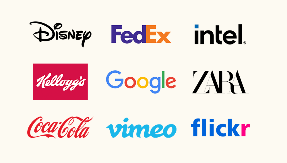
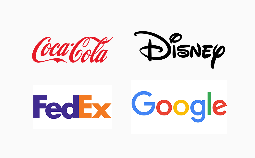
A wordmark logo, also known as a logotype, is a type of text logo that consists solely of the text of the brand name, stylized in a unique and distinctive way. It does not incorporate any symbols, icons, or graphic elements, relying solely on typography to convey the brand identity. Some famous examples of wordmark logos include Coca-Cola, Google, and Disney.
When to Choose a Wordmark Logo
New Brand Launch: When launching a new brand, especially when you come up with a unique brand name, a wordmark logo can help establish immediate recognition and create a strong impression in the minds of potential customers. This is particularly important when considering product launch ideas, as a strong brand foundation can significantly impact the success of your new offerings.
Clarity of Brand Name: If your brand name is concise, clear, and easy to remember, a wordmark logo can effectively showcase the name and reinforce brand identity without the need for additional symbols or imagery.
Typography Emphasis: When your brand identity relies heavily on a particular font or typography style to convey a specific message or aesthetic, a wordmark logo allows you to highlight these typographic elements and create a cohesive visual identity.
Digital Presence: In today's digital age, where online visibility is crucial, a wordmark logo can enhance search engine optimization (SEO) efforts by prominently featuring the brand name in text form, making it easier for potential customers to find and remember your brand online. Additionally, businesses looking to grow their presence on social media often explore strategies like engaging content, influencer marketing, and even choosing to buy Insta followers to boost their initial reach.
Cost-Effectiveness: For startups and small businesses with limited resources, a wordmark logo can be a cost-effective branding solution, as it often requires less design complexity and can be easily adapted for various marketing materials and digital platforms. If licensing your logo, use a royalty agreement template to protect your design and ensure fair compensation. Resources like Freshdox provide such templates.
Tips to Design a Unique Wordmark Logo
Let's look at five simple ways to design a wordmark logo that grabs attention.
1. Find the Right Typeface
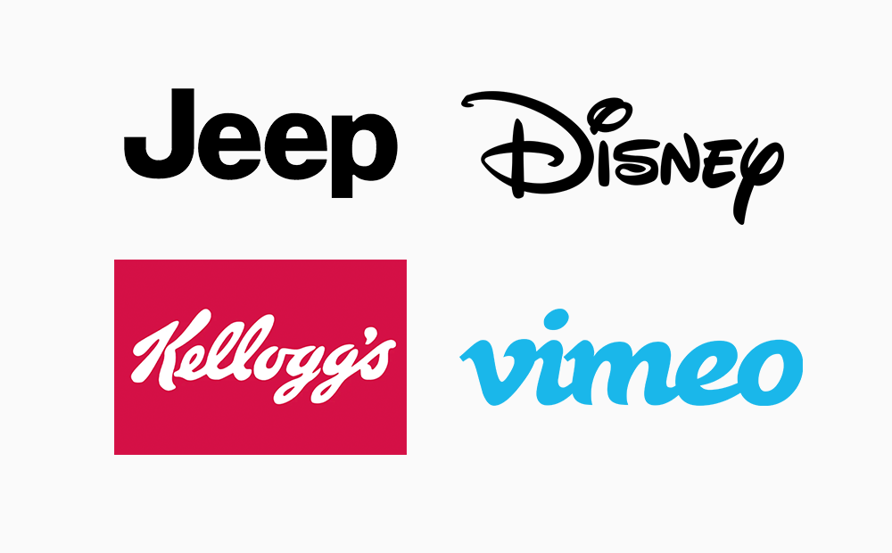
Selecting the appropriate typeface is crucial for conveying the right tone and personality of your brand. Consider factors such as readability, uniqueness, and alignment with your brand identity. For instance, H&M's typeface is clean and modern, reflecting the brand's focus on fashion and trends. Jeep's typeface, on the other hand, is bold and rugged, mirroring the brand's adventurous and outdoor-oriented image. The typeface conveys strength and durability, qualities associated with Jeep vehicles. Vimeo's typeface is sleek and contemporary, reflecting the brand's focus on creativity and innovation. Overall, selecting a typeface that aligns with your brand's values and resonates with your target audience is essential for creating a strong brand identity.
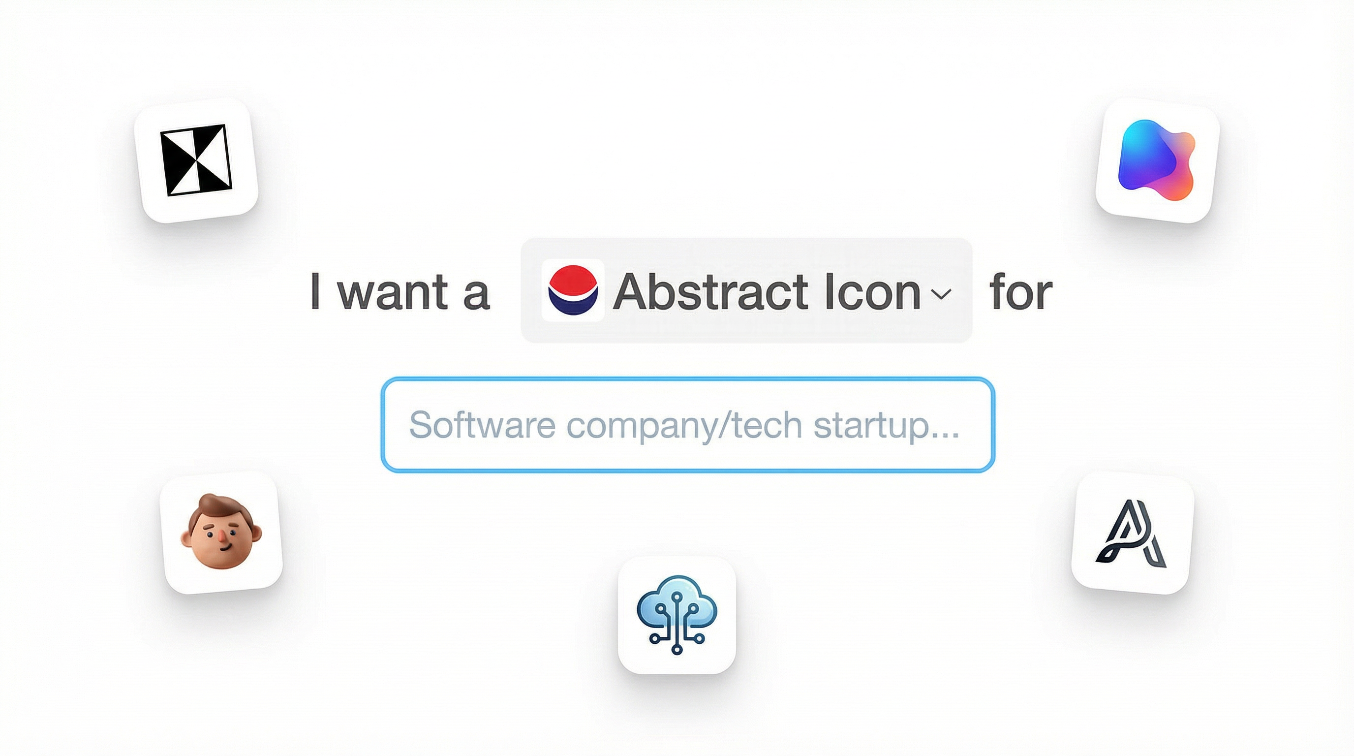
👇Click the image below to create a similar logo of your own.
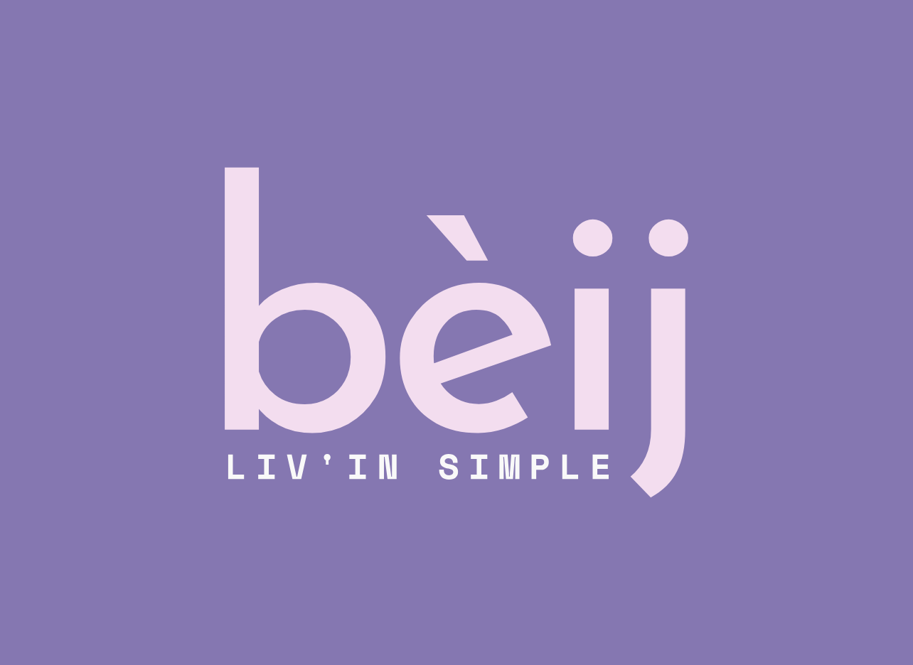
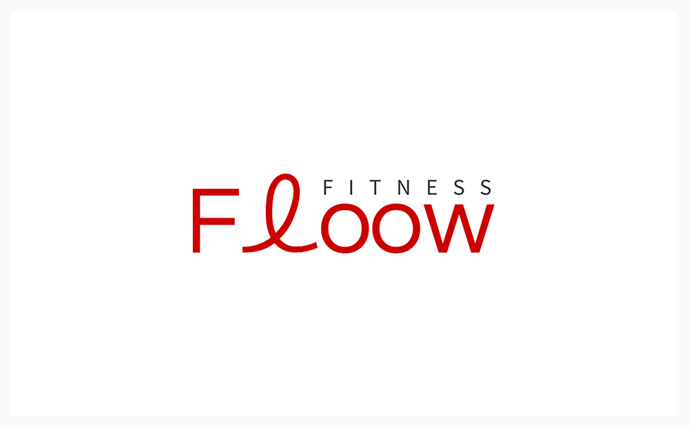
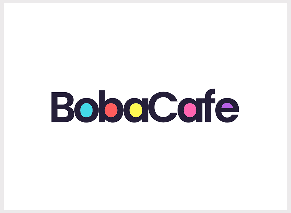
2. Use A Special Alternative Letter
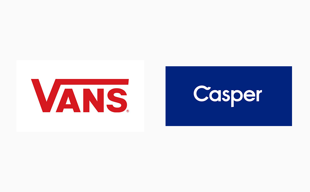
In the world of logo design, a special alternative letter can elevate a brand from ordinary to extraordinary. Consider the iconic swoosh in the "C" of the Casper logo or the exaggerated "V" in the Vans logo — these distinctive elements make the logos instantly memorable.
Sometimes, all it takes is one special letter to transform a mundane typeface into a captivating font. This element of surprise captures attention and leaves a lasting impression on viewers. Whether it's a playful curl, a decorative flourish, or an exaggerated form, unique characters add personality and flair to a logo, setting it apart from the competition.
👇Click the image below to create a similar logo of your own.
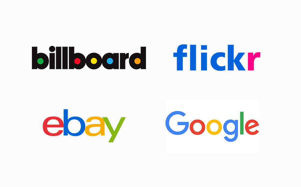
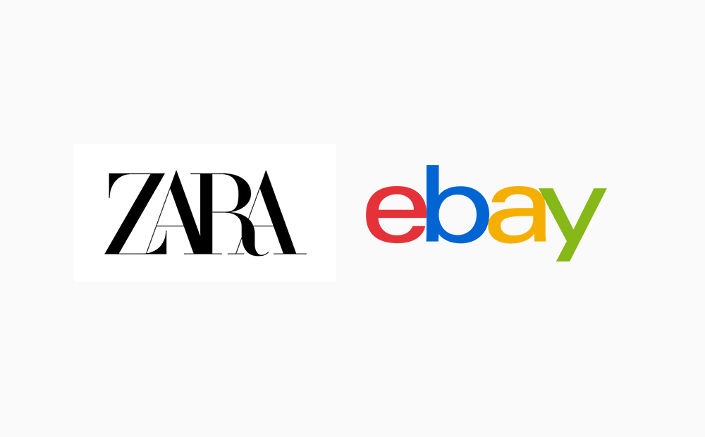
3. Multicolored Logo Design
Creating a stunning minimalist logo doesn't always require complex design skills. For instance, the iconic Billboard logo, which utilizes a minimalist approach but adds a touch of brilliance by filling in the white space with vibrant colors. This simple yet effective technique not only enhances the visual appeal but also makes the logo instantly recognizable. Similarly, the Flickr logo achieves a minimalist look by keeping the design concise and clean. However, it cleverly incorporates the brand's signature pink color into the letter "r," adding a pop of color that highlights the brand identity.
These examples demonstrate that a memorable logos can still be impactful with strategic use of simple logo color highlights. By carefully choosing where to add a splash of color or a subtle accent, you can create a logo that leaves a lasting impression while maintaining a minimalist aesthetic. It's all about finding the perfect balance between simplicity and visual interest.
👇Click the image below to create a similar logo of your own.
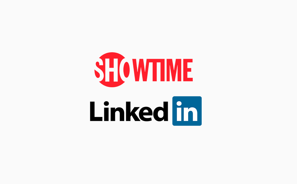
4. Incorporate Shapes
In the realm of wordmark logos, designers often leverage logo shapes to infuse visual interest and enhance brand recognition. One striking example is the logo of Showtime, where the first three letters "SHO" are encased within a red circle. By reversing the color scheme to create a negative space logo, Showtime creates a dynamic and distinctive visual effect. This strategic use of a logo shape not only adds a layer of depth to the design but also gives the logo a unique identity that sets it apart from competitors. Similarly, LinkedIn, despite being a one-word company name, employs a clever use of a logo shape to make its mark visually distinctive. Surrounding the letters "in" with a blue box not only adds a splash of color but also serves as a visual representation of connections within one's industry. By thoughtfully integrating shapes into wordmarks, designers can create logos that not only stand out but also convey deeper meanings and associations relevant to the brand's identity and values.
👇Click the image below to create a similar logo of your own.
5. Play with Letter Spacing and Letter Case
Letter spacing, particularly kerning, is crucial for achieving a visually appealing and readable design. Kerning refers to the adjustment of spacing between individual letters to ensure optimal balance and harmony within the wordmark. Determine whether you want some or all of your letters to touch. Adjusting the kerning allows you to control the proximity between letters, whether you prefer a tightly spaced, overlapping look for a cohesive appearance or a more open, airy feel for clarity and legibility. Consider how the weight and angle of your chosen font affect spacing. Different typefaces have varying characteristics, such as thin or bold strokes, slanted or upright angles, which can influence how letters interact with each other. For instance, a bold font may require wider spacing to prevent overcrowding, while a script font may benefit from tighter kerning to maintain fluidity and coherence. Pay attention to the overall balance of negative space between letters, ensuring that no particular area feels too crowded or sparse. Consistent kerning contributes to a polished and professional appearance, elevating the overall quality of your logo design.
👇Click the image below to create a similar logo of your own.
Conclusion
Designing a wordmark logo for your small business is an exciting opportunity to establish a strong brand identity and make a memorable impression on your audience. By following the tips outlined in this guide and carefully considering the unique aspects of your brand, you can create a distinctive logo that sets your business apart and lays the foundation for successful branding endeavors.