In the world of design, negative space is a clever trick that can make a huge difference in your creations. By strategically using empty space, you can add depth, intrigue, and memorability to your logos. In today's post, we're sharing some inspiring examples to help you up your game and so you can create your unique negative space logo.
What's Negative Space Design?
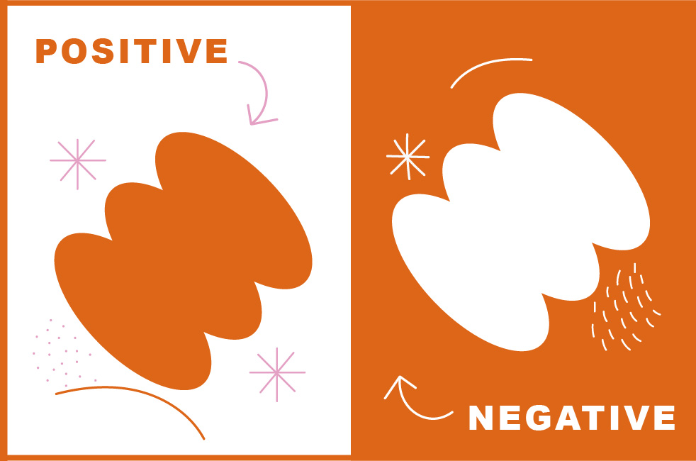
Negative and positive space work together in design to create balance and catch the eye. Positive space is the main subject, while negative space is the empty area around it. Using negative space creatively adds interest to your design, making it look cooler and highlighting the main subject. It's like the background that surrounds shapes, text, or images, and helps your design stand out.
In logo design, by using negative space cleverly, you can create unique logos that stand out and stick in people's minds. Here are 5 cool examples to inspire you with negative space in logo design.
💡Hidden Icon
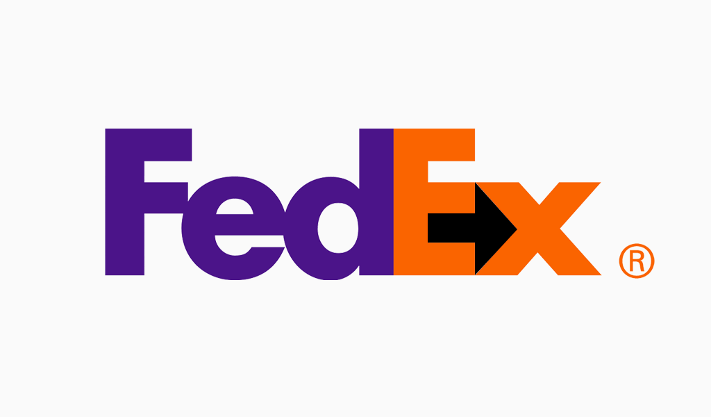
The FedEx logo features a negative arrow icon hidden between the "E" and "x", symbolizing forward movement and efficiency.
💡Combine positive and negative space.
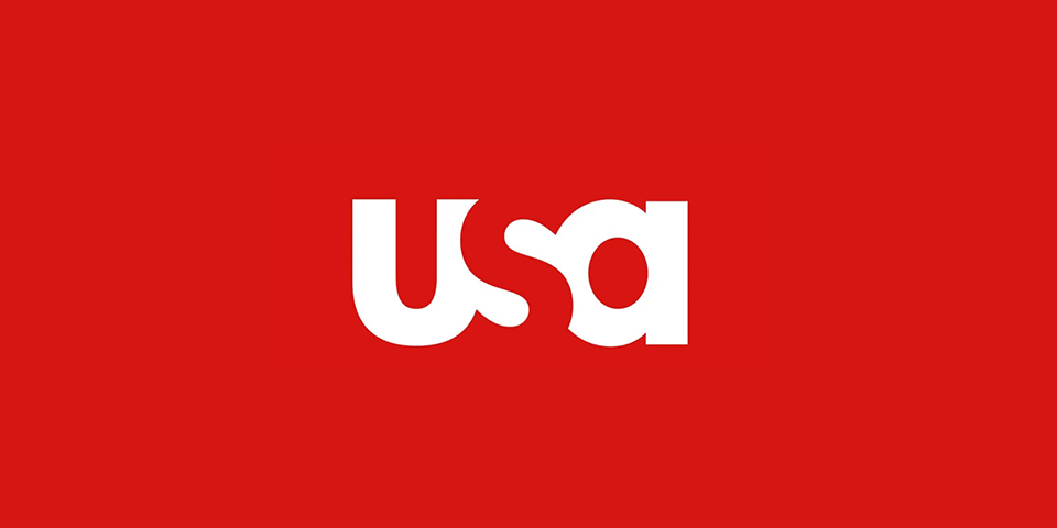
The USA Network logo cleverly combines positive space with the letters "U" and "A," and negative space to form the "S." This creative design highlights the interaction between both types of spaces, making the logo memorable and easily recognizable.
💡From closure
The Beats logo, which represents the popular Beats by Dre headphones, utilizes negative space to create the iconic letter 'b.' This clever use of negative space not only makes the logo easily recognizable but also adds an element of sophistication and minimalism that makes it stand out from the crowd. 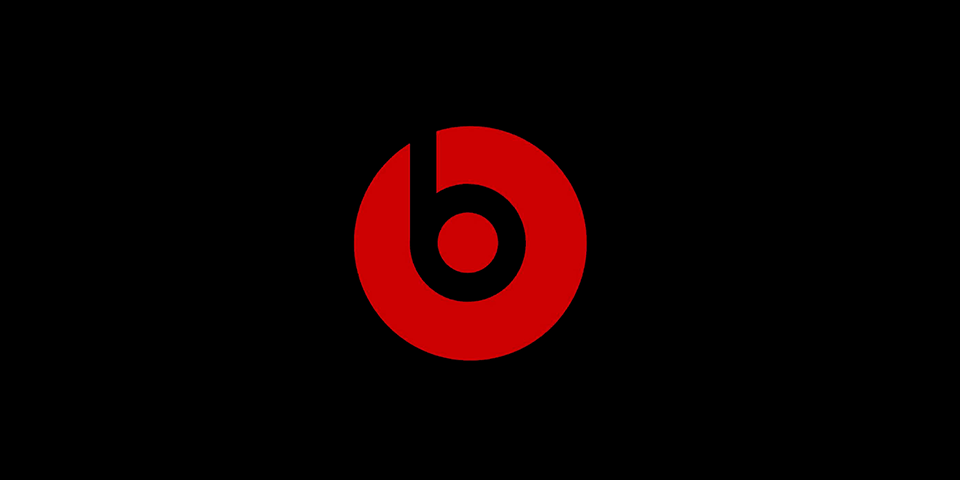
💡Double Entendre
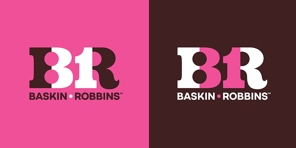
The Baskin-Robbins logo utilizes negative space design to create a visual double entendre. The letters "B" and "R" in the logo are arranged to resemble number "31," representing the brand's famous 31 flavors of ice cream. The empty space between the two letters creates the number "31" and adds a clever and memorable aspect to the design.
💡Overlap and Subtract
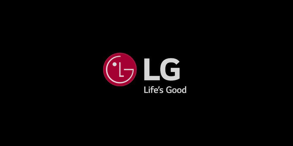
The LG logo combines the letters "L" and "G" with overlap and subtractive negative space design to form the shape of a smiling face, representing the brand's commitment to customer satisfaction and happiness.
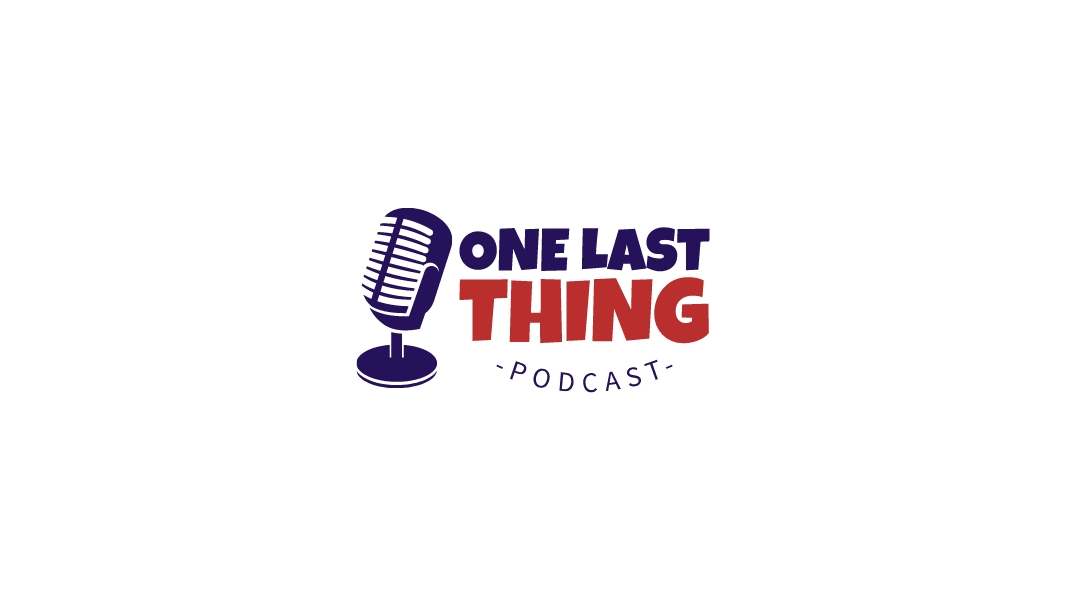
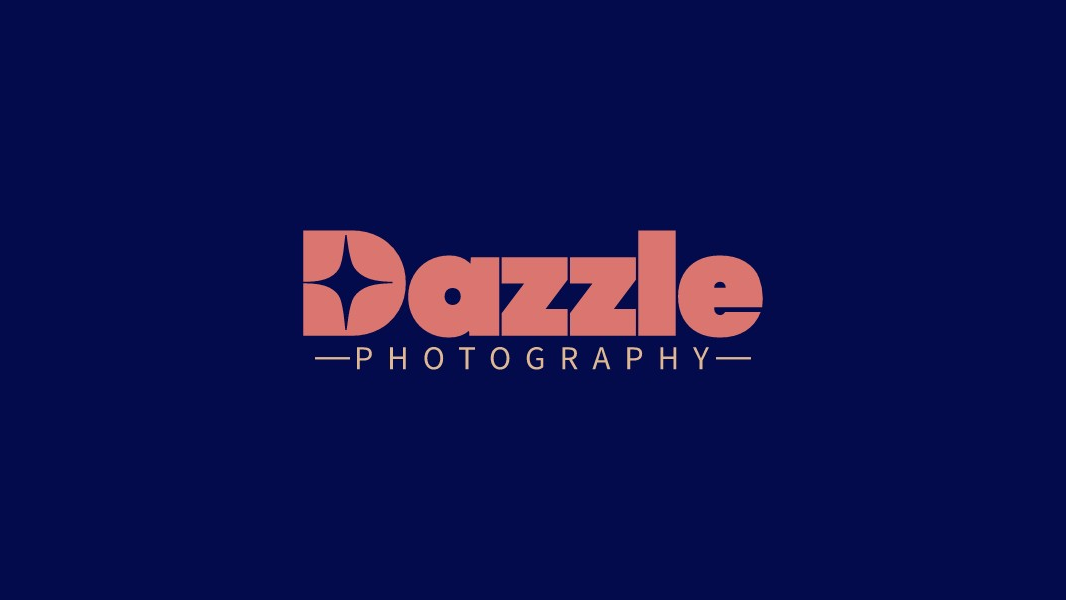
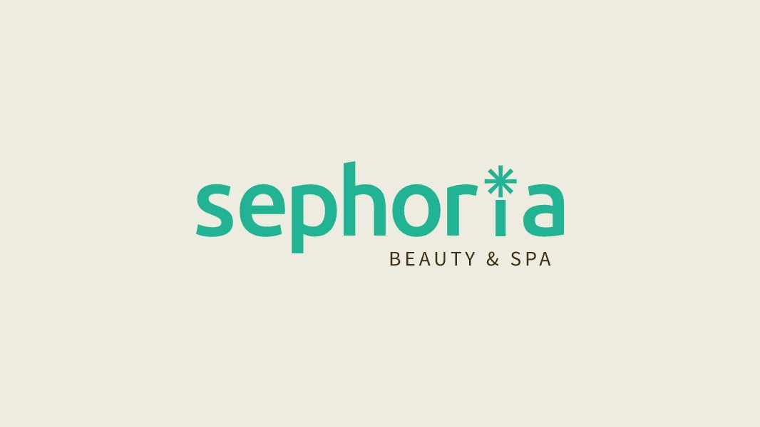
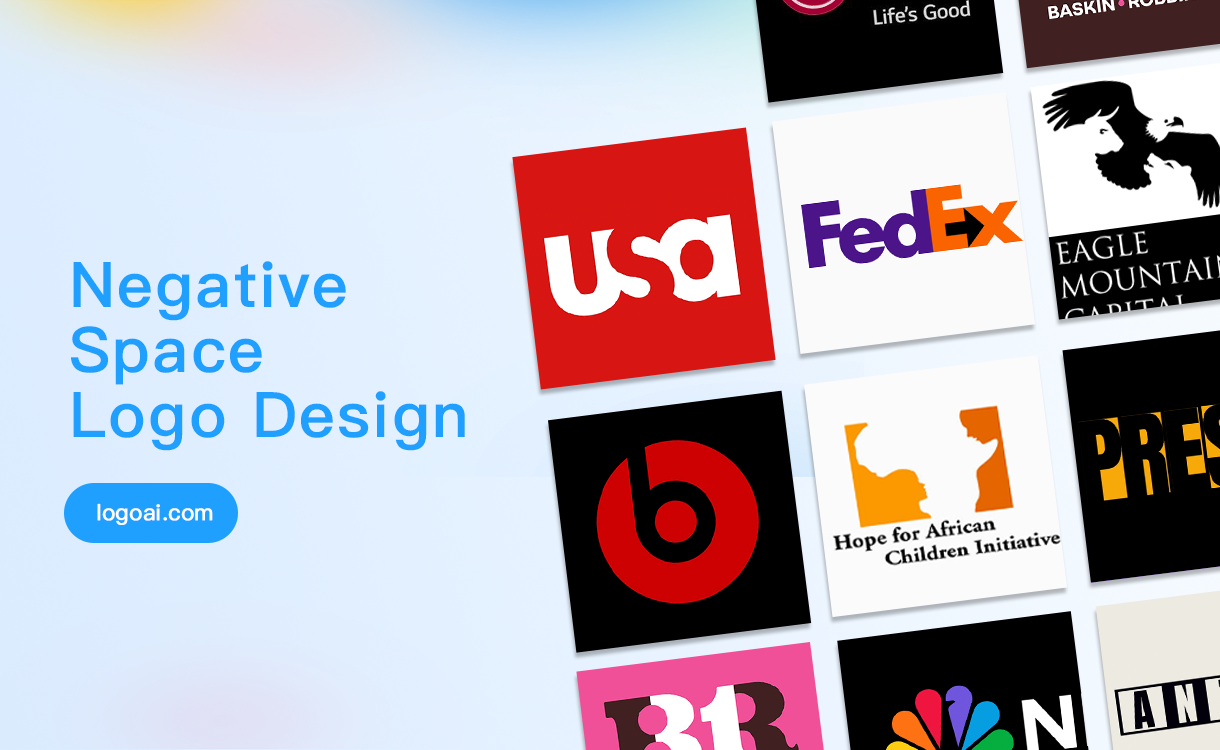
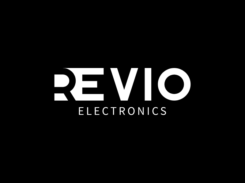
Negative Space Logo From LogoAI
You've seen some great negative space logo examples. So, If you want to create your own negative space logo, you can use teh following negative space logo templates to generate your own in matter of seconds.
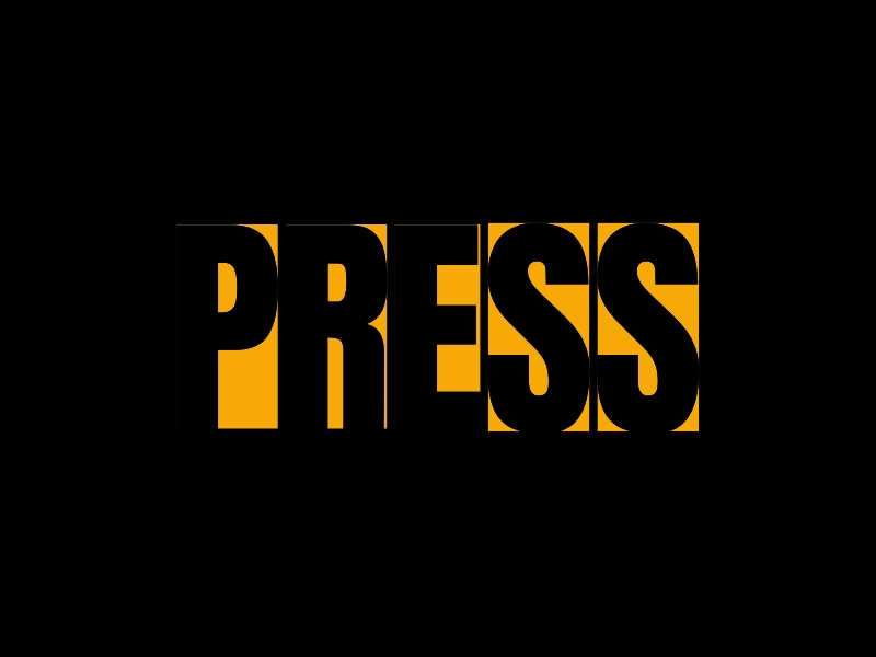 👆 Click to use this negative space logo templates
 👆 Negative space logo (single letter)
 👆 Negative space font logo template
when you're tackling your next logo project, keep this powerful technique in mind, find hidden meanings or shapes, by incorporating this subtle yet impactful element, and don't forget to experiment with our logo generator - it could be the secret sauce that takes your design to new heights!