In the fast-paced world of social media, change is a constant. Platforms evolve, trends come and go, and even the most iconic logos can undergo surprising transformations. For example the rebranding of Twitter's logo from the beloved blue bird to the enigmatic "X."
In this blog post, we'll embark on a fascinating journey through the history of Twitter's logo branding, tracing its evolution from the early days of the platform to the current "X" era. Whether you're a Twitter aficionado, a casual user, or simply someone with an interest in graphic design and branding, this post will provide you with valuable insights and a newfound appreciation for the power of logo evolution. Get ready for an exciting ride!
The Story of Twitter
Twitter, the social media powerhouse that has revolutionized the way we communicate and share information, began as a humble side project back in 2006. Jack Dorsey, Noah Glass, Biz Stone, and Evan Williams, a group of ambitious entrepreneurs, had a vision for a platform that would allow users to share short status updates with friends and followers. Little did they know that their creation would grow into one of the most influential and widely-used social networks in the world.
In the early days, Twitter faced its fair share of challenges, from web server crashes to skepticism about the platform's long-term viability. However, as more and more people discovered the power of Twitter's real-time, bite-sized business communication, the platform's user base began to skyrocket. Over the years, Twitter has become a go-to source for breaking news, celebrity interactions, political discourse, and global conversations. It has played a significant role in shaping world events. Today, with hundreds of millions of active users and a market valuation in the billions, Twitter has solidified its position as a true social media giant, forever changing the landscape of online communication. With social media scheduling platforms streamlining Twitter management, the platform remains a significant force in online communication.
Twitter Logo Design History
From its humble beginnings as a simple text-based logo to the iconic blue bird and the recent controversial "X" rebrand, Twitter's logo evolution reflects the company's growth, changing identity, and vision for the future.
Twitter(Twttr) Logo - 2005
The very first Twttr logo featured the company name in a quirky, bubbly font, with each letter in a different color. The overall look was playful and a bit rough around the edges, reflecting the experimental nature of the project. While this logo never saw the light of day on the public platform, it serves as a reminder of Twitter's humble beginnings and the journey the company's visual identity has taken over the years.
First Official Twitter Logo - 2006
In 2006, as Twitter prepared to take flight into the public sphere, the company knew it needed a strong visual identity to accompany its innovative platform. The task of creating Twitter's first official logo fell to designer Linda Gavin, who, along with her team, had just a matter of days to craft a design that would capture the essence of the budding social media platform. The result was a charming, cartoon-like bird, perched atop the Twitter wordmark. This playful mascot, affectionately known as "Larry the Bird," brought a sense of warmth and personality to the brand. With its tuft of feathers and wide, friendly eyes, Larry became an instant hit, helping to establish Twitter as a welcoming and engaging space for users to share their thoughts and connect with others.
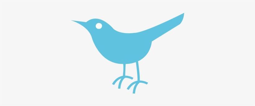
The Twitter Bird Icon - 2006 to 2012
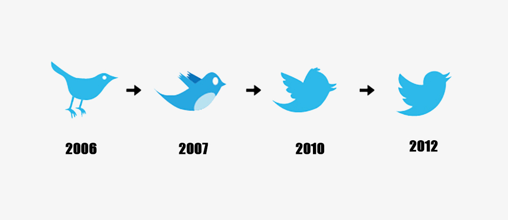
From 2006 to 2012, Twitter's logo underwent a gradual yet significant transformation, with the bird icon taking center stage.
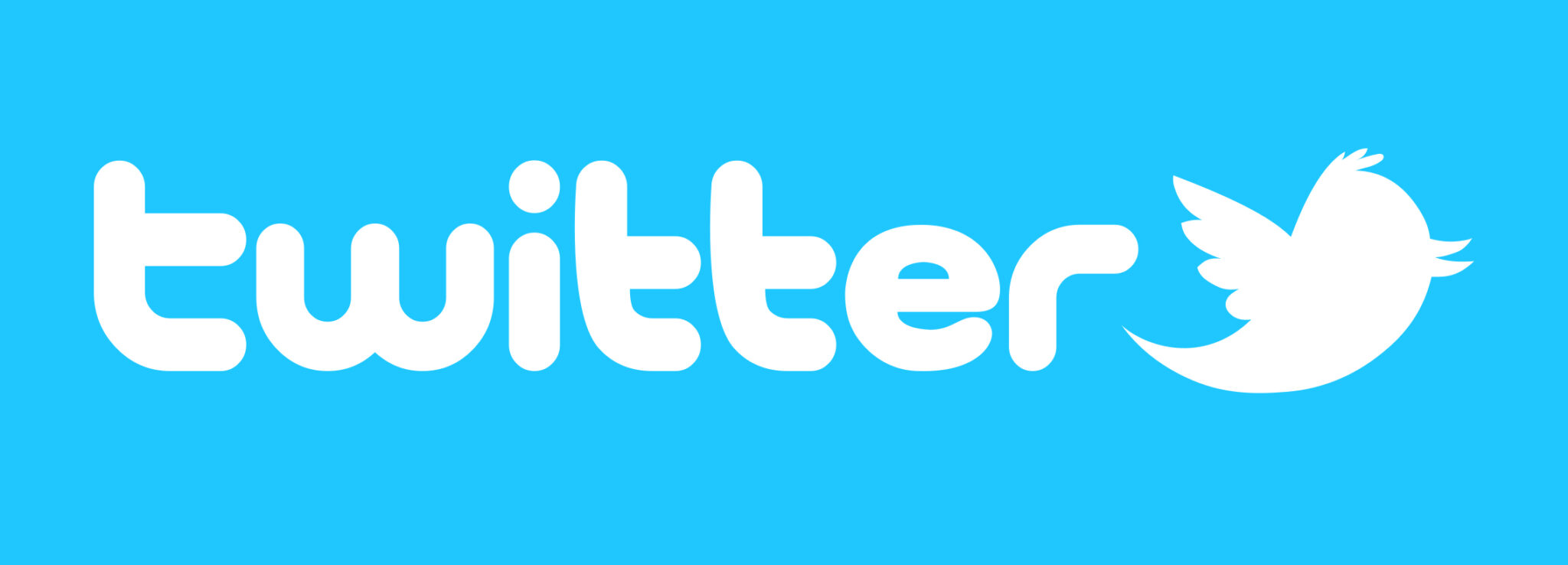
They took the basic blue wordmark and added a new element that would become synonymous with the brand: the Twitter Bird. This little blue bird, affectionately named "Larry the Bird" after NBA legend Larry Bird, started out as a simple logo symbol used alongside the Twitter wordmark. Larry had a playful, cartoonish look, with a tuft of feathers on his head and wings spread wide, ready to take flight. Over time, Larry became more than just a sidekick – he grew into a symbol of Twitter's unique voice and personality. As Twitter's popularity soared, so did Larry's status as the face of the brand. The addition of the bird icon marked a significant shift in Twitter's visual identity, setting the stage for the bird to eventually take center stage in the company's logo.
Twitter Logo - 2012 to 2023
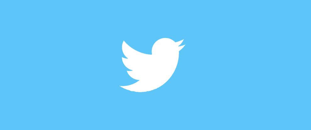
Twitter's most significant logo redesign came in 2012 when the wordmark was removed, leaving only the bird. Larry was stripped of all unnecessary details, reduced to a simple, sleek silhouette ascending skyward. This refined morden logo underscored Twitter's mission to be a platform of simplicity and freedom of speech, with the bird's upward trajectory suggesting limitless possibilities.
The Twitter bird's timeless charm and relevance symbolize the brand's journey, growth, and commitment to providing a platform for meaningful conversations.
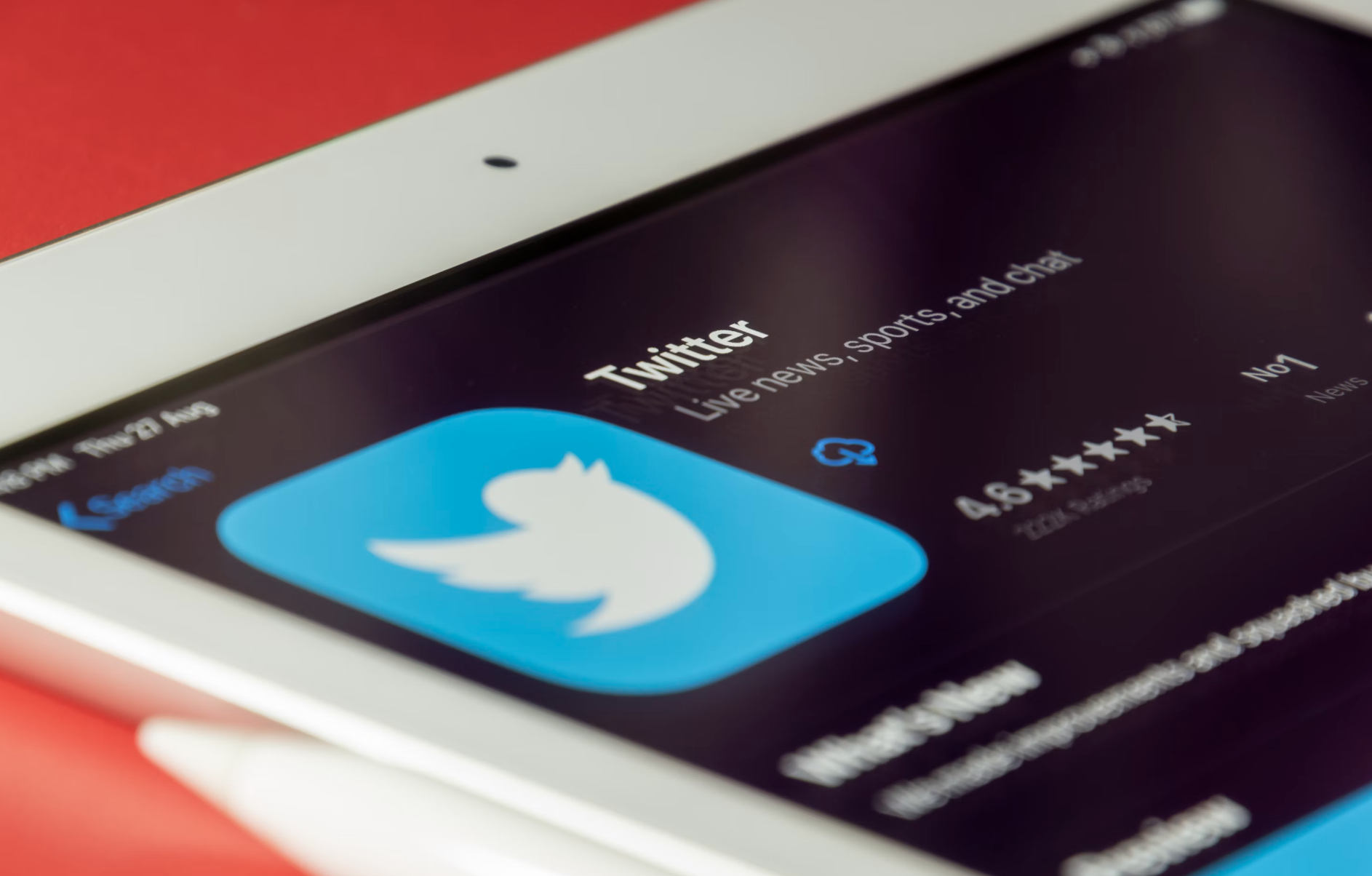
Elon Musk's X Logo - 2023 to Present
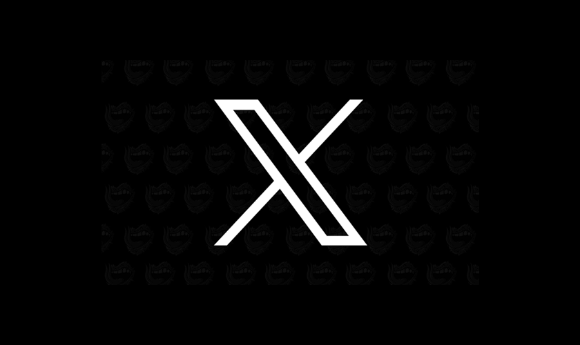
In a bold and unexpected move, billionaire entrepreneur Elon Musk acquired Twitter in 2023, setting the stage for a dramatic logo redesign that would shake up the social media world. Musk, known for his innovative and often controversial approaches to business, wasted no time in putting his stamp on the platform. The most striking change came in the form of a complete overhaul of Twitter's iconic logo. Gone was the familiar blue bird that had become synonymous with the brand, replaced by a sleek, minimalist "X" symbol. Check out X's brand guidelines for a more conceive understanding.
This new logo, a simple yet powerful representation of Musk's vision for the future of Twitter, signaled a major shift in the twitter management and the company's identity and direction. Some users and branding experts were initially skeptical of the change, questioning whether such a radical departure from the established logo was necessary or wise. However, Musk's track record of successfully disrupting industries and challenging the status quo helped to quell doubts and generate excitement around the rebrand. As Twitter continues to evolve under Musk's leadership, the striking "X" logo serves as a constant reminder of the company's commitment to innovation, adaptation, and pushing boundaries in the ever-changing landscape of social media.
Comparing to the Previous Logo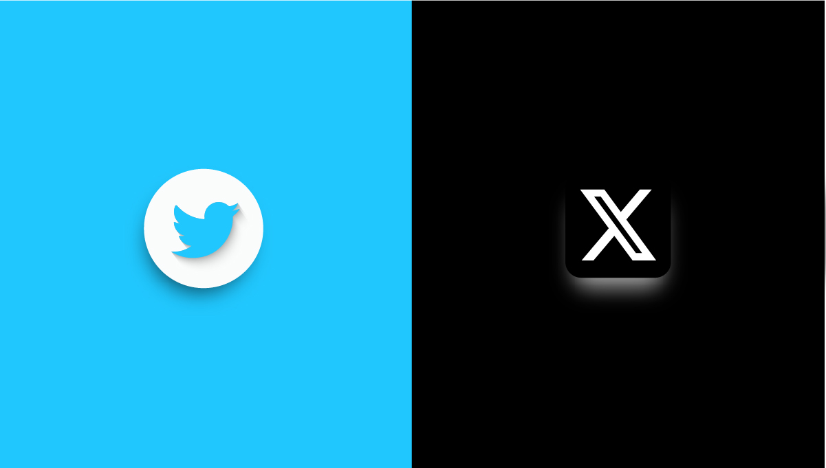
When comparing the previous Twitter bird logo to the new "X" logo introduced by Elon Musk, it's clear that the two designs represent vastly different approaches to brand identity. The iconic blue bird, which had been a staple of Twitter's logo for years, was a friendly and recognizable mascot that embodied the platform's core values of openness, communication, and community. Its soft, rounded edges and bright, cheerful color palette conveyed a sense of warmth and accessibility, inviting users to engage with the platform and share their thoughts and experiences.
In contrast, the new "X" logo is a stark departure from this established identity. The minimalist, monochromatic design feels more stark and impersonal, lacking the charm and personality that made the bird logo so beloved. The sharp, angular lines of the "X" suggest a more aggressive, disruptive approach to social media, reflecting Musk's bold vision for the future of the platform.
How Twitter's Rebranding Could Shape Its Future
In today's digital age, having a strong brand identity is super important. Twitter's bold rebranding signals that the company is committed to evolving and being innovative as they aim to shake things up in the social media landscape. The simple "X" logo marks a major shift away from Twitter's past friendly bird image, indicating that a new era of change is coming for the platform.
The "X" branding hints that Twitter wants to break the mold and disrupt what's considered normal for social media platforms. They want to blaze their own trail with an edgy, modern identity. This dramatic new look will undoubtedly impact how Twitter grows and develops its brand messaging, product roadmap, and overall vision going forward. It will be really interesting to see how this assertive visual transformation affects Twitter's carefully crafted brand identity and shapes their future direction in the coming years.