So What Does Red Color Represents In Logos? Red can also be used to evoke positive emotions like happiness, love, and excitement. If you want your brand to be associated with these positive feelings, red is a great color to use in your logo design. The top colors used by brands in their logos are 30% red (Venngage, 2019). Here are 5 Reasons to Choose Red Logos For Your Brand.
1. Red is associated with passion, energy, and excitement
If you want your brand to be seen as dynamic and exciting, red is the perfect color choice. Red logos convey a sense of urgency and can encourage people to take action. Whether you're launching a new product or running a sale, red is a great way to get people's attention.
2. Attention-grabbing
When you see red, it's impossible to look away. The color red is associated with energy, power, and passion - perfect for creating a strong first impression with your logo. A red logo will grab attention and leave a lasting impression on potential customers.
3. Conveys confidence and strength
Red logos convey confidence and strength. They are often used by brands that want to communicate these qualities to their audiences. For example, red is the color of choice for many sports teams and energy drink companies. It conveys a sense of power and vigor that can be very appealing to potential customers.
4. Red is a versatile color that can be used in many different ways.
Red is a versatile color that can be used in a variety of ways in your logo design. Whether you want a simple red logo or something more complex, there are endless possibilities when it comes to using red in your graphic design.
5. Red logos are eye-catching and memorable.
Because red is such a powerful color, red logos are extremely eye-catching and memorable. When people see a red logo, they'll immediately remember your brand. If you want your logo to make a lasting impression, red is the way to go.
Things You Should Know Before Making A Logo Before you jump on creating a logo there are things you should know.
Know Your Brand
What is your brand? What makes you unique and different from other companies or entrepreneurs in this industry? Once we have a clear idea of what our core personality traits are, it will be much easier for you to design an effective logo that can seamlessly align these qualities with your brand!
Choose Your Design Style
Logo design is about translating your company’s personality and vision into a visual representation. There are lots of different elements that come together in the final result, from colors to graphics or typefaces - but it's important not to get overwhelmed when thinking through each component because there isn't one "perfect" option for everyone! Keep going step-by-step with what you like best until something clicks (and make sure this feels right).
It Can Be Lettermark Or Monogram Logos
There are two main types of logos: lettermarks and monograms. Lettermarks are logos that consist of the initials of the company name, while monograms are logos that feature a distinctive symbol or emblem.
Both types of logos can be highly effective in conveying a company's identity and helping to build brand awareness. When choosing a logo for your business, it's important to consider your company's unique personality and objectives. A lettermark may be ideal for a company with a strong name that is looking to create a simple, memorable logo. On the other hand, a monogram may be better suited for a company.
Keep In Mind
● Logos with too many details or complex designs can be difficult for people to recall.
● Your logos should be versatile. They should look good on both digital and print media, and they should be able to be used in a variety of contexts.
● Your logos should be timeless. You want people to still be using them ten or twenty years from now, so avoid any trends or fads that will quickly date your logo.
● Don't forget that your logos are just one part of your overall branding strategy. They should work in harmony with your other marketing materials too.
Read our 3 Quick Ways to Create Your EdTech Startup Logo for a great start up.
Some Outstanding Red Logos
Here are some popular red logos that are millions billions of net worth. You probably know most of them as they might have left an impression on you too.
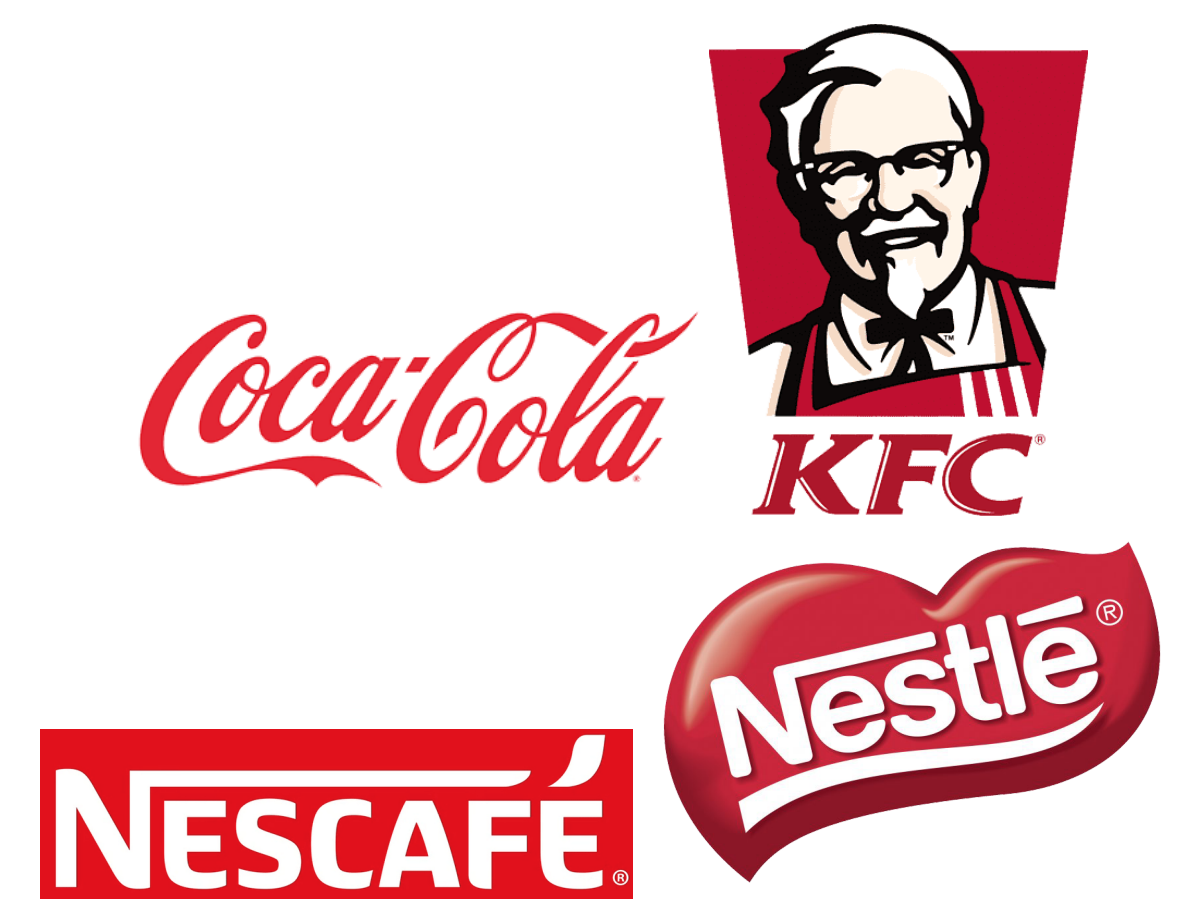
Food And Beverage
The most popular food logo brands use red logos to represent them. And they are skyrocketing, playing in billions. Such as Coca-Cola: $265 billion, Nescafe: $12.3 billion, Burger King: $10 billion, Nutella: $28 billion, Red Bull: $6.31+ billion, Nestle: $93+ billion, and KFC: $5.4 billion.
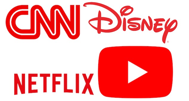
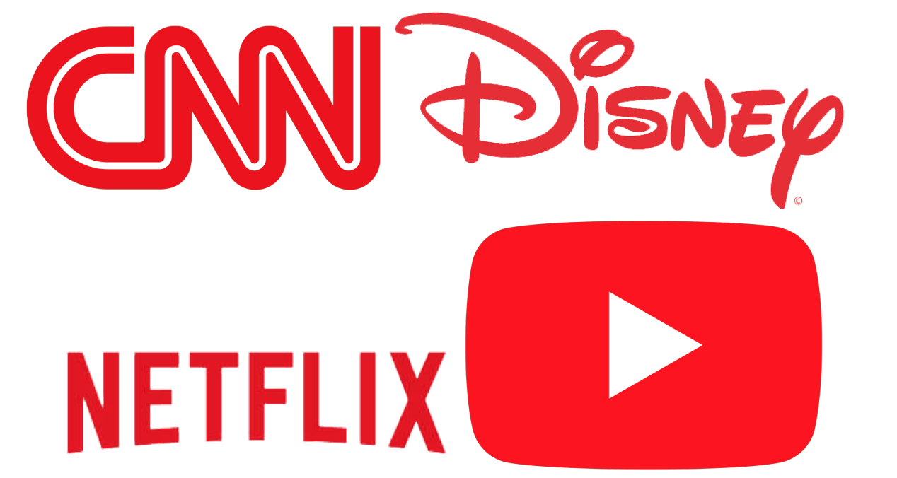
Media Industry
In today's media landscape, red logos are everywhere. From Netflix to TLC, CNN to BBC News, it seems like every major player in the industry is using red in their branding. And there's a good reason for it - red is an eye-catching color that can help brands stand out from the crowd. But red isn't just about being noticed - it also conveys a sense of urgency and excitement. In a media landscape that is constantly changing and evolving, red helps brands look dynamic and alive. In a sea of blue logos, red is a breath of fresh air. So if you're looking to make your mark on the media industry, don't be afraid to go red.
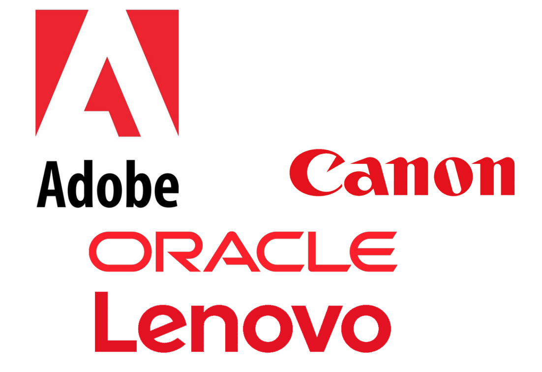
Technology
Even IT sectors and non-IT sectors are following the trend. Red logos are perfect for every brand and it grabs more attention than other colors and mostly, it can be hardly forgotten.
Airlines
This is no coincidence - studies have shown that red is an attention-grabbing color that can help to increase brand awareness. Not surprisingly, a number of airlines have also adopted red logos. Continental Airlines, Air Canada and Turkish Airlines etc are all examples of carriers that use red in their branding. While each airline's logo is unique, the common thread of red helps to create a sense of cohesion and brand recognition. In an industry where competition is fierce, red logos can give airlines a valuable edge.

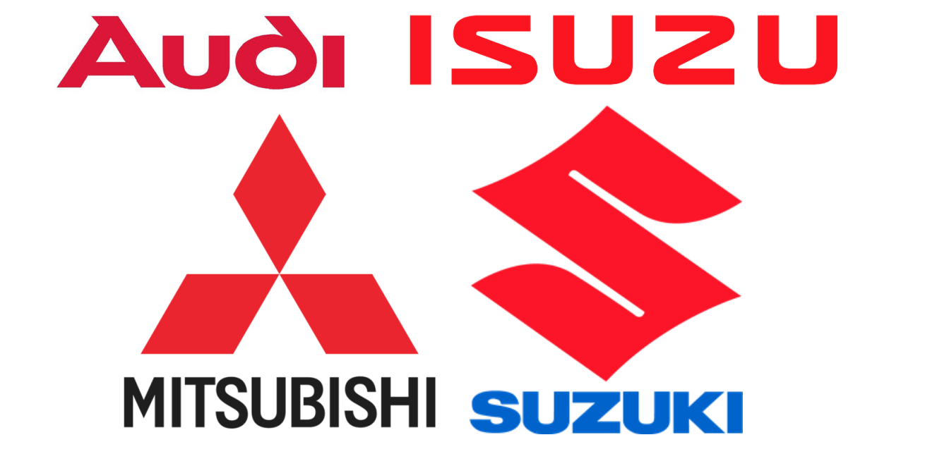
Car Industry
This is no coincidence - studies have shown that red is an attention-grabbing color that can help to increase brand awareness. Not surprisingly, a number of airlines have also adopted red logos. Continental Airlines, Air Canada and Turkish Airlines etc are all examples of carriers that use red in their branding. While each airline's logo is unique, the common thread of red helps to create a sense of cohesion and brand recognition. In an industry where competition is fierce, red logos can give airlines a valuable edge.In the car industry, red logos are often used to signify high-performance or luxury vehicles. For example, Mitsubishi,
Toyota, Suzuki etc use red logos, as do a number of other high-end brands. Red is associated with power and vitality, so it makes sense that carmakers would want to use it to convey these qualities in their brand. In addition, red is a very visible color, so it can help to make a brand more recognizable on
the road. Ultimately, red logos are just one way that carmakers can communicate certain qualities about their vehicles to potential customers.
Cloth Industry
The cloth industry is one of the oldest and most venerable industries in the world. For centuries, apparel logos have used red logos to distinguish their products from those of their competitors. Today, red logos are still a common sight in the cloth industry, and they continue to be an important part of many cloth makers' branding strategies. While red logos are often associated with high-end products, they can also be found on more affordable items. In recent years, red logos have become increasingly popular with younger consumers, who often see them as a symbol of quality and status. Whether you're looking for a luxurious new wardrobe or a simple shirt for your next big event, keep an eye out for red logos. They're sure to add a touch of style and comfort to it.
Best Red Logo Design Combination
Red is one of the most popular colors for logos, and it's easy to see why. Red is Associated with power, energy, and passion, making it an ideal choice for businesses that want to project an image of strength and vibrancy. At the same time, red is also a very versatile color, and it can be used in a variety of ways to create an eye-catching logo. One of the best red logo design combinations is a red and black color scheme. This contrast creates a look that is both dramatic and stylish, and it can be used to convey a wide range of messages. Whether you're looking to create a logo that is bold and attention-grabbing or something that is more subtle and sophisticated, a red works great with some combinations.
Red With White
Red and white make for a powerful combination when it comes to logo design. red is often associated with strength and power, while white represents purity and innocence. Together, they can create a logo that is both eye-catching and memorable. When used together, red and white can convey a message of passion, energy, and confidence. If you're looking to create a logo that will stand out from the crowd, consider using this dynamic duo.
Red With Blue
While there are endless color combinations that can be used for logo design, red and blue is a classic combo that is sure to make a statement. Red is associated with energy, passion, and power, while blue evokes feelings of calm, trust, and stability. When used together, these colors can create a sense of excitement and energy, while also conveying a sense of dependability and security. This makes red and blue an ideal choice for businesses that want to convey both strength and stability. Whether you're looking to create an eye-catching design or convey a message of dependability, red and blue is a great combo to consider.
Red With Yellow
Yellow is also a popular choice for logos, as it conveys happiness and optimism. When combined with red, it creates a cheerful, energetic color palette that is perfect for businesses in a variety of industries. From food and beverage companies to retailers and beyond, red and yellow logos are sure to grab attention and leave a lasting impression. When designing a red and yellow logo, be sure to use high-contrast colors to ensure legibility. And don't forget to have fun with it - after all, these are two of the happiest colors around!
Red with Black
Surprisingly, red and black can work really well together to create a strong and attention-grabbing logo. The two colors compliment each other perfectly, and they can really make a logo pop. Plus, red and black are both classic colors that will never go out of style.
The Risks Of Using Too Much Red In Your Branding
Logos are a critical part of any business's branding. They are often the first thing that customers see, and they can help to convey a company's values and make a lasting impression. However, it is important to use caution when incorporating red into logos or other branding materials. While red is a powerful color that can convey passion and energy, it can also be overwhelming and aggressive. Too much red can be overwhelming for customers and make a company seem unprofessional or even hostile. Just as with SSID (Service Set Identifier) in networking, where a name can influence how a network is perceived, the use of red in logos should be carefully considered. Instead, businesses should consider using red sparingly, reserving it for accents or important elements of their logos. By using red wisely, businesses can create logos that are both eye-catching and professional.
Final Thoughts On Using Red In Brand Design
Red is a powerful color that can evoke strong emotions in people. When used correctly, it can be an incredibly effective tool for branding and marketing.