Logo shapes carry symbolic meanings that can evoke specific emotions and perceptions. The triangle, a fundamental geometric form, holds a unique place in the logo design world due to its distinct visual and psychological associations.
Visual Symbolism of Triangles
Visually, triangles are perceived as strong, stable, and balanced shapes. Their three sides and three angles create a sense of structural integrity and solidity. This visual quality makes triangles an excellent choice for conveying ideas of strength, durability, and stability in design.
Moreover, if you change the orientation of a triangle, triangles can be perceived as dynamic and energetic shapes due to their angular lines and pointed edges. This sense of movement and direction can be leveraged in logos and brand identities to convey a sense of forward momentum, progress, and ambition.
Iconic Triangle Brand Logo Designs
Numerous iconic brands have successfully incorporated triangular shapes into their logo designs, leveraging the visual and psychological associations of triangles to convey their brand identities effectively.
1. Google Drive
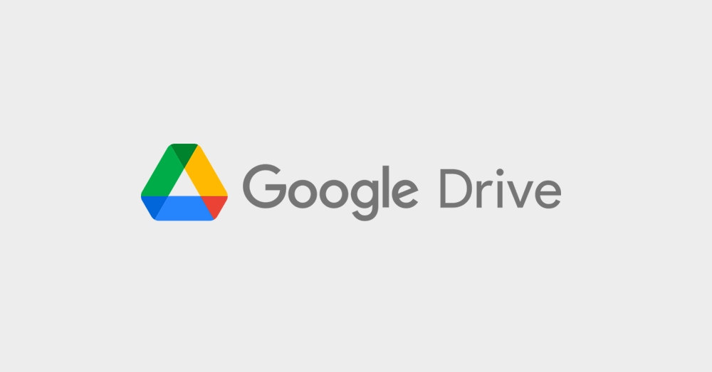
Google Drive's logo features a triangular shape with a vibrant green color and a horizontal line, representing a folded document or file. The triangle's solid and sturdy appearance conveys a sense of security and data protection, which is crucial for a cloud storage service. The geometric simplicity of the design aligns with Google's modern and colorful brand identity.
2. Guess
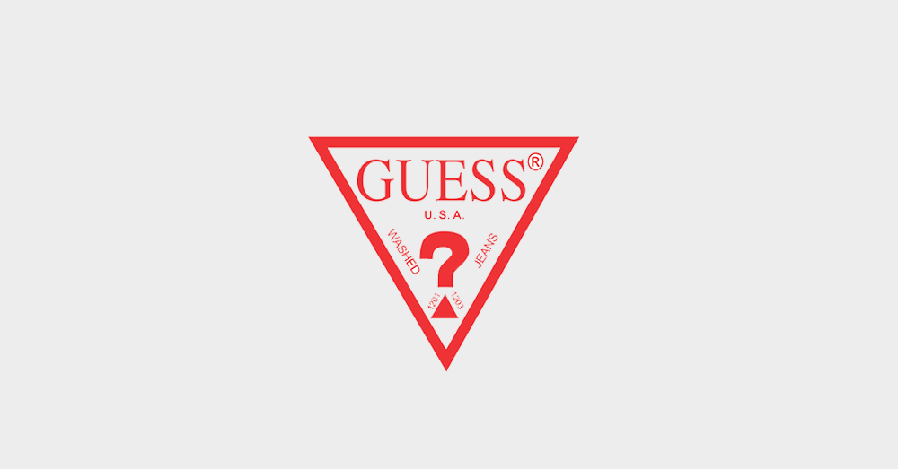
The Guess logo features a distinctive triangular shape with the brand's name enclosed within it. The triangle's bold and angular form conveys a sense of confidence, boldness, and modern style, aligning with the brand's fashion-forward identity. The use of negative space within the triangle creates a visually striking and memorable fashion logo design.
3. Airbnb
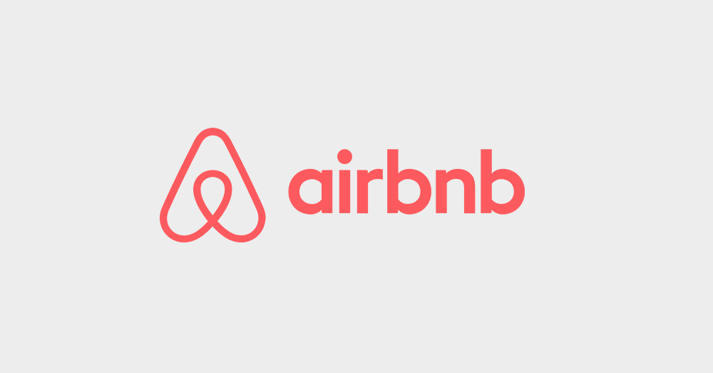
The Airbnb logo features a unique and iconic design that incorporates a triangular shape inspired by the symbol for "belonging." The triangle represents a stylized "A" that also resembles a house or a location pin, symbolizing the brand's focus on providing unique accommodation experiences. The geometric simplicity and recognizable form make the Airbnb logo highly memorable and effective in communicating the brand's essence.
4. Mitsubishi Motors
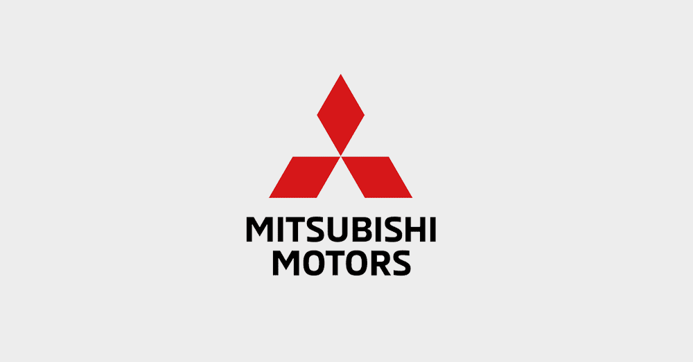
The Mitsubishi Motors logo consists of three diamond-shaped triangles forming a larger, stylized triangle. This design symbolizes the company's core principles: corporate integrity, enduring relationships, and global environmental protection. The triangular shapes convey a sense of solidity, reliability, and forward-thinking innovation, which aligns with the brand's automotive offerings.
5. Delta Air Lines
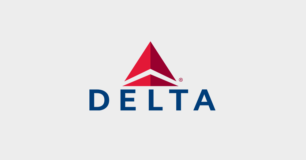
The Delta Air Lines logo features a stylized triangular shape resembling a delta symbol (δ), which represents the mathematical concept of change or difference. This triangular design effectively communicates the brand's commitment to innovation, progress, and seamless travel experiences. The dynamic shape also suggests movement and forward momentum, reflecting the airline's focus on efficiency and global connectivity.
6. Prada
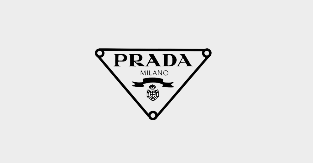
Prada's luxury logo design incorporates a triangular shape as a key element, with the brand's name positioned within the triangle. The clean and minimalist design exudes a sense of sophistication and luxury, reflecting the brand's high-end fashion and accessory offerings. The triangle's sharp angles and precise lines contribute to a sense of elegance and attention to detail.
Incorporating Triangular Shapes into Logo Fonts
While triangles are commonly used as shapes or symbols in logo designs, some brands have taken the innovative approach of incorporating triangular forms directly into their typography.
1. Fila
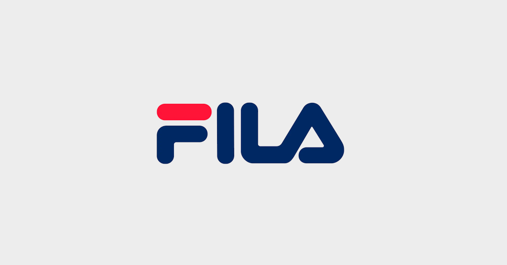
The Fila logo is a prime example of using triangles as the primary elements in the brand's typography. The iconic wordmark logo design features a series of triangular shapes arranged in a distinct pattern, creating a unique and recognizable font style. This design not only showcases the brand's identity but also reflects its athletic and energetic nature through the dynamic and angular letterforms.
2. Vizio
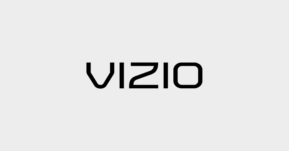
The Vizio logo features a bold, geometric sans-serif wordmark where each letter incorporates triangular shapes and forms. The sharp angles and triangular elements give the typography a modern, edgy feel that aligns well with the brand's focus on cutting-edge electronics and home entertainment products.
Tips for Creating a Triangle Logo
If you're considering incorporating triangular shapes into your brand's logo design, here are some valuable tips to ensure an effective triangle logo design:
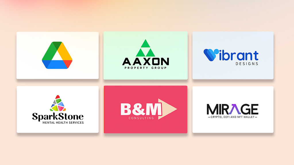
1. Piecing Together a Soft Triangle
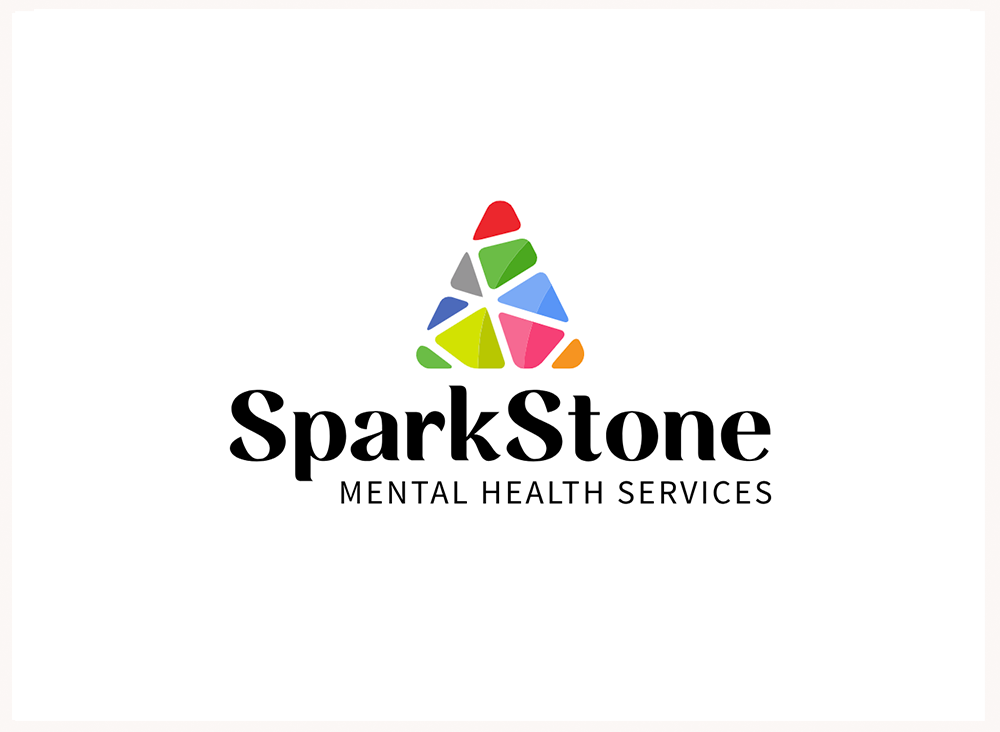
The use of multiple colors in the triangle symbolizes diversity and inclusivity, suggesting that Sparkstone's services cater to individuals from all walks of life. The soft, rounded edges of the composite triangle shape create a sense of warmth and approachability, making the logo feel inviting and non-threatening – an important factor when addressing sensitive mental health matters.
2. Try a Unique Lettermark Twist
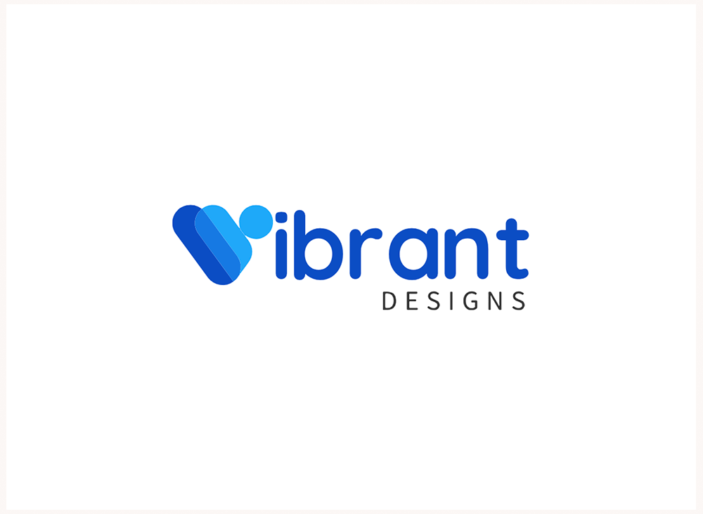
Replacing the initial letter 'V' in the wordmark with a unique, custom-designed letterform. This lettermark treatment immediately catches the eye and sets the brand apart, conveying a sense of creativity and innovation that aligns with the company's focus on design.
3. Using Simple Shapes and Negative Space
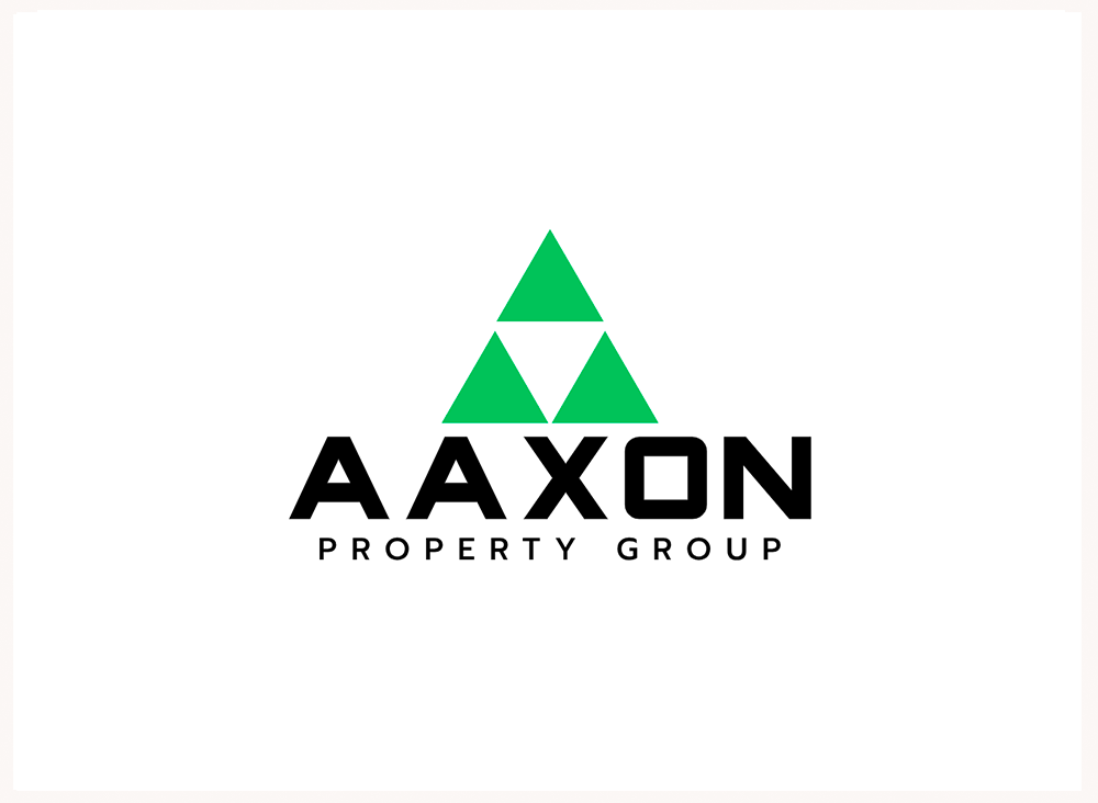
This logo choose a clever and minimalist approach by constructing the primary triangular symbol from three distinct green triangular shapes, with a white triangle nestled in the center. This strategic use of negative space creates a visually striking and memorable logo that stands out in its simplicity.
4. Abstract Letterform, Futuristic Identity
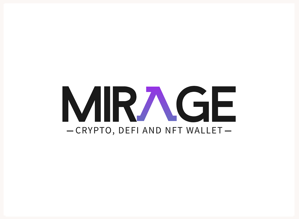
This logo employed a futuristic and abstract approach by replacing the letter 'A' in the wordmark with a custom-designed letterform featuring a blue-purple gradient. The gradient effect on the letterform creates a dynamic and eye-catching visual, suggesting movement and progression – qualities that are essential in the rapidly evolving crypto and NFT space. By seamlessly integrating the abstract letterform into the wordmark, the MIRAGE logo achieves a harmonious balance between standing out and maintaining legibility.
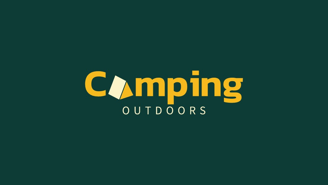
5. Rotating Triangle to Different Orientation
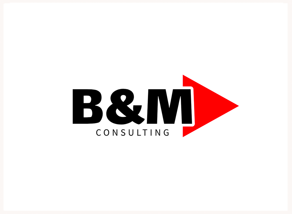
This logo have employed a unique and dynamic approach by rotating a simple red triangle shape at a 45-degree angle and positioning it on the right side of the wordmark, slightly overlapping with the last letter. This design trick adds a sense of movement and energy to the logo, effectively communicating the brand's commitment to providing fresh perspectives and innovative solutions. This clever use of negative space and overlapping elements adds depth and visual interest, while still maintaining a clean and professional aesthetic.
By following these tips and considering the symbolism and visual impact of triangular shapes, you can create an impactful triangle logo that effectively represents your brand's identity and stands out in a crowded marketplace.