The Tesla Logo Evolution: What does the Tesla symbol mean?

The Tesla Logo Evolution: What does the Tesla symbol mean?

Tesla stands as a beacon of innovation and progress in the automotive industry, embodying the values of creativity, sustainability, and cutting-edge technology. In this comprehensive exploration, we delve into the rich history and profound symbolism behind the evolution of the Tesla logo, offering insights on its significance in shaping the identity of one of the world's most innovative companies.


The Tesla Motors Story

Founded in 2003 by Elon Musk, Tesla Motors emerged with a revolutionary vision: to accelerate the world's transition to sustainable energy. Their goal was not merely to create electric cars but to redefine the entire concept of transportation, making it cleaner, more efficient, and ultimately sustainable for generations to come. The company's first breakthrough came with the release of the Tesla Roadster in 2008, the world's first fully electric sports car capable of delivering exhilarating performance without a drop of gasoline. This achievement not only demonstrated the viability of electric vehicles but also shattered misconceptions about their capabilities.

Building on the success of the Roadster, Tesla continued to disrupt the automotive landscape with the introduction of the Model S sedan in 2012. Boasting cutting-edge technology, long-range capabilities, and sleek design, the Model S quickly garnered acclaim as one of the most advanced and desirable vehicles on the market. It set a new standard for electric cars, proving that sustainability and luxury could coexist seamlessly.

Subsequent releases, including the Model X SUV and the more affordable Model 3 sedan, further solidified Tesla's position as a leader in the electric vehicle industry. Beyond cars, Tesla expanded its reach into renewable energy solutions, developing innovative products such as solar panels, solar roof tiles, and energy storage systems like the Powerwall and Powerpack. These initiatives aligned with Tesla's overarching mission to create a sustainable energy ecosystem that extends beyond transportation.


Tesla Logo History: The Tesla Logo Evolution

The evolution of the Tesla logo reflects the company's journey from its humble beginnings to its current status as a global leader in the electric vehicle industry.
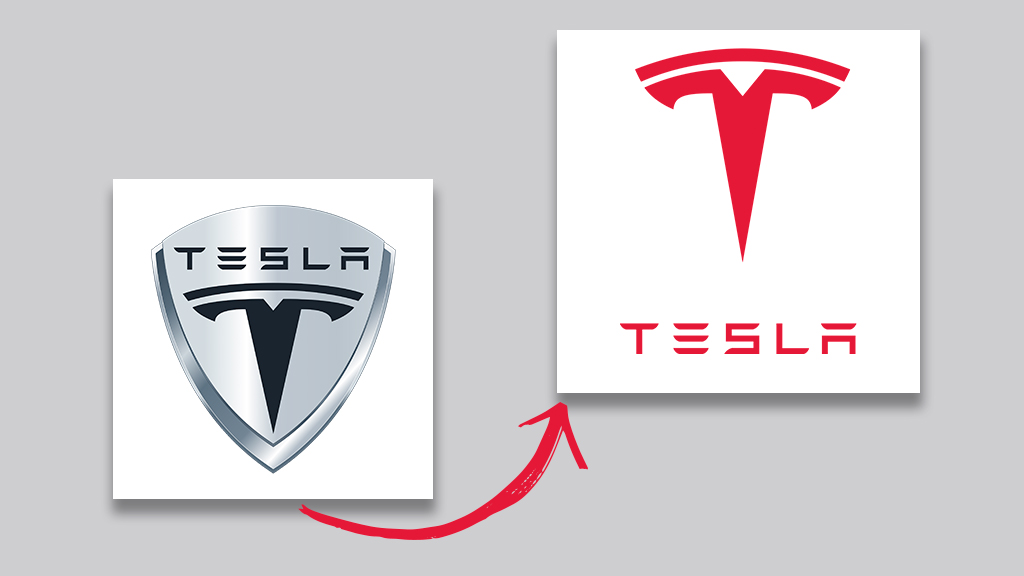
The initial logo design, introduced when Tesla Motors was founded in 2003, featured a shield emblem. This emblem served multiple purposes: it symbolized safety, a crucial aspect of Tesla's mission to produce reliable and secure vehicles, and it paid homage to Nikola Tesla, the company's namesake. Nikola Tesla, a prolific inventor and electrical engineer, was renowned for his contributions to the development of alternating current (AC) electricity and numerous other groundbreaking inventions. By incorporating a shield logo, Tesla Motors sought to honor his legacy while also conveying a sense of security and reliability to its customers.

In 2017, Tesla underwent a significant rebranding effort, which included updating its logo design to a sleeker and more streamlined version. This transition reflected Tesla's growth and modernization as it expanded its product lineup and established itself as a leader in the electric vehicle market. The new logo design retained the iconic "T" emblem but simplified the overall look, removing the shield element and adopting a cleaner and more contemporary aesthetic. This minimalist logo aligned with Tesla's evolving brand identity and communicated a sense of sophistication and innovation to consumers.

Today, the Tesla logo is instantly recognizable and has become synonymous with cutting-edge technology, sustainability, and forward-thinking design. Its evolution from a shield emblem to a sleek and minimalist design mirrors Tesla's transformation from a startup challenging the automotive industry status quo to a pioneering force shaping the future of transportation.


Today's Tesla Logo Design Elements

Let's delve deeper into the symbolism and design elements that make the Tesla logo an iconic emblem of innovation and sustainability.

Tesla Symbol "T" Meaning 

The "T" symbol in the Tesla logo is a nod to the company's products, which are built using the electronic principles pioneered by Nikola Tesla. It resembles a cross-section of an electric motor, with the main body representing one of the poles protruding from the motor rotor, and the second line on top representing part of the stator. This design choice was confirmed by Elon Musk himself in response to a tweet asking about the logo's meaning. By drawing inspiration from the electric motor, the Tesla logo not only pays homage to Nikola Tesla but also creates a visual link to the brand's technology-driven focus.

Additionally, Tesla's unique logo symbol is designed to convey a sense of futurism and innovation, reflecting the brand's forward-thinking vision. Its sleek and powerful appearance adds to the perception of luxury and sophistication, which aligns well with Tesla's position in the market as a provider of high-tech, premium automobiles. This deliberate choice in logo design reinforces Tesla's commitment to pushing boundaries and shaping the future of transportation.


Tesla Logo Font/Typography

The font used in the Tesla logo is known for its minimalistic style, characterized by the omission of certain parts of letters, such as the vertical lines in the "E" and "A" of the brand name. This unique feature gives the logo font a modern appearance, suiting the forward-thinking nature of the brand. 

Additionally, the design of the font, with multiple lines building the glyphs, evokes images of electrical cables and currents, reflecting the technology used in Tesla's cars. When paired with the iconic Tesla symbol, the font instantly communicates the brand's identity and conveys a sense of innovation. Overall, the clean lines and minimalist style of the Tesla font reinforce the brand's commitment to innovation and sustainability, while the slanted "T" shape adds to the visual representation of energy in motion.


Tesla Logo Color Palette

Tesla utilizes a variety of colors to showcase its brand identity. The most common depiction of the Tesla logo is in a simple black-and-white scheme. However, there are also versions of red logos that feature a bold red color.

Black and white are chosen for their associations with modernity, power, and luxury, reflecting the image that Tesla aims to portray. Additionally, the color white symbolizes purity, innovation, and technological advancement, while black represents luxury and innovation. Red is used sparingly as an accent color in the Tesla logo, representing passion and transformative change within the automotive industry. By combining these colors, Tesla creates a visually striking logo that communicates its dedication to innovation, luxury, and sustainability in the electric vehicle market.


Wrap up: Driving Innovation Forward with the Tesla Logo

As Tesla continues to lead the charge in revolutionizing the automotive industry, its logo remains a powerful symbol of progress and innovation. With its sleek design, minimalist font, and carefully chosen color palette, the Tesla logo encapsulates the essence of the brand and its mission to accelerate the world's transition to sustainable energy. In a world where logos often speak volumes about a company's identity, hopefully this article will inspiring companies worldwide to create their own brand logos.  

In essence, the evolution of the Tesla logo is not just a story of design changes, but a narrative of innovation, sustainability, and visionary leadership. It serves as a reminder that symbols have the power to inspire change and shape the future of industries. As we look ahead, we can only anticipate what new heights Tesla will reach and how its logo will continue to evolve, reflecting the company's ongoing commitment to innovation and progress.

Design your own logo now!

Make your business stand out with a beautifully designed logo that matches your style
请用微信扫码支付