
When we think about a brand like Coca-Cola, what’s the first thing that comes to our mind? In most cases than not, its logo. Why is that? What is it about that logo that makes it so powerful? After all, it’s only a swirl on a red background. Granted, they also used a nice font.
These are the questions that this article will answer, Why? and What?
Given that nowadays most businesses turn their heads to the digital realm, it’s safe to say that aesthetics and appearances play a vital role in their overall success. Why? Because we are all guilty of being humans! A nice logo attracts and retains attention. Of course, if you couple it with fantastic web-design then all the more credit to you. But let’s take things one step at a time. Let’s see exactly what it is about logos that make them so important. Coincidently, figuring that out will also unravel the answer to our main topic. So, let’s see how to create a successful logo.
Logos are like shadows
What exactly do I mean by this? Logos are a vital part of branding and as such, they must reflect your values, mission, and overall appeal.
Take FedEx for example. Notice that arrow that forms between the letters E and X. That's not accidental. It’s by all means purely intentional and it serves a purpose. It’s there to inform us that as a delivery service, FedEx is all about getting things done. An arrow is a direct representation of this delivery system, as it gets things from point A to point B. It also reflects their core value, which is: efficiency. More precisely, time efficiency.
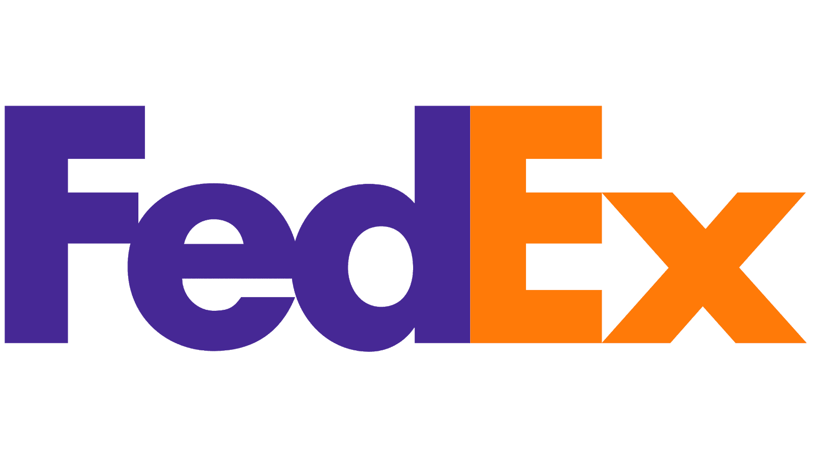
Source: https://logos-world.net/fedex-logo/
Amazon Prime does a similar thing but with a more swirly type of arrow. The message is the same, and we get it.

Source: https://www.dreamstime.com/illustration/amazon-logo.html
Aesthetics are important, but they have to serve a purpose. They have to evoke certain feelings and emotions. How do they do that? By mirroring the values that stand before your brand. So, when designing your logo always have in mind:
- What are your brand’s values?
- What is your mission?
- Who do you appeal to?
Those are the three questions that can forge an empire! Would you imagine Pepsi’s logo designed like IBM’s? Seeing that my first reaction would be to check if my graphics processor is failing.
Key takeaway: Design always should mirror your brand’s mission statement, and not the other way around. Note your ideas down, start from an initial logo design phase, and build from there.
Check your competition
Like the one above, this step is also a preliminary one before going on to create a successful logo.
Sure, you may already have some ideas surrounding your overall design. Your brand may be unique, but it’s sharing the market with multiple others that offer a similar service. What can we deduce from this? That there is a slight chance that your logos could be too similar.
Nothing is worse than copying your competition’s logo, so be thorough with your research on this. Make sure you diverge from your competitors in terms of design.
This is especially important because even though products may be similar, their appearance, and your brand’s appearance, can be the deciding factor when picking one of them. We do judge a book by its cover and in this case, it’s perfectly fine.
Logos denote professionalism, so creating a successful logo means delineating yourself from others and being original.
Key takeaway: Don’t take a good idea for granted. You may have a great idea, but maybe someone else came up with a similar one earlier. Inspect, analyze, and only after, decide!
Pick a design style
Some of the most popular design types for creating a successful logo are:
Classic
Modern
Minimalist
Vintage
Text
Depending on your business, you should go with that style that complements your brand the most. Again, don’t choose based solely on looks because that can turn into a recipe for disaster.
Every type of design has its strengths and weaknesses but, ultimately, its timeliness will be determined by your imagination.
Key takeaway: Whatever style you choose, add your own dimension to it.
A successfully created logo is a versatile one
Another important question you need to ask yourself is: Where will I use my logo? The answer is crucial, as you need your logo to perform well on any type of platform or medium.
When designing your logo take everything into consideration! Imagine your logo on the header of a page, and also as a letterhead for your official documents. How will it look like when printed or on mobile devices? The short answer is:
Logos are meant to be seen, and as such it’s your responsibility to ensure that your logo is ready to meet everyone’s eyes and, in this case, smartphone screen.
Key takeaway: Consider all the possible uses of your logo before plunging into the design phase.
Think about how you use space
The logo history of famous brands is packed with extremely convoluted designs. Designs that were so complex, you would think their place would belong on the walls of a church.
There are moments when you really want, and really should try to express as much as possible through your logo. Takes Apple’s first logo, for instance. The Newtonian logo is more complicated than gravity!
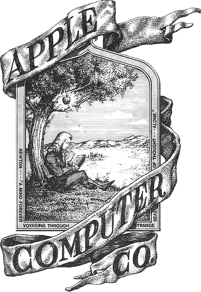
Source: https://commons.wikimedia.org/wiki/File:Apple_first_logo.png
Creating a successful logo is indeed complicated, but the end result should be crystal clear for the viewer.
Anyone looking at your logo should be able to discern what is happening over there. Although your intentions are good in nature, too many symbols, or too many design elements, can harm your design. How do you do it then? How do you add symbolism to your logo without sacrificing clarity? There is a shortcut to this, and that is negative space.
What is negative space?
Simply put, negative space is the space around your design’s central subjects. To exemplify this, let’s look at FedEx’s logo once more.
That arrow that we’ve talked about is a perfect example of how to use negative space in your logo design. This tip works great especially if your logo is more abstract as opposed to text only.
Let’s take another example, The Academy Awards.
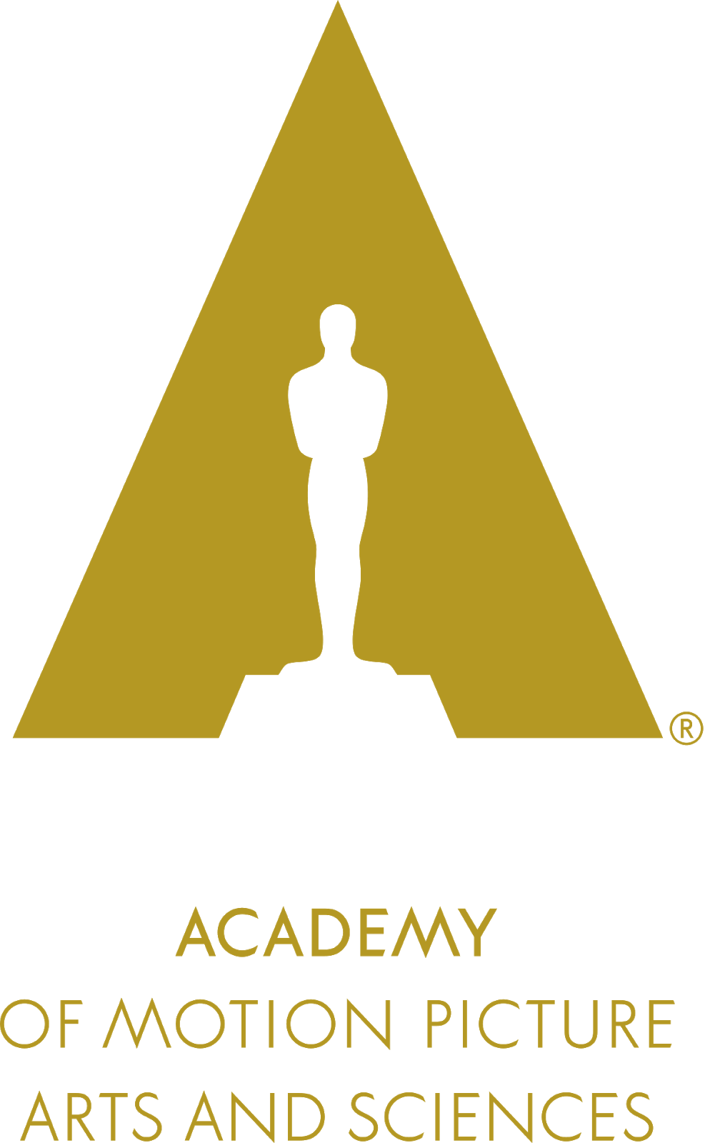
Source: https://en.wikipedia.org/wiki/Academy_of_Motion_Picture_Arts_and_Sciences
These guys didn’t bother with effectively designing a humanoid statue, but instead left space to do his thing. The outline is clear, we know what we are looking at, and at the same time, the overall design isn’t too crowded with visual elements. If The Academy gets movies wrong, at least they got their logo right.
Key takeaway: Complexity can be achieved without cluttering your design, through the use of negative space.
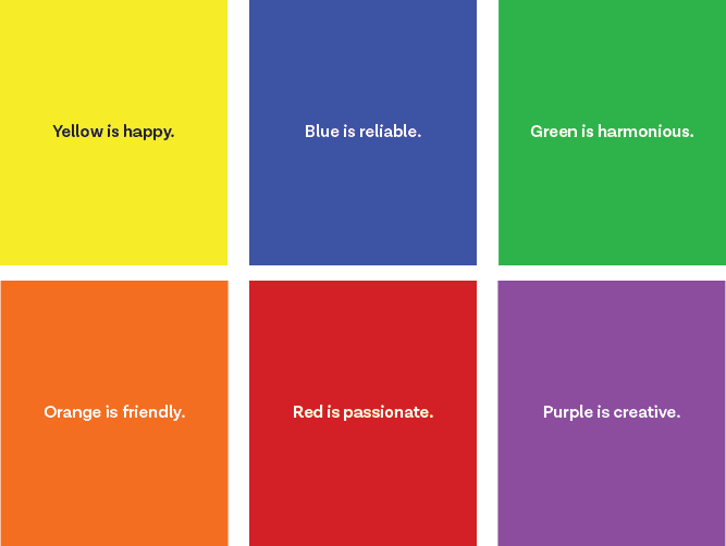
Choose your colors wisely
Color psychology is researched nowadays more than ever. It makes sense. There are more OLED technologies out there than TV programs ready to support them.
Nevertheless, colors have a psychological property that, if you play that card correctly, can work in your favor. Vibrant colors are an excellent choice if your target audience is youth. Energetic colors, like red, are great if you want to strike a sense of urgency with your logo.
Source: https://endeavorcreative.com/psychology-color-branding/
Colors and design elements are more alike than you probably imagined. Remember that in the previous step I mentioned negative space as a means to reduce design cluttering. The same goes for colors. Try to stick to a maximum of three or four colors. You want your logo to be memorable, eye-catching and visually appealing. Use too many colors and you risk hurting people’s cornea.
Key takeaway: Colors are used to evoke emotion. Use those colors that are best aligned with your brand to create a successful logo.
Watch out for typography
Abstract logos are great, but certain businesses are better equipped with a textual representation of their brand. Just take a look at The New York Times logo:

Source: https://help.nytimes.com/hc/en-us/articles/115014891408-Obtaining-and-using-Times-content
This logo is among the most recognizable out there, and they only used text. Why? Because it can be just as effective. Let’s think about it for a moment. Their business revolves around words and paper. It only makes sense that their logo is a stylized version of their name.
If you choose a textual logo, then look for the best font pairings out there. Especially if you own a website, you want a font that will go well and complement the one from your logo. Fonts should never compete with each other, they should enforce each other upon the viewer.
Predefined fonts are a great starting point even if you are planning to create a text logo on your own. Use them for inspiration and let your hands do the magic!
Key takeaway: When choosing to go for a textual logo, always take into account that the font you choose will have to be paired with another. Choose your font pairing carefully.
Don’t focus only on the present
Idee: trends are great, but they fade. Key point: your logo needs to be timeless, so think outside the box of present times.
Trends are great, but creating a successful logo is more than that. Your logo needs to be timeless, so think outside the box of present times.
Nike, Coca-Cola, and others, really didn’t do much to change their logo over time. Granted, this is due in part to the fact that you shouldn’t change your logo gratuitously. So, given that rebrandings don’t occur that often, go for a piece that is more than just a mirror of today’s popular choices.
Key point: Trends can give you a sense of direction when designing your logo but they do fade in time. Stay ahead of your time, and create something that can withstand current trends.
Creating a successful logo is sweat and imagination
There is a lot of effort and creative exhaustion put into creating a successful logo. That is all the better for you, as only those logos will have a genuine chance at generating that wow factor. Take your time, analyze, invest, and afterward, create!
Why should you pay attention to your logo? Because it is the visual representation of your brand. It is the image the people will get to associate with you and only you.
We all know that an image is worth a thousand words. That may or may not be true in all cases. But it’s definitely true in this case! Logos don’t need words to express themselves. Before a thought even has the chance to form in one’s mind, the picture of Coca-Cola sparkles something.
This emotional reaction is what makes logos so powerful. They are part of pop-culture, and there is no chance of getting past some of them without feeling something.
So, is it all worth it? My bet is on yes and, hopefully, upon reading this article, yours will be too.
