When you're building a tech startup, your logo is often the first thing investors, partners, and customers encounter. It needs to communicate innovation, trustworthiness, and clarity — all in a single glance. In 2026, the design landscape for tech brands has never been more diverse, yet the principles of effective logo design remain consistent: simplicity, scalability, and distinctiveness. Whether you're launching a SaaS platform, a fintech app, or an AI-powered tool, choosing the right logo style can set the tone for your entire brand identity.
Why Logo Style Matters for Tech Startups
A logo is more than a visual mark — it is a strategic asset. For tech startups, a well-chosen logo style signals professionalism and positions the brand within its competitive landscape. A cluttered or outdated logo can undermine credibility before a single word is read, while a clean, modern mark instantly communicates that a company is forward-thinking. The good news is that today's AI logo maker tools make it faster than ever to explore multiple styles and find the one that best fits your brand personality.
1. Minimalist Wordmark Logos
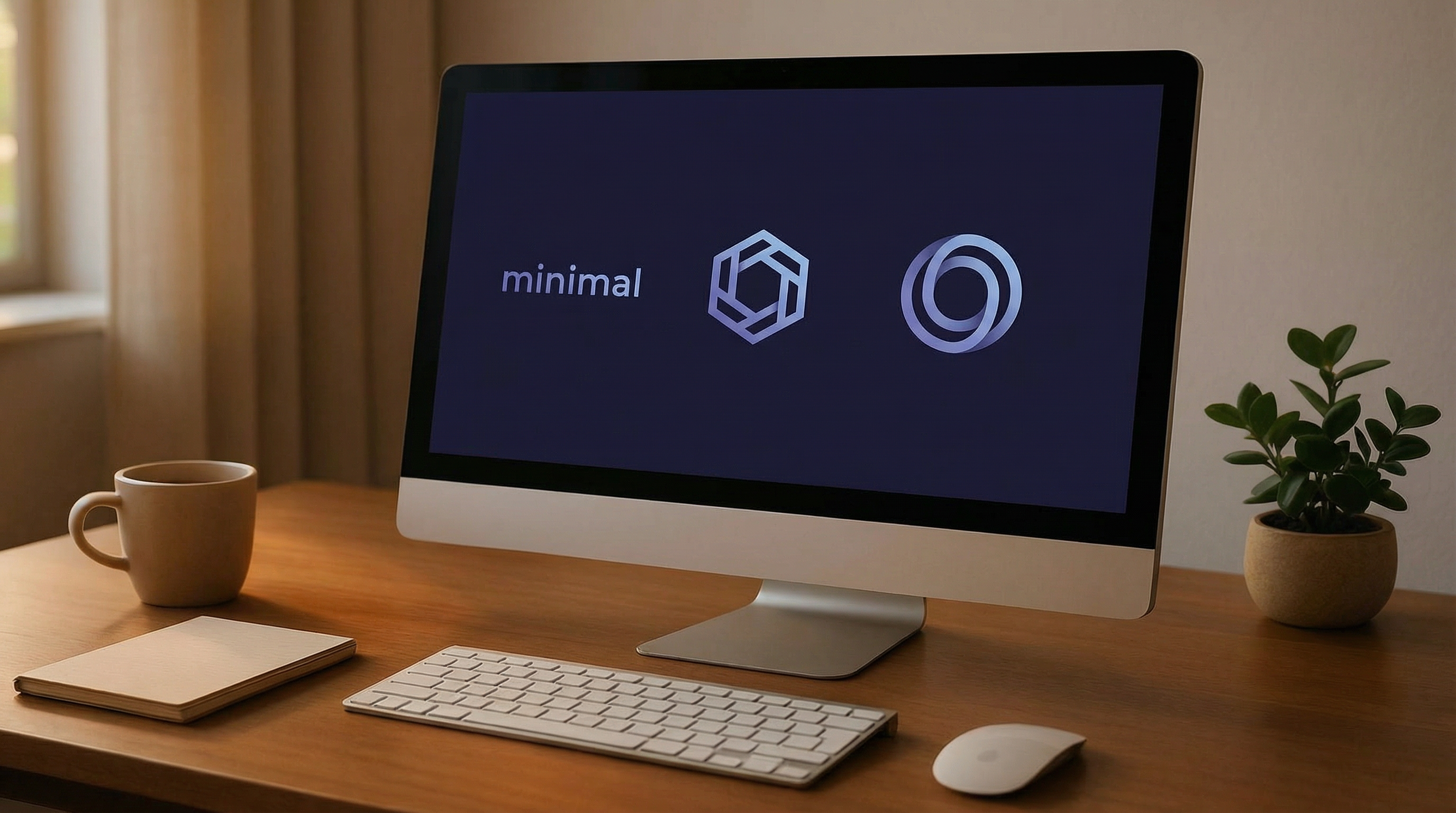
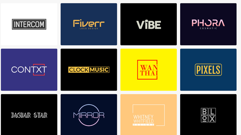
The minimalist wordmark remains the dominant choice for tech startups in 2026. This style strips the logo down to the company name rendered in a carefully chosen typeface — no icon, no decoration, just pure typographic confidence. Think of how brands like Intercom, Fiverr, and Vibe use clean sans-serif fonts to project authority and clarity. The minimalist wordmark scales perfectly across every touchpoint, from a browser favicon to a billboard, and it ages exceptionally well.
The key to a great wordmark is font selection. Tech startups typically gravitate toward geometric sans-serifs (clean, rational, modern) or humanist sans-serifs (approachable, warm, trustworthy). You can explore hundreds of minimal logo templates to find the typographic style that resonates with your brand voice.
2. Geometric and Abstract Icon Logos
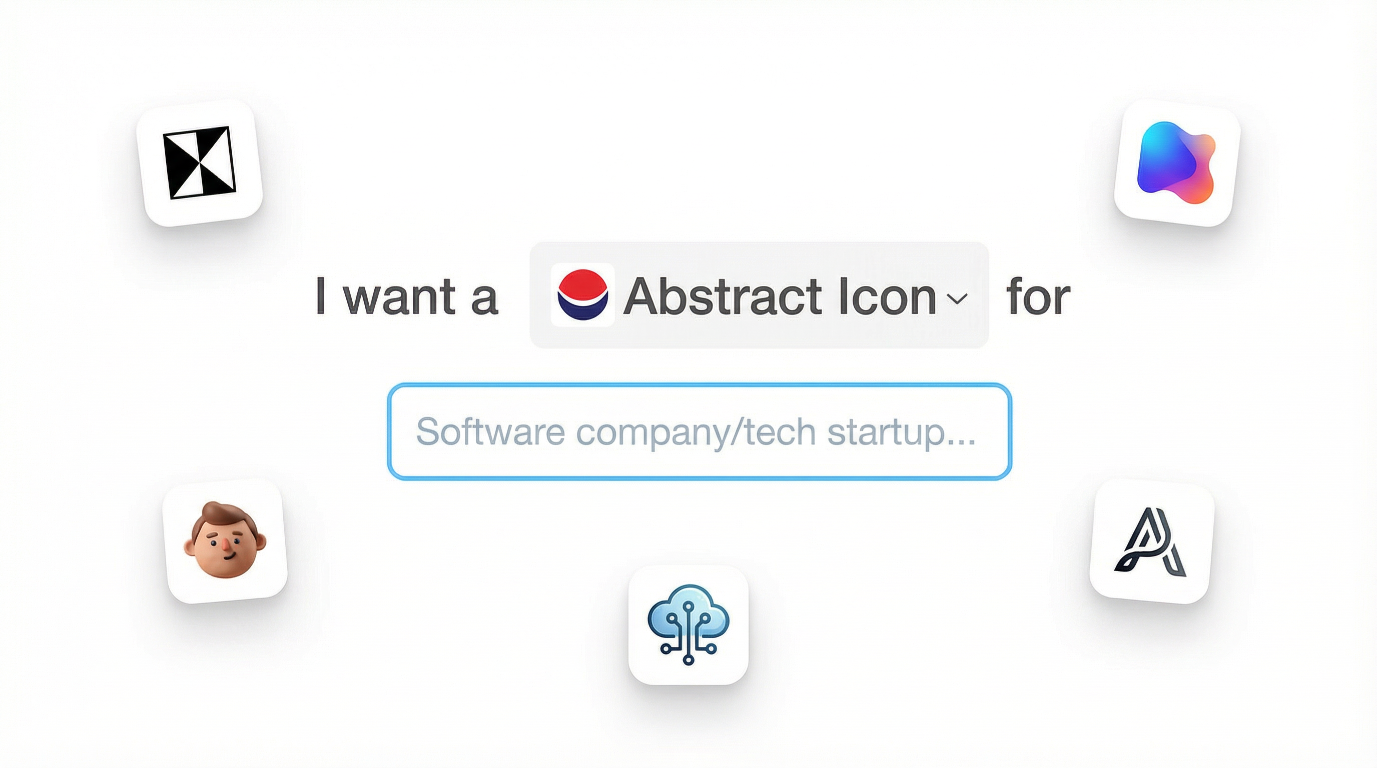
For startups that want a standalone icon — something that can be used independently of the company name — geometric and abstract marks are the gold standard in the tech sector. These logos use shapes like hexagons, triangles, circles, and interlocking forms to create a visual symbol that feels both engineered and memorable. Brands like Gadget Gizmos, Orketech, and Novelance demonstrate how a well-crafted geometric mark can convey precision, connectivity, and innovation without a single word.
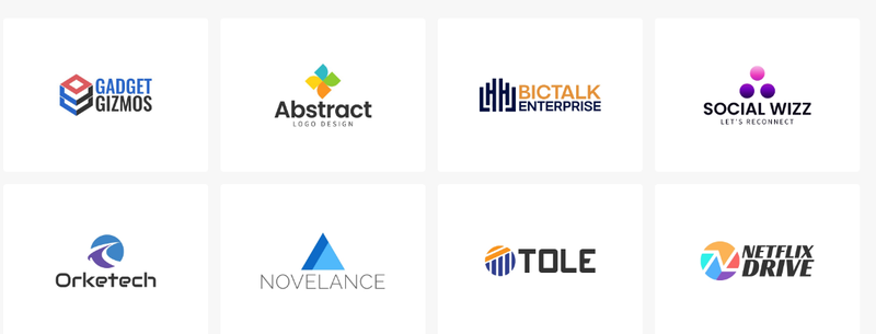
Abstract icons are particularly powerful for startups that plan to scale globally, as they transcend language barriers and carry meaning through form alone. The challenge is ensuring the mark is distinctive enough to stand out in a crowded market. Using an AI icon generator can help you rapidly iterate on geometric concepts until you find a shape that is both unique and meaningful.
3. Lettermark and Monogram Logos
When a company name is long or difficult to render visually, a lettermark — a logo built from one or two initials — offers an elegant solution. This style has been adopted by some of the world's most recognizable tech brands, and it works equally well for startups. A strong lettermark is compact, versatile, and immediately brandable. The key is to treat the letters as graphic elements, not just typography, using custom spacing, overlapping forms, or subtle geometric modifications to create something truly ownable.
If your startup name has strong initials, exploring initial letter logo templates is a smart starting point. Pair a well-crafted lettermark with a clean wordmark for formal contexts, and use the icon alone for app icons, social media avatars, and merchandise.
4. Gradient and 3D Logos
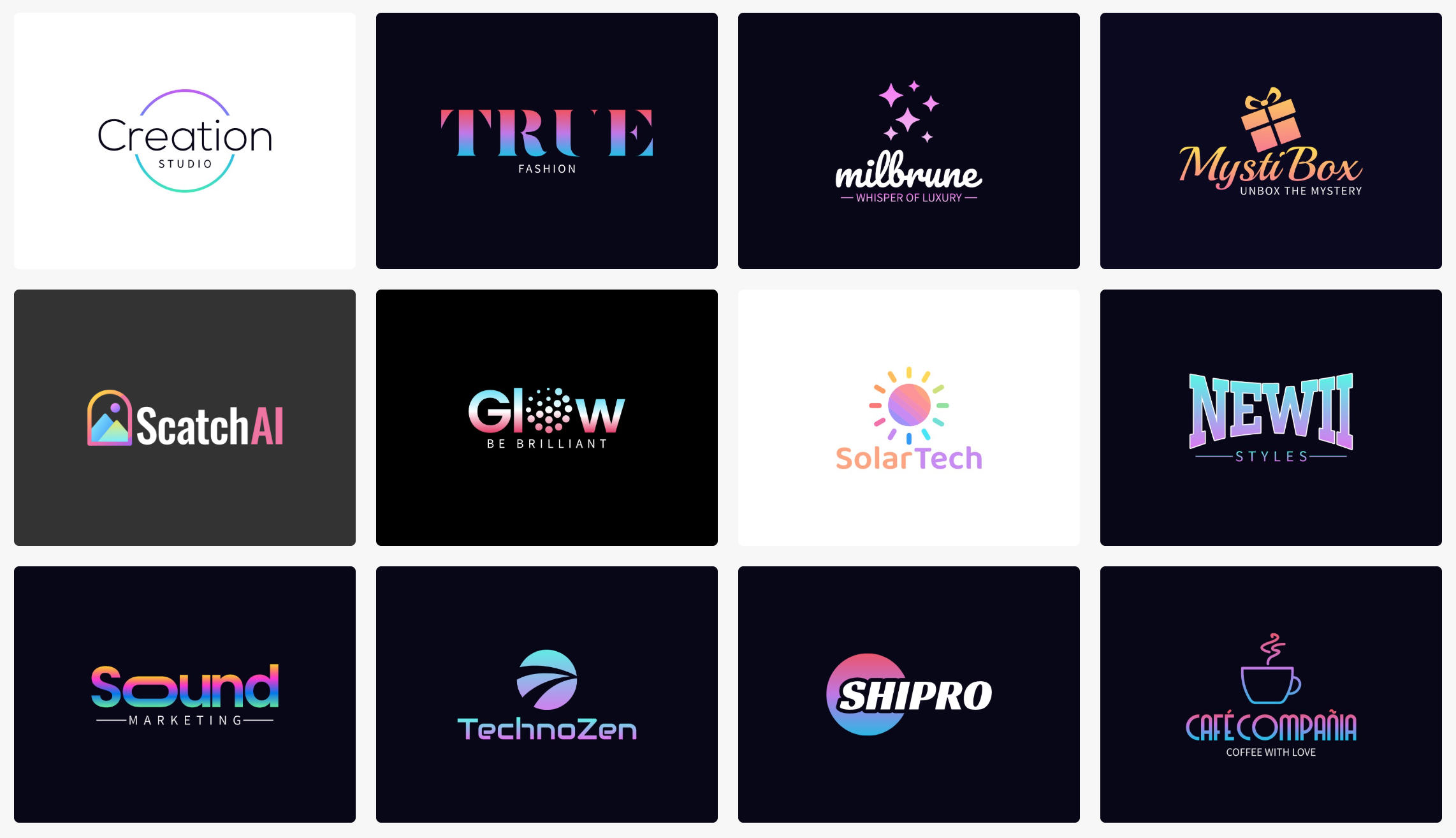
Flat design dominated the 2010s, but 2026 has seen a confident return of depth, texture, and gradient in tech branding. Gradient logos — those that transition between two or more colors — add dynamism and a sense of energy that flat designs can lack. When executed well, a gradient mark feels premium and forward-looking. Similarly, subtle 3D effects and dimensional letterforms are appearing more frequently in startup branding, particularly in the AI, gaming, and metaverse sectors.
 Gradient and 3D Logos
The risk with gradients and 3D effects is that they can look dated quickly if tied to a specific trend. The safest approach is to use gradients sparingly — as an accent on a geometric icon rather than across the entire wordmark — and to ensure the logo still reads clearly in single-color applications.
How to Choose the Right Style for Your Startup
The best logo style for your tech startup depends on three factors: your brand personality, your target audience, and your long-term vision. A B2B enterprise software company will likely benefit from the authority of a clean wordmark, while a consumer-facing AI app might thrive with a bold, colorful abstract icon. A fintech startup targeting institutional clients needs a logo that projects stability and trust, whereas a gaming or creative platform can afford to be more expressive and experimental.
Start by defining two or three adjectives that describe how you want your brand to feel — for example, "precise, intelligent, and approachable" — and then evaluate each logo style against those criteria. The LogoAI platform makes it easy to experiment across all these styles in minutes. Simply enter your brand name and let the AI logo generator surface options across wordmarks, icons, lettermarks, and gradient styles simultaneously, so you can compare and choose with confidence.
Final Thoughts
In 2026, the best tech startup logos share a common thread: they are intentional, scalable, and built to last. Whether you choose the timeless clarity of a minimalist wordmark, the visual power of a geometric icon, the compactness of a lettermark, or the energy of a gradient mark, what matters most is that your logo authentically represents your brand and resonates with your audience. The style you choose today will shape how the world perceives your startup for years to come — so choose wisely, and use the best tools available to get it right from the start.