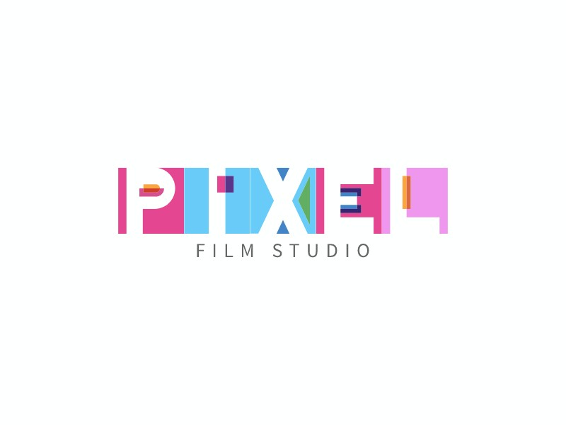
Typography alone can carry an entire brand — and the PIXEL FILM STUDIO logo is a perfect example of that. At first glance, it looks playful and modern. But beneath the surface, it is a carefully constructed piece of design that combines geometry, color, and structure to create a memorable identity. Let's break down why this font-based logo is so effective, and what designers can learn from it.
1. Typography as the Hero
Unlike symbol-heavy logos, this design relies entirely on custom letterforms. The word "PIXEL" is not typed using a standard font — it is built from geometric shapes including rectangles, triangles, and negative space cutouts. This transforms the text into a visual system rather than just readable letters. The result is a logo that is unique and ownable, avoids generic font usage, and blends typography with icon-like qualities. If you want to explore how far typography can go in logo design, the AI logo maker offers a powerful starting point for building custom wordmarks.
2. The "Pixel" Concept is Embedded in the Design
The brand name is PIXEL, and the design directly reflects that idea. You can see blocky, modular shapes, hard edges and digital-style construction, and small pixel-like accents embedded within the letters. This is a perfect example of concept-driven typography, where the form matches the meaning. That alignment makes the logo more intuitive, easier to remember, and capable of visual storytelling without relying on additional imagery.
3. Strategic Use of Color
The color palette is vibrant but controlled, featuring pink, blue, purple, and small accent colors such as orange and green. Instead of applying gradients, the design uses solid color blocks. This approach reinforces the digital and pixel aesthetic, keeps shapes clean and readable, and adds energy without overwhelming the viewer. The color segmentation also helps separate letter components, enhancing the overall visual rhythm of the mark.
4. Clever Letter Construction
Each letter receives a unique treatment. The "P" uses negative space to create depth, the "X" is built with intersecting geometric shapes, the "E" is abstracted yet still readable, and the "L" is simplified into a clean block form. Despite this heavy stylization, readability is preserved throughout. This balance is critical in logo design: too abstract and the mark becomes unreadable; too simple and it becomes forgettable. The PIXEL FILM STUDIO logo hits the sweet spot between the two extremes.
5. Strong Visual Balance
Even with different shapes and colors across each letter, the logo feels visually stable. This is achieved through consistent letter height, even spacing, and alignment along a central baseline. The smaller text "FILM STUDIO" set beneath the main mark adds hierarchy, a professional tone, and breathing room that prevents the design from feeling cluttered. This kind of structured hierarchy is something you can replicate using text logo templates that allow full control over font pairing and layout.
6. Perfect Fit for the Industry
For a film studio logo, this visual style is highly appropriate. It communicates creativity, motion, and modern digital production. The geometric forms even subtly resemble editing blocks, timeline fragments, and motion graphics elements. This connects the logo to video production without resorting to clichés like cameras or film reels — a much more sophisticated approach to industry-specific branding.
7. Scalable and Versatile
This logo works across formats because it is vector-friendly, built with simple shapes, and easily adaptable to animation. Imagine the letters animating in sequence, blocks assembling like pixels, or colors shifting dynamically in a motion intro. This makes it ideal for motion branding, which is critical for film studios. For brands looking to bring their logo to life, tools like the animated logo maker can add that extra dimension of movement and personality.
Key Takeaways for Designers
The PIXEL FILM STUDIO logo offers several important lessons for anyone designing a font-based logo. First, do not rely on default fonts — customizing letterforms is what creates true uniqueness. Second, align the design with the brand's meaning; here, the word "pixel" directly inspired the modular geometry. Third, use color intentionally as structure rather than mere decoration. Fourth, always balance creativity with readability, pushing boundaries while staying legible. Finally, think beyond static design and consider how the logo will perform in motion and across different scales and media.
Final Thoughts
The PIXEL FILM STUDIO logo proves that typography alone can be expressive, distinctive, and brand-defining. By combining geometric construction, concept-driven design, and strategic color usage, it transforms a simple wordmark into a full visual identity. In an era where AI-generated design is increasingly prevalent, this is exactly the kind of thoughtful, intentional approach that stands out — where form, meaning, and execution all align perfectly.