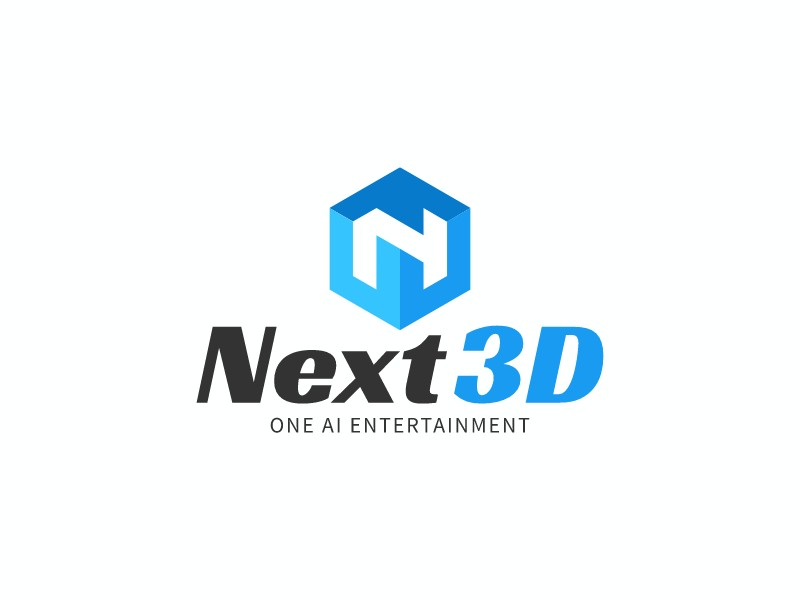
Not every great logo needs to be complex. The Next3D logo — created for an AI entertainment brand — is a masterclass in doing more with less. At first glance it appears simple: a blue hexagonal icon with a white "N" letterform, paired with a bold mixed-weight wordmark and a clean tagline. But look closer and you will find a series of deliberate design decisions that work together to communicate exactly what the brand stands for. This post breaks down why this logo works so well, and what other brands can learn from it.

1. The Icon Does Double Duty
The hexagon is one of the most versatile shapes in logo design — it conveys structure, precision, and technological sophistication. But what makes the Next3D icon exceptional is that it does not just use a hexagon as a container. The shape itself is rendered with a subtle 3D perspective, giving it a sense of depth and dimension that immediately reinforces the brand name. The beveled faces catch the light differently, creating a visual hierarchy within the icon that draws the eye inward toward the "N" letterform at the center.
This kind of layered meaning — where the shape, the rendering style, and the embedded letter all reinforce the same idea — is what separates a thoughtfully designed logo from a generic one. The icon communicates "3D" without needing to say it, because the form itself demonstrates it.
2. The Color Gradient Is Purposeful, Not Decorative
The blue gradient used across the hexagon is not simply a stylistic flourish. The transition from a lighter sky blue at the top to a deeper cobalt at the base creates the illusion of a light source hitting a three-dimensional object from above — reinforcing the 3D effect and adding realism to what is otherwise a flat vector mark. This is a technique borrowed from product design and industrial rendering, and it works because it is consistent with the brand's core proposition: AI-powered, dimensional, forward-looking entertainment.
Blue is also the dominant color in technology and entertainment branding for good reason — it communicates trust, intelligence, and innovation. The specific shade used here sits in the bright, energetic range of the blue spectrum, avoiding the corporate coldness of navy while still projecting professionalism. It is a color that would feel equally at home on a gaming platform, a streaming service, or an AI software product.
3. The Typography Creates Contrast and Hierarchy
The wordmark "Next3D" is set in a bold italic serif-influenced typeface, with "Next" in dark charcoal and "3D" in the same vivid blue as the icon. This two-color, two-weight treatment does several things simultaneously. First, it creates a visual connection between the icon and the wordmark — the blue in "3D" echoes the blue of the hexagon, tying the two elements together without requiring them to touch. Second, the contrast between the dark "Next" and the bright "3D" creates a natural reading hierarchy that emphasizes the brand's defining characteristic.
The italic angle of the wordmark adds energy and forward momentum — a subtle cue that this is a brand about what comes next, not what has already been. Below the wordmark, the tagline "ONE AI ENTERTAINMENT" is set in a clean, widely-spaced uppercase sans-serif, providing a grounding counterpoint to the dynamic wordmark above. The spacing and weight of the tagline ensure it reads as supporting information rather than competing with the primary brand name.
4. Simplicity Enables Scalability
One of the most practical virtues of this logo is how well it scales. The icon is clean enough to work as a standalone app icon or social media avatar at small sizes, while the full lockup reads clearly at large display sizes. There are no fine details that would disappear at small scales, no thin strokes that would break up in print, and no complex gradients that would render poorly on low-resolution screens. This is the hallmark of a professionally designed logo — it works everywhere, every time.
For brands in the entertainment and technology space, scalability is non-negotiable. Your logo will appear on mobile screens, desktop interfaces, merchandise, event signage, and social media thumbnails — often all in the same week. A logo that only looks good at one size is not a logo; it is a liability. The Next3D mark avoids this trap entirely through disciplined simplicity.
5. The Overall System Is Cohesive
What ultimately makes this logo work is that every element — the 3D hexagon, the gradient, the mixed-color wordmark, the italic angle, the clean tagline — is telling the same story. There is no visual noise, no element that feels out of place or added as an afterthought. The logo communicates "next-generation, AI-powered, three-dimensional entertainment" through form, color, and typography simultaneously, without relying on any single element to carry the full weight of the message.
This kind of cohesion is what separates a logo that merely looks good from one that actually works as a brand asset. If you are building a brand in the technology or entertainment space and want to achieve this level of intentionality in your own logo, the 3D logo maker on LogoAI is a powerful starting point — it lets you explore dimensional icon styles, gradient treatments, and mixed-weight wordmarks in minutes. You can also browse the full AI logo maker to experiment with different icon and typography combinations until you find a system that tells your brand's story as clearly as Next3D tells its own.
Key Takeaways for Your Own Logo Design
The Next3D logo offers several lessons that apply to any brand. Choose a shape that reinforces your brand's core idea, not just one that looks appealing. Use color with intention — let it do functional work (like creating depth or connecting elements) rather than simply decorating. Create typographic contrast and hierarchy so the most important information is read first. Design for scalability from the start, not as an afterthought. And above all, ensure that every element in your logo is working toward the same message. When a logo achieves that kind of coherence, it does not need to be complex to be memorable — it just needs to be right.